 FA+
FA+
9543
Views
Views
354
Favorites
Favorites
Category
Artwork (Traditional) / Fanart
Species Mouse
Size 982 x 756
File Size 467.6 kB
Report this content
★
More from Ruaidri


Mr. Ages! May I please speak to you?
Story time!
You may have noticed recently that I've been taking some time off to sort out some of my problem areas when it comes to drawing. It's slow going... my brain seems to naturally resist study of any sort, but I'm determined to get better at this damn stuff so I've been doing my best to force myself to study just about everything.
I started out by hitting anatomy fairly hard, but now that I feel like I'm getting a better hang of that, I've been drifting into other areas of art. I'm beginning work with backgrounds, mainly composition and value studies- basically black and white doodles.
At the same time, I've been exploring a more cartoony style, as you might have noticed in my latest batch of headshots. I don't plan on fully switching over to a 'toony style, but I've always head a soft spot for these sorts of characters, and an artist should be able to draw in a variety of styles anyway.
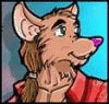
Thinking about where I could go to see good examples of these cuter, toonier characters, the movie The Secret of N.I.M.H. popped into my head. I hadn't seen it, but I'd seen it pop up here and there and knew the art style was about what I was after, so I tracked it down and gave it a watch.
Turned out I liked it, rather a lot. I was quite surprised to find death, blood and murder in a movie currently rated G according to netflix, but I guess it's true what they say- they don't make 'em like they used to.
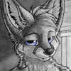
Anyway, after going through the movie the first time, I went through it again looking for any interesting screengrabs that might make good practice. I don't typically do fan art, it's just not my bag, but it seems like it might be good practice, and to be honest I'm not quite ready to leave the world of the movie just yet. (I'm sure anyone who's finished a good book or movie recently knows what I mean!) So I set to work, and a few hours and half a prismacolour pencil later, here's the result.
Admittedly the character didn't turn out quite as nice as I'dve liked- I haven't really studied the style much yet. Other than that I'm actually rather satisfied, I thought it would end up looking much worse than this, so I guess a better than expected result is all an artist can really ask for. x3
Definitely let me know your thoughts guys! If you like seeing this stuff, I might very well do some more. Though probably in paint next time... filling a whole page with pencil reminded me of why I gave up on pencils in the first place. Yeesh.
You may have noticed recently that I've been taking some time off to sort out some of my problem areas when it comes to drawing. It's slow going... my brain seems to naturally resist study of any sort, but I'm determined to get better at this damn stuff so I've been doing my best to force myself to study just about everything.
I started out by hitting anatomy fairly hard, but now that I feel like I'm getting a better hang of that, I've been drifting into other areas of art. I'm beginning work with backgrounds, mainly composition and value studies- basically black and white doodles.
At the same time, I've been exploring a more cartoony style, as you might have noticed in my latest batch of headshots. I don't plan on fully switching over to a 'toony style, but I've always head a soft spot for these sorts of characters, and an artist should be able to draw in a variety of styles anyway.
Thinking about where I could go to see good examples of these cuter, toonier characters, the movie The Secret of N.I.M.H. popped into my head. I hadn't seen it, but I'd seen it pop up here and there and knew the art style was about what I was after, so I tracked it down and gave it a watch.
Turned out I liked it, rather a lot. I was quite surprised to find death, blood and murder in a movie currently rated G according to netflix, but I guess it's true what they say- they don't make 'em like they used to.
Anyway, after going through the movie the first time, I went through it again looking for any interesting screengrabs that might make good practice. I don't typically do fan art, it's just not my bag, but it seems like it might be good practice, and to be honest I'm not quite ready to leave the world of the movie just yet. (I'm sure anyone who's finished a good book or movie recently knows what I mean!) So I set to work, and a few hours and half a prismacolour pencil later, here's the result.
Admittedly the character didn't turn out quite as nice as I'dve liked- I haven't really studied the style much yet. Other than that I'm actually rather satisfied, I thought it would end up looking much worse than this, so I guess a better than expected result is all an artist can really ask for. x3
Definitely let me know your thoughts guys! If you like seeing this stuff, I might very well do some more. Though probably in paint next time... filling a whole page with pencil reminded me of why I gave up on pencils in the first place. Yeesh.
Category Artwork (Traditional) / Fanart
Species Mouse
Size 982 x 756px
File Size 467.6 kB


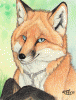


It's hard to believe this movie was made the year I was born. Way, way ahead of its time.
The only thing I can find to critique, and this is reaching, would be Ms. Brisby's nose. It's a touch longer than I remember. Beyond that, all of your study is clearly paying off. Keep it up!
The only thing I can find to critique, and this is reaching, would be Ms. Brisby's nose. It's a touch longer than I remember. Beyond that, all of your study is clearly paying off. Keep it up!
There are a lot of things off about the character... I hadn't actually studied the drawing style at all yet, I just sort of went for it, heh. I'm going to spend a little bit of time going over how to draw the character properly, so hopefully next time she'll look a bit better!


Aha! I was kind of hoping you'd drop a comment here. You may not even remember this, but while I was working on this picture today I brought up the soundtrack for some listenin' and I happened to notice a familiar face in the comments... https://www.youtube.com/watch?v=7k8o8yNb6aM&index=1&list=PL80B2D945B64CE2DA
I know it's a bit odd, but I just always find it mildly amusing when I see someone I recognize a bit outside of the FA bubble, heh.
Anyway, thanks a bunch! Definitely glad I watched it, just a shame the sequel had to be so bad. I wouldn't have minded spending a bit more time in that world, but apparently it's not worth it. :P
^_^ This kind of thing happens to me a lot. Part of the roo magic that seems to cause stuff like this to happen to me a lot. That and I have waaay too much time on my paws lol. This makes me feel really special. I do love this a lot. I need to go looking for your art more often. I watch a ton of people and sometimes it causes me to miss out on stuff. I'm glad I didn't miss this.
Most of my gallery is... not like this. If you're not too into the raunchy stuff it makes sense you wouldn't see much of my work. That said, I do plan on doing more from this movie, it's actually a great reference for traditional painting... and super duper adorable, which makes studying actually fun, haha. So it might not hurt to check back in now and then.
Either way, thanks again, really glad you enjoyed it! :3
Either way, thanks again, really glad you enjoyed it! :3

Amazing job, for an amazing movie! You have always been one of my favorite artists, and it's wonderful to see you flexing your art muscles, and trying new things! Hollywood mouse movies were a big influence on me, in my early years, and it's no wonder why when I asked a friend to draw me for the first time, they made me quite similar to a male Mrs. Brisby! I cry at the end credits... "Flying Dreams" is simply too beautiful, and it just... Oh man... Touches me on such a primal level!
Please keep up the great work! This sure has made my week!
Please keep up the great work! This sure has made my week!
I actually can't listen to the end credits theme... I quite like the version they play mid-movie with the female singer, but the way the guy sings in the end credits drives me batty for some reason! Can't stand it. Everything else is pretty nice though, music wise!
Anywho, thanks a ton! I'm very glad to hear you like how it turned out. It's a new movie for me, but it's neat to be able to bring back some fond childhood memories for other folks. :P
Anywho, thanks a ton! I'm very glad to hear you like how it turned out. It's a new movie for me, but it's neat to be able to bring back some fond childhood memories for other folks. :P

I didn't see this in the theater, and I wish I had, but I remember the commercials for it. This really is a magical film, and you captured that magic perfectly. Thank you for doing this. It was dreadfully hard work, I can tell from ALL THAT SHADING...
Whoof. Do you have any knuckles left? And how long did it take you to wash the graphite off the edge of your hand?
Whoof. Do you have any knuckles left? And how long did it take you to wash the graphite off the edge of your hand?
It actually went by surprisingly quickly. Doing the work in all one colour made things go faster as you might expect... a lot of this scene is just 'black' so all I had to do for those is just mash the pencil in and scribble around a lot 'till it was filled in. The areas with light and texture took up almost as much time as all the dark areas, despite being lesser in amount!
That said, it still only took me five hours or so, which is still less than what colouring a normal commission picture would take, so it wasn't too bad. As for the pencil, it was actually a prismacolour coloured pencil, more waxy than dusty, so I didn't get all that much on my fingers. As for my hand, I did much of the shading while holding the pencil like a brush so it didn't hurt at all. Doing fine detail with more of a 'writing grip' definitely causes pain fairly quickly for me, but this was all big loose shading so it wasn't too bad. :P
Anyway, there's a bunch of serious answers to what were probably less than serious questions, haha. I'm really glad you liked it though, thanks a bunch! :D

It's nowhere near as disturbing as the research that inspired the writing of the book. https://en.wikipedia.org/wiki/Behavioral_sink

Secret of NIMH is definitely a classic, both for the story and animation, and for how it touches on darker subjects like that. It really stands out in my mind for that reason -- you know. There's terrible forces at work in the world, and people are gonna die. It's just how it goes, and it gives it that much more impact. More poignant and memorable than some of Disney's movies of the time, for that reason. Also an interesting tale in that regard, too, since the idea was first pitched to Disney, who turned it down -- and then Bluth went on to fund it any way he could, even taking a great personal financial risk to do it.
Anyways, this is a lovely tribute to it, and a fantastic departure on your behalf~ l3
Anyways, this is a lovely tribute to it, and a fantastic departure on your behalf~ l3


Hey, nice job there. Neat to see how you handle something so different from your more customary output. 9B woodless and a smudge stump can make faster work of large black areas, though if you hate penciling anyway maybe ink washes for your value studies? Either way, I wouldn't object to you throwing more studies and explorations into the mix.
And yeah, NIMH's good, definitely one for any furry or animation fan's list.
And yeah, NIMH's good, definitely one for any furry or animation fan's list.

Damn, Ru, NIMH? That's very awesome and unexpected to see from you. I still remember ordering the book from some sort of kid's book pamphlet that we used to get in school, which I still have. I should really reread/rewatch sometime.
I quite enjoy B/W art and this looks pretty nice, so I'm definitely looking forward to more.
I quite enjoy B/W art and this looks pretty nice, so I'm definitely looking forward to more.
Unexpected that I'd like it, or that I'd draw it? 'Cause it's not that surprising really that I'd be fond of it... I'm a sucker for all things cute and adorable. x3 There will definitely be more, though I'm toying with trying some in colour so I don't know if there will be more BnW work.
Au contraire, mon ami! I've always loved cute things. I've got a small collection of stuffed animals I keep around the house just to amuse my desires for adorable. I don't think you can really be in this fandom if you don't have some love of small fluffy adorable things. x3


A movie very dear to me, for sure!
I'm interested that you said you wanted to try out a toonier style, but you turned to Don Bluth. I've always considered his work to be a mixture of feral and anthro, leaning more towards the feral side of things. When I think toon, I think Roger Rabbit or Bonkers.
I'm certainly not complaining though! I've been hoping to see you have a go at this more feral body shape and style. You're certainly capable
There are a huge variety of cartoony styles to be sure... basically when I say 'toony' I mean anything other than realistic. This particular style remains authentic to the animals they're based on, but at the same time are far from realistic... I guess they just strike the balance in a way that I like.
The roger rabbit/bonkers style is just a bit too silly for me. I'm drawn to cuteness, not sillyness so much. x3
You'll may be happy to hear that not only do I plan on studying this sort of cartoony feral body type during my time off, but also actual full blown normal animals too- I'm hoping to start getting into drawing them properly. So things should be interesting going forward, I think!


Wow, that's fantastic! Always glad to see someone do NIMH fan art. n.n
BTW, would you mind if I featured this on the Thorn Valley tumblr (with attribution and a link back here, of course)?
BTW, would you mind if I featured this on the Thorn Valley tumblr (with attribution and a link back here, of course)?


This is great, and I fully understand the idea of not wanting to leave a world--especially one as compelling as The Secret of NIMH's. I also hadn't seen it until recently, and the stack of paper behind me is a testament to my reticence to leave behind Mrs. Brisby and the others. It helps that she's quite cute, too.
The only comment I would have artistically is that you could focus on the overall tonal range of your drawing and make sure to leave room for highlights and full darks. I'm not sure if you were using toned paper, but if so you could put down chalk, and, if not, just erase some graphite. I seem to recall that that shot in the movie has direct sunlight reflecting off the metal, and I bet those are bright highlights. That would also allow you to put Mrs. Brisby in sharper relief, to make her silhouette stand out more.
You could also go in the opposite direction. By that, I mean that the original intent in the movie may have been to introduce us to this harsh, unforgiving, scary-looking machinery and introduce us to the main character standing in the middle of it. It really underscores her vulnerability and lack of power in the dangerous and harsh world around her--one of the themes in this rather gritty movie. Thus, you could perhaps light her so that the background is dark, strengthening her silhouette, and light her softly from the bottom, so that her character would have some of the brightest values in the composition, rather than the highlights from the sun.
Consciously I'm aware that the character should always be more or less the highest point of contrast in a picture, but in animation you don't always get the chance to do that, it seems... in this particular scene, she's rather poorly lit and actually doesn't stand out from the background all that well. The metal behind her isn't reflective, it'd dull and rusted and not even directly lit, so the contrast isn't there in the scene either. I thought about altering things a bit to make her pop more, but I decided to just match what I saw for now since it was a study piece anyway. I actually ended up digitally lowering the contrast a touch when I was done because my highlights were brighter than that of the scene from the movie! So I definitely see what you're saying, and in a proper picture they'd be spot on, but in matching the scene I decided to stick to what I saw. :P
However you do have some interesting ideas there, and if I keep drawing movie scenes I'll probably end up sprucing up the lighting on the character a bit to make it more interesting than the flat shaded cell colouring they used, so you've given me some things to keep in mind at any rate!
However you do have some interesting ideas there, and if I keep drawing movie scenes I'll probably end up sprucing up the lighting on the character a bit to make it more interesting than the flat shaded cell colouring they used, so you've given me some things to keep in mind at any rate!


Comments