 FA+
FA+
398
Views
Views
6
Favorites
Favorites
Category
Artwork (Digital) / Fantasy
Species Dragon (Other)
Size 1168 x 800
File Size 358.8 kB
Report this content
★
More from FlyingFire


Listed in Folders


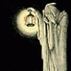
Style Play~ Contemplative.
So, here's a thing! Nice, isn't it?
But something is a bit off, isn't it? The styles don't mesh, now, do they?
Lets talk about that a little bit. This is something I've found to be interesting, particularly here, on FA itself. One might notice that one area is very blended, unlined, shaded and highlighted. Yet, the other is very much lined. All the color is inside the lines, separated by neat and clean lineart that keeps all the colors separate... but it's not highlighted, shaded or blended except for the eyes.
Lets talk styles as well. Do the styles here necessarily fit together? No, they don't; but they don't have to. the foreground has a very crisp, clear dragon immidiately visible in the foreground, where the background is kind of... there. They contrast sharply, yet each has something to offer the their own style.
I've been playing with some contrasts, and I liked how this one stood out and spoke for itself, here. In all honesty, I just so happened to like this one, so it gets to be uploaded, but that's not the point here. The point is that I am seeing less and less art that experiments with things like this. Why? ...well, that's a good question.
Just a little pondering late at night. I'm debating on keeping this dragoness, because she's interesting, has an interesting design and style, ans I like her funky horn on top of her head. X3
(For reference, the Style of dragon is Flight of Dragons.)
Category Artwork (Digital) / Fantasy
Species Dragon (Other)
Size 1168 x 800px
File Size 358.8 kB
Listed in Folders

If I was to put on my part time art student hat, I'd say that there is nothing inherently wrong with using the different styles. What you've done, in essence, is adjusted the focus on the camera taking the picture. The dragon's in sharp focus, the background is indistinct because it's just there to ground the dragon, basically.

I personally like the contrasting styles of this piece. It's very reminiscent of the 80's-90's cartoons that has the extremely detailed painted backgrounds, with the characters and intractable objects standing out in the foreground. Very Rescuers / Secret of Nimh esque. Foxie likie! =^_^=
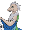
I really liked the Flight of Dragons for the art style. Story-wise, I admit that I much preferred the original sourcebook The Dragon and The George, which was pretty much a complete deconstruction of the classic fantasy plot.
Both versions of Smrgol were crazy awesome, though. Dragon suffered a crippling stroke that left him a paraplegic and he still went straight into battle against a much younger, completely fit dragon. Forced a tie, too.
Both versions of Smrgol were crazy awesome, though. Dragon suffered a crippling stroke that left him a paraplegic and he still went straight into battle against a much younger, completely fit dragon. Forced a tie, too.
Many of the sequels were, too. They did get somewhat formulaic but they managed to keep many of the characters fresh and interesting, and introduced some very neat new characters.
KinetetE would have been aweseome in Flight of Dragons. (She's the other AAA+ magician, very stern, very cold-seeming, and doesn't suffer fools at all, but she cares a great deal about Carolinus and fairly frequently den mothers him around to try and keep him out of trouble).
KinetetE would have been aweseome in Flight of Dragons. (She's the other AAA+ magician, very stern, very cold-seeming, and doesn't suffer fools at all, but she cares a great deal about Carolinus and fairly frequently den mothers him around to try and keep him out of trouble).
Comments