 FA+
FA+
744
Views
Views
27
Favorites
Favorites
Category
Artwork (Digital) / Portraits
Species Unspecified / Any
Size 1280 x 582
File Size 1.53 MB
Report this content
More from sunkenshrines


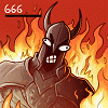
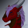
Picking up some old photos from my traditional sketchbook and trying to colour them. Three slighty different methods used here.
It's definitely a cool thing to do, but a lot of my 'tricks' I am using with fully digitally done lines don't work here anymore thanks to some technical limitations, for instance, due to my grainy paper and bad photos of my lines in my hardcover sketches I can't extract the entire 'black' of the lineart to colour it. As well as I am super messy when sketching traditionally and my lines and shapes look radically different in some areas of my book. May explain why this stuff looks a bit different to my usual content. Please ignore any mistakes I've done because I scribbled these in a few minutes :P
Left piece belongs to a universe by lethaldoors, sketched up as a test (without reference in a break ._.) before making "Reliquary". The two other characters belong to me.
It's definitely a cool thing to do, but a lot of my 'tricks' I am using with fully digitally done lines don't work here anymore thanks to some technical limitations, for instance, due to my grainy paper and bad photos of my lines in my hardcover sketches I can't extract the entire 'black' of the lineart to colour it. As well as I am super messy when sketching traditionally and my lines and shapes look radically different in some areas of my book. May explain why this stuff looks a bit different to my usual content. Please ignore any mistakes I've done because I scribbled these in a few minutes :P
Left piece belongs to a universe by
 lethaldoors, sketched up as a test (without reference in a break ._.) before making "Reliquary". The two other characters belong to me.
Coloured in the latest version of Krita 64-bit, lines done with an absolutely normal pencil. Feedback appreciated.Category Artwork (Digital) / Portraits
Species Unspecified / Any
Size 1280 x 582px
File Size 1.53 MB


I like the rough pencil style very much. In my Opinion pencil drawings show a kind of dynamic that can hardly be achieved by digital ink lineart. The one in the center is my favourite. Could you elaborate on the three different methods you used for coloring maybe? I'm interested because I'm trying to get into digital coloring at the moment and would love to learn as much as possible.
Yeah, pencil does feel totally different - I always think I've got more control and more appeal in a traditionally drawn piece of lineart.
The three are not too different, in all three I am using a flat colour layer as a base with multiply layers for shading and overlay for lighting with additional normal fine brushes as highlights.
What's different is a) the pencil itself, all three were made with different 'settings' with contrast and levels sliders, so the intensity and darkness of the lines vary from piece to piece.
b) The stage of detailing, the left one is just a bit of cel-shading while the right one actually uses additional shading 'tricks' like airbrushing parts to soften them and filters.
Technically, they're not to different, but there were as well some minor differences in terms of workflow!
If you want to know any further stuff about colouring, just ask!
Thanks for your reply man! I do have one more question if thats okay. Did you seperate the lines from the white before starting or did you just put the entire layer with the lineart as a multiply layer on top?
I think I know a fair amount of stuff about coloring by now. My biggest problem seems to be the selection of the correct colors for shading. I think i can see that you didn't just add more black to the red surfaces in the center piece for the shadows but a totally different color? Something more link purple?
Couldn't figure out what color to pick in what case. Oh my...
Anyway, thanks for sharing!
No problem at all. I couldn't seperate the lines properly thanks to the grittiness of the paper (and my shitty photo quality ._.), so it's only Multiply on top.
I used Multiply for shading and added a clipping mask so I only paint 'on top' of the flats. I also don't use black for shading, that turns out boring in most cases, but rather a blue to purple desaturated hue. On the other hand, the lighter parts on the right are a pink-ish hue on a overlay layer.
If you need a bit of insight into that, check this out: http://www.deviantart.com/art/Giant.....rial-251104611 Basically, using different hues for your shading on a multiply layer (instead of black) is better to set a certain mood and make a piece more interesting! For instance, for the left piece I used a desatured but dark blue, and on the right a more red to orange hue.

Comments