 FA+
FA+
1189
Views
Views
98
Favorites
Favorites
Category
Artwork (Traditional) / Fantasy
Species Dragon (Other)
Size 842 x 1092
File Size 603.7 kB
Report this content
More from Symbolhero


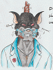
Yup! Believe it or not, the last day at the inktober halloween pics was a dragon (sooooo halloweeny I guess? : T)
But anyway, it was very obvious that I wanted to close October with Orion XD so there you go my last but not the best pic of my month.
Ok then, that´s all for black and white pics, time to add some colors to my gallery XD
But anyway, it was very obvious that I wanted to close October with Orion XD so there you go my last but not the best pic of my month.
Ok then, that´s all for black and white pics, time to add some colors to my gallery XD
Category Artwork (Traditional) / Fantasy
Species Dragon (Other)
Size 842 x 1092px
File Size 603.7 kB


I love the designado of this character, also I like how you draw and continue improving in your art and skills, also your characters show a very heroic pose,like Drake (wolf whistles), but Orión looks more serious, because he can be more moral and a great leader, but Drake is a leader, a tomcat and of course a sexy,terrible and exciting warrior (specially when he uses his sexy armor)


Finally, I have the chance to write a comment on your "Inktober Halloween picture"... so brace yourself! ^_^
First of all, it's really GREAT to see an artist doing such nice project... and drawing a LOT of different and challenging artworks! So, kudos to you!! ^^
And secondly... it is TRADITIONAL MEDIA!!!!
Line art... a pen and white paper, right? This is great! This is no digital stuff or whatever... it is true craftsmanship. Just your hands... your mind... the pen and the paper... nothing else is used.
Now, I would like to leave some words on the style you've chosen.
You use the hard "black and white" shading pretty well and your pictures strongly remind me of Frank Miller's drawings - which is great because I love this style and have tried it myself.
Anyway, you manage to use the black shadings to give us an expression of the shade (to separate light and dark parts) and you also manage to draw surfaces this way. For example, most of your characters (like the "Mummy" or "Orion" here) have rather shiny... glossy skin. And the shading you have used does provide a rather shiny look, indeed! I was thinking... maybe it looks too shiny... maybe it looks like metal every now and then - BUT NO! It does not!! The hard black parts do give us an expression of a rather shiny, soft surface... but they don't look like metal. So, it still LOOKS like organic skin, which is the idea behind all this.
Furthermore, this black-white-style has a lot to offer... and it is still NOT easy to use. After all, you are forced NOT TO USE any kind of colour! And all the small, softer shading steps and levels must be done with soft lines, hatches or... not at all.
And that's the trick behind this technique: The human eye (well, it's the brain!) does finish all the lines and parts which are not closed or shaded. SO, you do NOT HAVE TO close or finish all the lines, at all... and you don't really NEED colours here because the brain does complete the shape on its own.
You managed to use this technique in all your pictures.
Okay, some pictures are weaker... some are stronger.
The "Rat" artwork isn't that interesting or strong... BUT it offers a nice idea about "how to draw fur texture with small brush strokes". The rat's fur does look interesting and really good! The coat... well, it's efficient and simple, but it doesn't appeal to me that much. ^^ And the pose is rather weak - compared to all other pictures!
But still, the style is pretty great!
There is one artwork in which the black-white-style is done BEST - it is "The Bat"!!!
Well, what can we say... it is BATMAN!
IT IS THE DARK KNIGHT!
This style is ideal for him!!! And hey... this is - I guess - the only artwork in which you have chosen a different angle from the light source!
All the other artworks are illuminated from the front and above... it is very bright with only few shades.
But hey, the BATMAN artwork... wow, we have the light source from the left side, which allows you to leave the other side of his body in darkness... very well done.
In "The Bat" we can see that his style works best with just FEW white parts. And of course you have to set them correctly!!
Well... and it's a human - we don't see that many human drawings here.
^^ Really great!
The best black effect is in "The Mummy" because I like how the black cape works as a strong contrast to the detailed rest of the body.
There is something about "The Skeleton" artwork... it is one of the artworks with nice details.
For example, the necklace or head clothing... the tiny lines... sometimes parallel and sometimes in cube shapes... or round shapes... this looks pretty good.
See, you can work with hard shading and almost NO details... but you can also play with fine details and less shading.
And both ideas are explored in all your artworks!!!
^____^
In "The Gore" we have another fine detail: The leather belts and little veins.
The black shading does really give us an impression of strong black leather... nicely done!
And the veins are also very fine, throbbing and quite believable.
It is a wonderful series of artworks and I even like the idea behind the titles... always "The ??" ! :D
Yeah, this is pretty neat.
"The Zombie" and "The Werewolf" artworks don't really fit in the series. These artworks have soft shading and lots of textures and details.
They are both excellent artworks - highly detailed - but they are no as simple as the other artworks. Like I said... they don't fit to the black-white-style series..... but still, very nice drawings!
Would be interesting to see how the Werewolf would look like... if it was only shaded with simple black and white.
XD
"The Vampire" is a classic bust shot and most of the black parts are his cloak. It does work pretty well and the fine lines building up his long hair are excellent!
I love the feathers in "The Devil"! But the title font is a bit annoying and out of place here. XD
Looks like a badge for a convention of some sort.
XD
Like I said, there are weaker and stronger artworks in this series... but the effort is commendable!
Thanks for showing us such a nice series of art!
And... it was a great practice for you, I am sure of it!!!!!!!
Holy shit!!!! this is too much for my body XDDD but I love it!!! : DE
I could spend a lot of time to analyze each point, which I did XD
I must say that I kinda felt more confident with the hard black shading as a comic style, just like you just said, And indeed, Batman was of the bests works I ever did with this, it´s almost if it´s worthy, with more work, to be in a cover of their comics XD ok I guess that´s an exhageration heheh, but I do love it. Thank god I was playing Batman Arkham Knight for the inspiration heheh.
Yeah, each day in the month I usually got time to draw a lot, less time, a lot inspiration, less motivation. It can be notices in certain pics, especially some of those that I havent post it here.
I must admit this has being an intereting experience with paper and inking, although it was difficult since there´s no ctrl + z XDDD
But it was such a great practice. I ´m so glad that you pointed out a lot of perpectives on each of the pics you just mentioned ^ ^ you really made my day and have more confidence with this.
I hope I can do more of this in the future and with more stuff on it ; )
Comments