 FA+
FA+
2538
Views
Views
265
Favorites
Favorites
Category
Artwork (Digital) / Miscellaneous
Species Unspecified / Any
Size 1200 x 800
File Size 763.6 kB
Report this content
★
More from Iggi


Listed in Folders


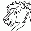
Critique Please: Aurora Tiger
Looking for some feedback on where to take this, a piece I started back in April-ish; trying to finish old projects and work on inspirational themes in my down-time (see journal). I don't want to over render the aurora, but I want it to still feel like a tiger. Before I proceed with finishing touches, I'd like to know how much more rendering you feel it needs to read as a tiger, or be worth hanging as a poster on a wall. The sky and mountains will get a bit more, but please also leave feedback on that too!
Direct questions:
I was thinking of pulling out the milky way, maybe it is too much clutter?
Do you think the stars need more in quantity and umf?
Is the tiger detailed enough to read as tiger, or is it too detailed to look like an aurora?
Would you buy this as a poster or print?
Direct questions:
I was thinking of pulling out the milky way, maybe it is too much clutter?
Do you think the stars need more in quantity and umf?
Is the tiger detailed enough to read as tiger, or is it too detailed to look like an aurora?
Would you buy this as a poster or print?
Category Artwork (Digital) / Miscellaneous
Species Unspecified / Any
Size 1200 x 800px
File Size 763.6 kB
Listed in Folders


So after some looking at it.
I feel the stars are actually a bit too bright and detract from the main focus of the aurora, though the milky way in the background is just right. The aurora itself looks very good, if possibly having slightly higher color range than a natural one. The aurora is not recognizable as a tiger and I would not have actually guessed that if not told, it struck me as more of a lion or panther, is specifying the type of big cat even critical to this piece though?
But the overall piece is still quite beautiful, the mounains are good and the aurora also looks great. But again, the main thing that strikes me is possibly make the brightest stars dimmer by a little bit.
[Hope that was helpful, and not just gibberish! And I would not buy it as a poster or print, but I admit that is because I am wierd and would only do that for something I had commissioned.]


over all its looks really nice! If you were to leave it the way it is, it would still be an outstanding piece. However if you're looking to tweek it say make the light around the jaw line look more like the fur that is on a tiger. Making it that define makes it look more like panther than a tiger to me. I'm not sure adding stripes to it would work since it would make it really busy but definitely indicating fur on the face and maybe neck area would help. Dimming the stars some would also help make the aurora pop out more. You might be able to get away with the stars if you some of the bigger ones a little smaller.

I was thinking of pulling out the milky way, maybe it is too much clutter? I think the milky way is important and wouldn't remove it. I would probably make it larger. IMO it looks too small in the sky.
Do you think the stars need more in quantity and umf? I think the stars themselves are fine!
Is the tiger detailed enough to read as tiger, or is it too detailed to look like an aurora? I see a big cat, but not a tiger. I don't see any stripes personally, and it looks a bit thin to be a tiger. I think it looks like an aurora though. The pose looks really stiff though and the left arm seems off to me, I wish I could say how but I can't put my finger on it. I also think the tail might look better if the lower line of the tail was outlined by the aurora as opposed to the top line.
Would you buy this as a poster or print? Probably not, but I very rarely buy posters/prints. It's gorgeous though, I'd use it as a wallpaper :)
A lovely image concept, looks to me as if you to a tutorial lesson from Jocarra to me anyway.
Now as too critique, assuming that this is truly out in the middle of nowhere, then the view of the milky way should be more vibrant in the background.
I am not sure what time of year this is but some of the stars should hints of color as not all stars are plain white, sometimes have pastels of blue yellow or red. I do like that ou have varying magnitudes in the stars brightness though, as too much uniformity would make the image look flat.
I will be quite honest, I could tel easily it was a cat, but to whether a tiger to any other type of feral feline, not so much, but then again trying to make detail stripes with impressionistic strokes is not easy to define. An to make it stand out would lose the effect of the aurora.
Would i buy this image, maybe maybe not, a poster be cool though. I more wish this kind of image design was a commission type option.
Huh, didn't know Jocarra did a tutorial, I was just playing around with a relaxing concept trying to get out of my art funk (As I started this back when I did the galaxy ocelot pic but never had time to finish it). Though I'll have to see if there are any ideas in it I can use to improve my piece. Thanks for the links!

the line that defines the tigers rear legs produce the illusion of the back being all out of sync, although upon closer inspection the back of the tiger is correct, it's not as greatly defined. maybe the rear legs lines shouldn't be shaded so hard? all i can think of is imagine breaking up the lines like if they were behind flames, but instead of the flame pattern use the aura to break up some of the lines.
some lines are well mixed, and some like the rear legs stand out too loudly. hope this non artist's feedback helps, lol.
some lines are well mixed, and some like the rear legs stand out too loudly. hope this non artist's feedback helps, lol.


I believe part of what has me, like many other people, not see a tiger as much as a big cat is that the facial structure doesn't appear to be as much of that of a tiger. Part of this is due to the way the fur goes off of the side of the face as a tiger. Obviously, any indication of stripes would be quite useful here, too.
One of the other things that's thrown me off with the idea of it being a tiger is the placement of the ear as well as the shape. The ear appears to be a bit more pointed when tigers have round ears.
That being said, I also feel that the strong, uniform intensity you have for the Borealis in some ways flattens the image a bit and creates confusion over the visual hierarchy of the image.
On a different note, I feel that your pose feels a bit stiff to me, and the proportions feel like they may be off. I think the main thing I'm seeing with the proportions, just looking at photos of tigers, is that the body isn't long enough.
As for the pose, I might suggest doing an exaggerated gesture if you consider redoing the image so that in the final rendering the motion won't be lost.
I do also agree with others that some of the stars might be too intense and also confuse the visual hierarchy. It's a bit difficult to tell where the eye is supposed to go and I don't think that this is intended as an afocal piece.
That being said, though, your colors are quite fantastic and your mountains are incredibly beautiful to me. I really do like the idea of the image overall.


Do not change a thing! You would be crazy to change a thing. Your piece here has been made perfect, and therefore changing anything would ruin the beauty of this work of captivating art.
Just a little word from me and my friends here in Saskatchewan Canada. The land of the living skies
Just a little word from me and my friends here in Saskatchewan Canada. The land of the living skies
Comments