 FA+
FA+


1539 submissions


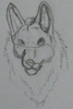
I wanted to make a redesign for Deimos, making him more spikey than in previous versions :)
If you like my work and would like to encourage me to keep doing more unique and personal art, you can support me on my Patreon account at https://www.patreon.com/negg and you can get hi res pictures, alternate versions, sketches and more pictures unposted anywhere;D
If you like my work and would like to encourage me to keep doing more unique and personal art, you can support me on my
 Patreon account at https://www.patreon.com/negg and you can get hi res pictures, alternate versions, sketches and more pictures unposted anywhere;D
Category Artwork (Digital) / General Furry Art
Species Dragon (Other)
Size 767 x 1280px
File Size 181.2 kB
Listed in Folders


There's some wicked stuff going on here that I haven't seen in your earlier pictures.
First of all, it looks like you've selectively used a paper/canvas-texture that is then shaded a bit, and that alone has worked really well. Of course it doesn't really tilt with the anatomy, so you get the same look on the angled leg as you get elsewhere, but that's something you might work around in the future - or choose to ignore, since it looks really good either way.
Secondly, and what I found most awesome, was the shading done particularly on the lower edge of the cranium. I mean the area from the snout and towards the cheekbones. The highlights on the head are really good looking, but that streak of shade there (coupled with the folds from the sneer) works -super- well. It looks exactly like what I'd expect from the best comic books. Of course, this being a face and faces being important, you look like you've gone into much more exact detail there than elsewhere. Increasing the resolution, as it were - smaller brush strokes. And that's understandable.
The rest also looks -very- good, but it means you have more powerful and sharp gradients going on at the top of the picture, and then there is less and less contrast and detail as you go down - over the torso, the arms, thighs and legs, until the toes. Of course the features are also larger and smoother, but I think it's a valid observation. I feel like it's easiest to spot on the feet. Now, the toes may be in partial shadow, and they're naturally less detailed than a face should be, but if I wanted to leave a comment that highlighted a potential for improvement, then that's what I'd point out. Less and less use of contrasts towards the bottom.
Not that I think it's remotely economical or, in the end, very rewarding to apply the SAME level of detail everywhere. There are probably other things you could change that would be more immediately rewarding to you. However, someone else will have to point out those things, and in turn be of more help than I could hope to be. ;)
Did you make any new lessons or experiences with this drawing that will help your future ones? It seems like such a significant step up compared to some of your earlier work.
Anyway, please keep up with the excellent performances! I'd like much, much more. :D
Wow, thank you very much for your post ;D and yeah I learned a few things on this piece, and it`s been a while since I haven`t taken my time working on a picture. So yeah I`ll do more of these in the future, since I really enjoyed working on this piece.
Also, about the lack of details on the paws, yeah I did it on purpose, just to give more enfasis to the head. But yeah, I think I`ll do a fully detailed piece of this dragon or another dragon someday, showing the sinew, bones and wrinkles of the feetpaws ;D
Also, about the lack of details on the paws, yeah I did it on purpose, just to give more enfasis to the head. But yeah, I think I`ll do a fully detailed piece of this dragon or another dragon someday, showing the sinew, bones and wrinkles of the feetpaws ;D


Comments