 FA+
FA+
1570
Views
Views
4
Favorites
Favorites
Category
All / All
Species Unspecified / Any
Size 848 x 687
File Size 147.1 kB
Report this content
More from lapinbeau


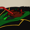
Juuust working some things over, people.
Which dialogue font do you prefer, out of the ones shown?
Please consider them carefully. (And don't just look at the responses below so you pick "the winner.")
I'll delete this once I've gotten a good amount of votes.
(Also, the speaker is a lying liar who lies)
Which dialogue font do you prefer, out of the ones shown?
Please consider them carefully. (And don't just look at the responses below so you pick "the winner.")
I'll delete this once I've gotten a good amount of votes.
(Also, the speaker is a lying liar who lies)
Category All / All
Species Unspecified / Any
Size 848 x 687px
File Size 147.1 kB


#1 if you want the standard toony font that is clear and legible.
#4 if you are looking for something unique yet very legible. :3
#2 looks a bit too bulky and hard to read quickly, and the rest make the letters appear to be too close and mushed together, and I squint to try to read it.
I'm used to reading outlines of words as a habit due to lack of eyeglasses when I was younger, so when words are not spaced apart and/or are very bulky it makes it difficult to read quickly. Just my own opinion of course :D


I don't like #6, it seems distracting. The others are all good, 1&2 seem more like standard all-caps comic font, but I think it'd be neat to see something that uses an all-case font, like 3,4,5.
2 is a bit too wide at this size, whereas 1 is more comfortable to read. Not sure if it'd be different at a different display size.
So uhh... *squint* I'd say 1 or 4, depending on whether you want all caps or mixed case.
2 is a bit too wide at this size, whereas 1 is more comfortable to read. Not sure if it'd be different at a different display size.
So uhh... *squint* I'd say 1 or 4, depending on whether you want all caps or mixed case.


I'm torn between No.3 and No.4 for a mixed case font. I'm totally down for No.1 for an all-caps font.
I'm a fan of the mixed case fonts but I'm also curious as to the style and tone of the project itself. I've found that tends to help choices like this out a bit more. It's not always the best choice for some situations.
I'm a fan of the mixed case fonts but I'm also curious as to the style and tone of the project itself. I've found that tends to help choices like this out a bit more. It's not always the best choice for some situations.


#4 looks good but if my eyes aren't mistaken those are all 'free' fonts, which often have a clause still attached that allows the creator to charge a license fee if whatever you use it for becomes succesful enough, financially.
With that in mind, give http://www.myscriptfont.com/ a try :3 I use it to make all the fonts I use now, so I know I can never be caught short should I ever get popular enough (hey I can dream).
With that in mind, give http://www.myscriptfont.com/ a try :3 I use it to make all the fonts I use now, so I know I can never be caught short should I ever get popular enough (hey I can dream).


Comments