 FA+
FA+
808
Views
Views
24
Favorites
Favorites
Category
Artwork (Traditional) / General Furry Art
Species Dragon (Other)
Size 953 x 1280
File Size 6.44 MB
Report this content
More from Adleisio


Listed in Folders

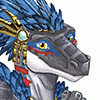
First off this piece was initially inspired by a piece by Two Steps from Hell titled "Archangel"
Listen here: https://www.youtube.com/watch?v=mLUguXpUIb0
So I really wanted to redraw this piece from 2012 [link HERE for comparison] because I really wanted to test the limits of my skills coming into 2016. And I think I really set the precedence for what I want my art to look like.
Redraw Meme Comparison: HERE
Overall, I am really happy with this piece and I cannot fathom doing a full scene piece with some of the new techniques that i have learned from watching videos online and reading books on realistic drawing.
The sword was inspired by some of the designs in Sword Art Online and is sheathed in this piece otherwise is fairly generic. I don't really like wearing gold and I see a lot of gold metals as it is, so I did silver, because I like silver more. Wings I did use a very nice reference for and the underside of the wings is much more plain as you have the longer feathers on the bottom and more layers of smaller feather on the top/back side of the wings.
Not sure if I should make her an official character or not, but either way, do not piss her off ;P
Things I learned:[/u]
-White pencils are INVALUABLE when it comes to balancing out tones, shadows and separating the subject from the rest of the paper.
-French greys are excellent for making more natural looking fletching on arrows, USE THEM!
-First time using a white gel pen to high tonal high lights, and I still learning good placement for those high lights.
-Hair, not a flat color, very dynamic in that aspect.
-Try to avoid similarly toned colors when choosing clothing -ish. You can differentiate by by doing gradations and actually using tonal space.
-I did not use a ruler and probably should have. USE THEM!
-I am not terribly found of the really rough vellum texture, too much grainy textures in tight spaces.
-The KUM longpoint sharpener is your friend for Prismacolor Premier Color Pencils, just don't make it too pointy.
-Use a kneaded eraser to pick up pencil flakes to keep smudging to a minimum and don't drag your hand across the page
-Have A LOT of patience towards the end, don't do a ton of detailing up front, you will likely burn yourself out and make mistakes near the end as you tire, save your energy for those details, and take breaks as needed, have plenty of water or something to drink.
Sketching: ~1 hour
Transferring: ~1 hour
Coloring: ~6 hours
Total Time: ~8 Hours.
Colors used:
-White
-Black
-Denim Blue
-Cerulean
-Copenhagen Blue
-Sky Blue Light
-Warm Greys
-Cool Greys (High tonal value)
-French Greys 10%, 20%, 70%, 90%
-Cream
-Sand
-Sandbar Brown
-Dark Brown
-Espresso
-Light Umber
-Burnt Ochre
-Slate Grey
-Metallic Silver
Art (C) Adleisio, myself
Please leave any questions you have below so that other may see them with their answers. :3
Category Artwork (Traditional) / General Furry Art
Species Dragon (Other)
Size 953 x 1280px
File Size 6.44 MB
Listed in Folders
Thank you, and Shiron was the initial inspiration for the original piece, but I tried to keep it to a minimum as the sort of color pattern is not uncommon. I tried to keep the clothing a bit more distant from that, but yeah people saying it looks like Shiron which is not the intent.
I do appreciate the more in depth comment <3
I do appreciate the more in depth comment <3
Well their are 3 things I see similar to Shiron, those being: the blond hair, the blue ear frills and the wing alignment. The wings are thinner than Shiron I do notice, and the muzzle looks more masculine than to the rest of her body but she does have the feminine curves and strength of a huntress.
Comments