 FA+
FA+


")
105 submissions


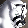
So, remember this picture? http://www.furaffinity.net/view/170269/ It was the third entry in my gallery. It's about 2 years old, and I thought it could use an update. That one was okay but I see a lot of flaws in it now.
The new one isn't perfect by any means, but I think it's an improvement even though it has a very different mood. The colors are darker and more saturated and the lines are much cleaner, but mostly, in the first version, the Boss Hoss is kind of skinny, and that will not stand.
I think this is my first foray into multi tone color, the red under lighting I mean. All my previous coloring has been very mono-hued and I have to say I really like the way it looks, I'm sure my next few attempts at coloring will go totally overboard in this respect, and eventually I'll find a healthy middle ground.
And to pimp it again, this was done from sketch to final version in Paint Tool SAI. Google it.
Category Artwork (Digital) / General Furry Art
Species Horse
Size 650 x 900px
File Size 104.9 kB


not quite the image i had in mind but...it gets the point across well enough, hehehe.
http://d.furaffinity.net/art/dynota.....ku_sashi10.jpg
http://d.furaffinity.net/art/dynota.....ku_sashi10.jpg


Thanks!
Next time I revisit this picture I need to be looser with the thumbnail. The first picture is better in the sense that it actually looks like he's slouching, resting in between sets. This one he looks like he's flexing. Granted, every time people draw a muscular dude with his shirt off, it looks like he's about to burst from strain cause he's flexing so hard. You don't see the detail and striations in muscle unless you flex... but beside that, I just mean his general posture. I should have had his chest scooped a bit, and his left delt is all messed up. It should have been higher and rotated more toward him. The position of the as it is now ooks like his arm should be at his side, not raised in front of him.
Anyway, not a big deal. Something to watch for next time.

Yeah looking back at the earliest pics in my gallery, he was just kind of... there. His expression were kind of all over the place and as I've continued to draw him, it appears as though he's slowly... well, kind of going insane. Cocky, certainly, but... well, you'll see what I mean when I get the comic I'm working on finished. You know how characters sort of write themselves sometimes.


Comments