 FA+
FA+
5515
Views
Views
779
Favorites
Favorites
Category
Artwork (Digital) / All
Species Dog (Other)
Size 556 x 835
File Size 228.5 kB
Report this content
More from kamui


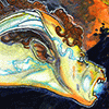
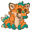
So, this is the piece I used for the digital painting panel on Sunday, for those who may have been curious to see what we cooked up there.
To be fair, I'd done a bit of prep work before the panel started, and this final version is after a couple of additional hours' worth of painting, but hopefully the folks who were in attendance will attest that this is more or less what they saw assembled ^_^
To be fair, I'd done a bit of prep work before the panel started, and this final version is after a couple of additional hours' worth of painting, but hopefully the folks who were in attendance will attest that this is more or less what they saw assembled ^_^
Category Artwork (Digital) / All
Species Dog (Other)
Size 556 x 835px
File Size 228.5 kB

Thanks, dude ^_^ It was my first time doing a panel, so I'm sure it was a bit rough around the edges, and there are some content balancing issues to work out, but I had fun, and other folks seemed to get a kick out of it, so I'm considering it a success.
Maybe I'll see you at something similar next time!
Maybe I'll see you at something similar next time!


Maybe I'll do something similar again next time! In the meantime, there's always the tutorial book <3


One of the things I mentioned in the panel was the importance of value difference (ie, light vs. dark) in terms of creating contrast that the eye can easily see. Between the hue aspect of color (which color of the rainbow it is) and the value aspect, I think the eye takes a lot more depth and boundary cues from value when perceiving our surroundings, so making sure you have good value contrast is really helpful when putting together an image.
If you look at a monochrome version of this picture, the figure is basically white, the water/rock is basically black, and the flowers are more or less a 50% gray. Once you add in the bright red of the flowers against the blue tones of everything else, it really pops ^_^
If you look at a monochrome version of this picture, the figure is basically white, the water/rock is basically black, and the flowers are more or less a 50% gray. Once you add in the bright red of the flowers against the blue tones of everything else, it really pops ^_^

Haha, IT IS IMPOSSIBLE.
One trick for directing the viewer's eye along your composition and keeping their attention for a bit longer is to take an important detail and partially hide it. People will basically subconsciously try to see behind the obstacle blocking their view, which means an extra second or two of viewing time <3
One trick for directing the viewer's eye along your composition and keeping their attention for a bit longer is to take an important detail and partially hide it. People will basically subconsciously try to see behind the obstacle blocking their view, which means an extra second or two of viewing time <3


Thanks, man! I find it really helps to just block everything in really roughly at first and see how the balance and composition look before worrying much about form or color or any kind of detail. That way I know when I do take the time and effort to add those things in that it's not going to be wasted later when I decide that the whole thing has to be scrapped or drastically changed to make it interesting ^_^
There are tons of great resources for learning to digitally paint online, and barring that, there's always my tutorial book <3 I didn't cover much of anything at the panel that I don't also talk about in decent detail in the book, so you might check it out at some point if you're curious!

I know one of the folks attending it said he was taking video, but he also mentioned that the size of the file would probably preclude him from uploading it. If he does figure out a way to do so, hopefully he'll get in touch with me and I can see about making it available <3
In the meantime, I'll probably try to put together at least another flash animation of me working on this one and post that up in a bit.
In the meantime, I'll probably try to put together at least another flash animation of me working on this one and post that up in a bit.


Thanks, dude. I was working at about 1800x1200 during the panel because I was chugging along at it on my laptop, but once I got back home to my chunkier desktop setup, I upscaled it to about 3000px tall before finishing it, so there's a reasonable amount of detail in there. Maybe I'll make it into a poster at some point, if the coffee cats posters ever start selling <3


You did a lot more work on this, but that's the image, I can attest! I was playing around last night and have a much better idea how to approach things now, though I'm trying to paint like you which isn't working so well. I have to learn to paint like me! But this is a VERY keen image. Love the rain, love the expression, love the package. :"D It's a real winner, dood. And look: red! :"D
Yeah! I'm totally excited to see folks meld what I do with their own styles <3 Everybody totally develops their own work-flow in Photoshop, but I'm totally convinced that with your traditional painting background, you're going to find a way of making images in PS that totally clicks for you, and it's going to be amazing.
Also, package!
Also, package!


Thanks! Working with the sort of Hawaiian/Polynesian theme for FC'09, I knew I wanted to use local flowers like hibiscus or plumeria or orchids or whatnot. I wound up going with the hibiscus because I really liked the crazy amounts of ruffles in the petals and the extreme stamen makes for an interesting silhouette ^_^


Oh man, I wish I could have attended that panel, or FC for that matter. Amazing work as always.
Have you considered posting video of your digital painting process? I'm not familiar with the program(s) that make that possible, but it seems to be a popular thing for concept artists on youtube.
Have you considered posting video of your digital painting process? I'm not familiar with the program(s) that make that possible, but it seems to be a popular thing for concept artists on youtube.
Yeah! I just started looking into some screencasting programs here, and now I finally have a computer that could conceivably run them in the background while painting without the entire system slowing to a crawl.
I'm sure it'll take some experimenting to figure out a reasonable way to present the finished product (I don't think 4 hours of raw screencap footage is going to do anyone much good, and it certainly isn't youtube-friendly ^_^), but hopefully a bit of trial and error will lead to something workable/useful. I'll definitely post links to anything I come up with here ^_^
I'm sure it'll take some experimenting to figure out a reasonable way to present the finished product (I don't think 4 hours of raw screencap footage is going to do anyone much good, and it certainly isn't youtube-friendly ^_^), but hopefully a bit of trial and error will lead to something workable/useful. I'll definitely post links to anything I come up with here ^_^
The ones I've seen often speed it up quite a bit, at least x2, and are usually speed paintings to begin with.
It's really cool how you put your technique out there, like...open source art, hahaha. I love learning the mechanics of how other artists work, even looking at sketches. A sketch is sometimes more fascinating to me than the finished product because you get all those movement lines. That dynamic usually gets lost when paint is globbed on. I think part of the reason I love your art is because it doesn't lose that, it's totally alive.
It's really cool how you put your technique out there, like...open source art, hahaha. I love learning the mechanics of how other artists work, even looking at sketches. A sketch is sometimes more fascinating to me than the finished product because you get all those movement lines. That dynamic usually gets lost when paint is globbed on. I think part of the reason I love your art is because it doesn't lose that, it's totally alive.
I'm all about open source! I figure that 1) it's totally not a competition here, and 2) even if it were, if all my skills were based on little tips and tricks that can be easily communicated and copied, I don't really deserve to be ahead ^_^ If those tips can help other people out in the meantime, more power to them. That means more pretty stuff for me to look at <3
And thanks for the rad compliment! Keeping some of that energy from the sketch phase alive in the final is something I've toootally wrestled with. Back when I used to do mostly line-based stuff, I always felt like my end result was super dead and lifeless. I find it's easier for me to keep some of the sketch-phase energy there if I focus mostly on paint and building things up with form and color.
And thanks for the rad compliment! Keeping some of that energy from the sketch phase alive in the final is something I've toootally wrestled with. Back when I used to do mostly line-based stuff, I always felt like my end result was super dead and lifeless. I find it's easier for me to keep some of the sketch-phase energy there if I focus mostly on paint and building things up with form and color.


Hehe, good deal ^_^ Yeah, it would have been fun to have like 5 hours to do the full thing, but past a certain point, I'm sure it gets boring to watch like stroke....stroke...stroke.... unfold. Definitely the sort of thing tailor-made for time-elapse film ^_^
Plus I think I tend to get self-conscious and hasty when I'm under scrutiny. When I'm alone, it's easy to just kind of get lost in it and slip into the zone for a couple of hours. I barely notice the world around me once I really get into the groove.
Plus I think I tend to get self-conscious and hasty when I'm under scrutiny. When I'm alone, it's easy to just kind of get lost in it and slip into the zone for a couple of hours. I barely notice the world around me once I really get into the groove.

true - i'd wager that reaction to scrutiny is not uncommon at all. i know i can barely draw in front of people without becoming a gibbering heap or pointing in a random direction and going 'look over there' and hoping they turn their head long enough for me to get something done. i completely forgot you'd likely be undergoing the same thing. at least until you mentioned drawing packages in front of people and i thought, damn, yeah, i know i couldn't!
Well, to be fair, I did have that sketch pretty well mapped out beforehand, so it was no big deal to go through it again in front of folks, but if I had to sit down in front of a completely blank slate and just start something from scratch, I probably would have been sweating bullets ^_^ There's a pressure there not to suck that's just not really present when you're alone and not on a 2-hour timer...
And let's be honest -- the package was the easy part! Nothing like a little fan service to placate the angry mob ^_^ It was drawing in all the non-package bits that had me worried I'd be boring people, haha.
And let's be honest -- the package was the easy part! Nothing like a little fan service to placate the angry mob ^_^ It was drawing in all the non-package bits that had me worried I'd be boring people, haha.


Thanks, dude ^_^ There's always a good bit of color tweaking that goes on for me, especially at the end of a piece -- that's totally a sweet perk to working in Photoshop <3
In general, the two things I check for are the color temperatures, like you say, and the underlying values -- if you desaturate this piece, the dog is white, the flowers are about a 50% grey, and the water is maybe an 85% grey, so there's a reasonably clear contrast there. Obviously, crazy saturated colors can go a long way to changing the way color contrasts look to the eye, but I think a certain amount of that underlying value information still comes through. Again, if you're working in natural media, it's tough to say "just desaturate it real quick to check!", but I guess you could always make a black-and-white xerox or scan it in and run that check digitally without too much trouble ^_^
In general, the two things I check for are the color temperatures, like you say, and the underlying values -- if you desaturate this piece, the dog is white, the flowers are about a 50% grey, and the water is maybe an 85% grey, so there's a reasonably clear contrast there. Obviously, crazy saturated colors can go a long way to changing the way color contrasts look to the eye, but I think a certain amount of that underlying value information still comes through. Again, if you're working in natural media, it's tough to say "just desaturate it real quick to check!", but I guess you could always make a black-and-white xerox or scan it in and run that check digitally without too much trouble ^_^


Mmm, I love the mix of very realistic, paintery main image and large, flat flower border. The red of the flowers is JUST muted enough to suit the image, the texture too makes them really nice. I love to see good use of textures in digital work.
The border really makes you work for the picture. xD Not a bad thing though.
The border really makes you work for the picture. xD Not a bad thing though.


Just a big WOW!
One of the best pieces in your, more than just awesome, gallery.
There are so many aspects, which make this picture so great... The lines, the proportions of him, his really eye-catching and cute face/look, the shading, the lighting effect, the water and the contrast of the matt flowers to the detailed centre.
*blabber*
That piece catched me so much, and it was great to see the process of it.
Keep up your awesome style because it's a pleasure to see the work of such talented artists. =)
Comments