 FA+
FA+
1750
Views
Views
93
Favorites
Favorites
Category
Artwork (Digital) / All
Species Husky
Size 1280 x 640
File Size 807.4 kB
Report this content
More from Yuniwolfsky


")


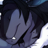
On left, it is original post I uploaded this morning, and one on the right is edited closer to my style and fixed little shading :)
what is you guys' opinions?
what is you guys' opinions?
Telegram Announcement, the BEST way to communicate with me!:

https://t.me/Yuniwuskyannouncement

CHECK MY PATREON TODAY! STICKERS AND REWARDS!
Category Artwork (Digital) / All
Species Husky
Size 1280 x 640px
File Size 807.4 kB


Normally I'd go for thinner lines over thicker ones, but since the character and background are both blue, yet aren't connected to each other, thicker lines work better to separate them. I don't feel like the light outline outside the dark outline works all that well on the left one, but it might work if it was only present on sides that light would catch, outside the black. In this particular one, I'd pick the one on the right, but if the background were a complimentary color, I might pick left.


Comments