 FA+
FA+
2095
Views
Views
69
Favorites
Favorites
Category
Artwork (Digital) / General Furry Art
Species Unspecified / Any
Size 1050 x 336
File Size 119.3 kB
Report this content
More from rickgriffin


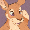
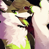
Grape again, and I'm most happy with this iteration.
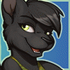
Also: Bino!
Also: Bino!
Category Artwork (Digital) / General Furry Art
Species Unspecified / Any
Size 1050 x 336px
File Size 119.3 kB


I just went back and compared this one to the last three redesigns. It's been interesting.
However you change the style, I'm interested in seeing the new designs applied to the comic. I love seeing this type of behind-the-scenes stuff. Keep up the good work, Rick. The quality of your comic keeps getting better, and it's obvious you put a lot of work into it. :)
However you change the style, I'm interested in seeing the new designs applied to the comic. I love seeing this type of behind-the-scenes stuff. Keep up the good work, Rick. The quality of your comic keeps getting better, and it's obvious you put a lot of work into it. :)


Hm... I kinda have mixed feelings on this one to be honest.
In terms of Grape: I like what you did with the eyes. It adds more of the feline characteristic and makes her look more feminine compared to your third design. Also the "cheek fur" looks really good as well, giving it a nice fluffy look and contrast between the types of fur on her face like the original design. The only problem I have with it is that I feel like as if it seems to have lost some of its "cartoonish" feel in the process. Maybe its because of the expression she has on her face, which looks really pleasant by the way... kinda gentle and sweet.
In terms of Bino: I totally don't mean anything bad with your current concept, but to me it seems like as if he has either lost a lot of weight or has turned into a girl XP. Compared to the original design he looks... more slender all around. The ears are thinner and put back more which give it the look of a "slick hairstyle" and the muzzle itself looks totally different compared to before. In the comic his muzzle looks smaller and rounder compared to other dogs, which is probably why this one looks like a completely different kind of dog to me. Maybe its the expression and pose that's throwing me off as well... when I look at it I can't help but feel like as if he's saying "OH no you didn't!" XD.
So that's my opinion. Again, I totally don't mean anything bad with your Bino concept, it just doesn't seem to agree with me *shrugs*.
Also, I'm starting to think that not only is the overall look of the character important, but also the LOOKS they give are as important as well, so maybe after an anatomy concept is made we can get a few expressions to compare as well? Just a suggestion! I'm no artist... I'm only some random fan/stranger that's saying whats on his mind XP. I hope this helps in some way and I can't wait to see more of your ideas!
...and here I go AGAIN writing a critical analysis paper... of CARTOON CHARACTERS in a WEB COMIC .
I blame my English teacher :P.


Comments