 FA+
FA+
5224
Views
Views
210
Favorites
Favorites
Category
Artwork (Digital) / General Furry Art
Species Unspecified / Any
Size 940 x 369
File Size 279.2 kB
Report this content
More from rickgriffin


http://www.housepetscomic.com
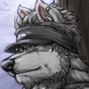
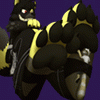
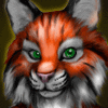
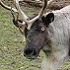
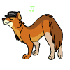
Personally? I really like where I'm going with this, but then again, that's probably because it flows very close to my 'comfort' style. However, when it first came up on the actual site where I could see it privately, it looked very incongruous next to the older style. As much as I like the designs, this could serve to be a problem. I took the art off the title bar temporarily just so there wasn't an immediate jarring difference for readers.
Personally? I really like where I'm going with this, but then again, that's probably because it flows very close to my 'comfort' style. However, when it first came up on the actual site where I could see it privately, it looked very incongruous next to the older style. As much as I like the designs, this could serve to be a problem. I took the art off the title bar temporarily just so there wasn't an immediate jarring difference for readers.
Category Artwork (Digital) / General Furry Art
Species Unspecified / Any
Size 940 x 369px
File Size 279.2 kB


Wow... color brings a whole new perspective on the new design .
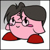
I'd have to agree with others that have commented before me, this new style is going to take some getting used to. However, this new design really does fulfill your intentions from the beginning: To make distinct differences between the different species in your comic to help identify the characters easier for your audience.
Instead of making a paper this time, I'll try to sum it up here: Its a nice new look, characters are different and identifiable, your humor is still awesome, and since you are comfortable with this particular style it might be for the best. All in all, I think it works out for you and the readers, and I am looking forward to reading the comic when its finalized in the new style. Thanks for sharing with us!
...comment still a bit long, but I'll work on that in future ones XP.


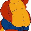
To be honestly truthful I don't know about this. I kinda still like the old style before, but I don't mind the new style. To me this kinda of big jump and could cause problems. I could tell the species apart when it was black white, but the color kinda help more. But this might cause alienation with already reading it. I don't mind it, but it kinda of hard geting use to it. I need atleast a few weeks to see I like or not, or maybe week. Before I decide on this. I would post on comci strip site, but seems like you need to be register for it. So I thought it be better to post here. Maybe if I could see them as individuals or together single picture, then maybe it wouldn't be surprise or shock to my system. For some strange reason I get this unnervous feeling with this. I think need some more time to see if I like it further. I mean its not bad, but this just seem to big of jump. I hope don't mind what I said, but I kinda need to say it to state my opionon. But it kinda up to you of what you want to do with it.

nice XD hmmm....
I think the change is pretty good, maybe its just me that feels awkward about it >_>;
When i look at it, they don't seem like the old characters at all... but i guess thats what happens when you redesign the characters :B
hhhhrrmmmm.... MAYBE you need to make another comic like this just to be sure? :3


I check my morning comics before I check FA, so I saw this strip in its proper context first.
For ME, the new character designs meshed just fine once I saw them in color, on the usual page. There are definite changes, and the characters are more visually distinct -- but they're still very much themselves. The art shift didn't jar me: it feels like a logical evolution.
And as for the strip itself -- not only did I laugh out loud upon first reading it, I still audibly chortle every time I RE-read it. Poor Bino. "Did you try holding it down?"


Comments