 FA+
FA+
62253
Views
Views
1505
Favorites
Favorites
Category
Artwork (Digital) / General Furry Art
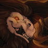
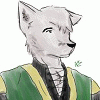
Species Wolf
Size 1024 x 1280
File Size 851.1 kB
Report this content
More from demicoeur


Listed in Folders

KISSKISSFALLINLOVE
Sorry for the delayed upload. Moving into the new house has gone well but was ultra time-consuming! The good news is, my new house used to be a pub/inn reputed for being a frequent haunt of highway men and is supposedly haunted. No emoji could do my excitement justice.
Thank you so much to everyone who bought printed copies of CF! If you'd like to buy a finished printed copy of Cinderfrost Chapter 1, you can now order it from fur planet!:
https://furplanet.com/shop/item.aspx?itemid=882
Like the comic? Consider supporting through Patreon! Chapter 2 now in the works and you get access to other exclusive content including comics, high resolution images, and loads of sketches/coloured sketches. Thanks to all my patrons for continuing to make production of my original works possible!
<<< PREV | FIRST | NEXT >>>
Category Artwork (Digital) / General Furry Art
Species Wolf
Size 1024 x 1280px
File Size 851.1 kB
Listed in Folders


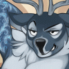
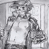
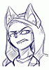
This was a shocking turn of events. I guess you could say their night will be full of excitement. If Frost is a bottom, I guess he will be riding the lightning. This whole thing has suddenly become...electrified... There is definitely some static in the air and it will soon -discharge-
Muahahahaaa I made some jokes
Muahahahaaa I made some jokes


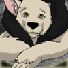
That's okay, I tried a zigzag formation to see if I could manage it as other comics have and decided once it was done I would never do this again,
Panel 1 and 2 are read from left to right as usual, but panel three is directly below 3 (the sound-effects are meant to lead the eye there but don't do so well). Then left to panel 4, down again to panel 5 below it and to the right from there.
Panel 1 and 2 are read from left to right as usual, but panel three is directly below 3 (the sound-effects are meant to lead the eye there but don't do so well). Then left to panel 4, down again to panel 5 below it and to the right from there.

I had a bit of trouble too, though it did feel as that was the best way to read. I admit I didn't see the thin white line of the "sound effects" (and just now saw the "KS KS kS" in panel 4, so cute), but once I see that, it's quite obvious.
Never say never, just learn from it, and make the next attempt better! :) Dialogue continuing, or a thicker line of the MmmMm, or something.. it's doable, and the panel layout is good.
Never say never, just learn from it, and make the next attempt better! :) Dialogue continuing, or a thicker line of the MmmMm, or something.. it's doable, and the panel layout is good.


It has been 3 years since we set off on this journey. *applauds* <3 http://memeshappen.com/media/create.....meme-30443.jpg


Nobody is posting the link, so I'll go ahead and do it =w=
https://www.youtube.com/watch?v=37I4VcYvaLg
https://www.youtube.com/watch?v=37I4VcYvaLg


I don't want to say this to sound like bad, but have you tried using bleeds? That might help the flow of everything a bit better. I'm talking about panels overlaid on top of over panels, so the pages look a bit more dynamic, perhaps, and less like a jigsaw puzzle put back together. None of that was said to sound flippant, by the way, but to be descriptive.
I think if you used bleeds more, you'd have less need for all the connected speech bubbles, because you can give everything a bit more room, maybe? This is admittedly easier to show than to explain.
Don't think that I hate this, because really, I love the art, and I can tell you've put effort into it, and ultimately if you asked me, I would probably buy it. I'm just very particular about comics, because here's the thing-
Nobody hardly ever criticises the art quality, and I certainly have no objections to it, but I think comics really have to work as comics. One thing I think might help is if you made the panels all a bit bigger. That would give you more room to fit text in without going into the guttering, and I think you can get away with a smaller border/margin because online, at least, because clicking for the next page is that 'eye break' for readers, anyway.
I thought I'd give you my opinions here, because you can take them or leave them as you wish, but in truth, I don't think the rules and laws of comics are set in stone- it's a case of knowing the rules before you can break them, as the expression goes. But for what it's worth, I'm just saying how I roll. Nobody is likely to ever tell me "I like how you laid it all out", but I'm just telling you what I'd do.
The frustrating thing is that it's not that easy for me to do in text- I'd rather doodle something and show you that :P
Thank you for the advice. I'll give bleed's and overlapping panels a try to make things more cohesive in the future.
The large margins is for print; a large chunk gets trimmed off in print and if the artwork is close to the page edge in print it looks cramped and awful. I suppose I could crop it down for Web but I find having a billion versions of my files is how errors happen when I do go to print so I tend to avoid that.
The large margins is for print; a large chunk gets trimmed off in print and if the artwork is close to the page edge in print it looks cramped and awful. I suppose I could crop it down for Web but I find having a billion versions of my files is how errors happen when I do go to print so I tend to avoid that.


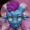
Y'know, as much as I like the comic, and I do, I feel like the last panel of the previous page and first of this one should have been a page of their own to underline how important of a declaration that was. You know, since Frost is visibly stumped, why not stump the reader as well ?
Same with the kiss. If I got it right, it's their first kiss and yet the panel doesn't do much to depict the scene with the gravitas it should have. It has the potential to be a memorable scene but only if the reader choose to stop in their tracks and focus on it (because that's what paneling is, a series of tracks that the eyes follow). Instead, it is admittedly a bigger panel than usual but nothing too special that would underline how out of the ordinary it supposedly is.
It also lies over the panel below it, making me feel like this panel below is the one I should read next but I'm not actually sure it is, which makes it slightly confusing. Does the comic go left to right in the first row, then right to left in the second row, finally going left to right for the third row ? If so, the middle-right panel should go over the middle-left panel, the same way top-right goes into middle-right. You know. To guide the eyes, like a track.
The art is expressive enough to carry a scene and all its meaning but the framing doesn't work in tandem with it to make the scene feel truly special. Just my random subjective 2 cents.
I agree with pretty much everything you've said. Comics have been a huge learning process for me, but these last scenes gave me a lot of trouble in particular. A big part of it was that I was determined to keep my page numbers down to manage the deadline I was aiming for. When chapter 2 is complete, I aim to redo some pages as a second edition to resolve some of the pacing and panelling issues, including this one.
To answer your question, the panels are read in a zigzag as you suspected; the panel below the kissing panel is read next, then to the left, down, and to the right again; I'm not a big fan of breaking the intuitive reading of a left-right, top-bottom formation because even done well I've had trouble with it as a reader, so I'm not sure what provoked me to try it myself!
To answer your question, the panels are read in a zigzag as you suspected; the panel below the kissing panel is read next, then to the left, down, and to the right again; I'm not a big fan of breaking the intuitive reading of a left-right, top-bottom formation because even done well I've had trouble with it as a reader, so I'm not sure what provoked me to try it myself!
Sounds like you're trying to be too effective with the space you have to work with. If your deadline and whatever obligations you have can allow you to, then let loose. It's better to have a story that runs for longer but hits harder than having it done quicker at the expense of its emotional resonance.


Hey, it's a bit of a stretch, but I was wondering if this story is a metaphor about homosexuality? Two people, young, friends, very close - uncertain about their feelings for each other, each afraid of what would happen if a certain 'secret' is revealed to the other - or to an even less accepting world. The full circle of this tale just seems to mirror a few people I've known over the years.
It can definitely be interpreted that way. To say I incorporated that kind of comparison intentionally would be a lie though - I find when I write the story I'm just going with what I feel would make a good story and what interests me/what I find relatable and only later do I see some of the symbolism creeping into the story, if that makes any sense :) I'm happy for people to see it that way!
The exact date it was built I can't find for the life of me, but it's been around since at least 1750 and only closed as a Pub/Inn in 1914. It's situated exactly one day's horseback ride from London, so it became a frequent stop for highwaymen and thus got its reputation as being haunted by Dick Turpin. I've personally not experienced anything freaky though ;P I just love how much history it and the village itself has!


Comments