 FA+
FA+


4527 submissions


Something I've been wanting to do for some time is try rendering some scenes from animated movies as practice with colour and lighting. I have used a fair amount of real life photographs in my studying, but real life can look a little boring. It seems like a good idea to take a look at how the pros deal with lighting and colour to make things look so appealing, especially since I find this is an area I really struggle with in my own work.
I also wanted to play around with acrylics some more. I still have no idea what I'm doing with them, so forgive how kind of awful this is, heh. I wanted a very simple scene to start out with, in fact I didn't even really plan on working out the background, I figured I'd just do some colours that vaguely represent it and focus on the character, but I noticed about three hours in that I was basically rendering the background anyway, so whatever. I ran with it.
Once again I'm not exactly what you'd call happy with this, but I'm still experimenting with acrylics, trying to figure out what makes them tick. I haven't found a surface I'm happy painting on yet, for example- the canvas paper I bought seems to work nice but is way too textured for my liking. I also still only have crummy brushes for acrylics, but I ordered a few more that will hopefully be better, won't know until they show up.
Most of my drawing has been from my imagination, trying to replicate things has never been a strong point of mine so it's all a bit wonky, but maybe some of y'all will still wanna see this so here it is. Lemme know whatcha think.
Category Artwork (Traditional) / All
Species Unspecified / Any
Size 656 x 477px
File Size 521 kB

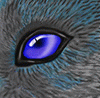
Stellar job on the eyes. The wavy quality of the paint gives the scene an almost dreamlike feel; at very least it looks like things could move at any moment. Looking good!
I would suggest not to be afraid of high contrast -- deeper shadows under the ears and in the folds of the clothing might pop out the art a bit more.
I would suggest not to be afraid of high contrast -- deeper shadows under the ears and in the folds of the clothing might pop out the art a bit more.


Ru - you're honestly a true artist. I've followed you for a few years now and you're always pushing yourself to try something new, and never afraid to show it. I hope you never lose that drive. You're work is stunning and traditional artists are so hard to find these days - but you are definitely one of the few I genuinely enjoy watching.
This is an amazing piece and you should be proud of how it turned out. I know as the artist you'll see what others don't, just as I hear what others don't in my music - but this is almost a flawless piece in my eyes.
Keep on rocking!
This is an amazing piece and you should be proud of how it turned out. I know as the artist you'll see what others don't, just as I hear what others don't in my music - but this is almost a flawless piece in my eyes.
Keep on rocking!
Aw damn, thanks so much man!
Truth be told, I often -am- afraid to show it. I waffled back and forth on the idea of posting this at all because of how not totally happy with it I am. I'm not sure why I worry so much, I don't think anybody has ever said something about my work with the intent to be offensive for as long as I've been posting, but it's still a little hard to put yourself out there every time you post a picture I guess, heh.
It usually ends up being worth it in the end though, folks usually got some pretty nice things to say even when the result is a bit rough. :P I may see a bunch of things I'm not happy with, but I'm very glad to hear you like it, so once again thanks a bunch!


Probably not. It's a little painting done on some scrap paper for practice, so in real life it's literally pretty rough around the edges. I'm also not entirely sure how I feel about selling replications of movie scenes. It's probably fine, bit of a legal and moral grey area, but I'd have to think on that for a bit.


The acrylics definitely gives a different feel to your work, a lot less defined lines and not as deep of shadows, which I don't know if that's the nature of the paints or how you are practicing working with them. One reaction as I kept looking it over is Wow she is fuzzy, especially so for the furry artist who is the best at making furries fuzzy, so the look of fur is top notch. The eyes are impressive, so bold that no matter how long you look at the picture you go straight back to them, once again, don't know if that is on purpose with the medium or not but would be interesting to see with a sultry look or hypnosis piece. And expressions lead to the best part of this, omg the look on her face had me laughing. You NAILED the expression of early movie Judy confusion.
Seriously, it is really cool to see the experiments you do to try something new.
Seriously, it is really cool to see the experiments you do to try something new.
I wouldn't say it's the nature of the paints- acrylics should actually be able to have a much wider range of contrast than watercolors. It's partially me being a bit scared of bold colours, and I think I may have also scanned this a bit on the light side, and removing the paper grain that my scanner emphasizes way too much also killed some of the colour detail.
Excuses, though- most of it's me just not being great at controlling acrylic colour yet. I'll get there in time hopefully!
It's human nature that when we're looking at a scene, our eyes are immediately drawn to the area of highest contrast. It's very fortunate for artists that that often ends up being the eyes- dark lashes, white areas of the eye, the super dark iris and light reflecting off the eyes all stacked on top of each other makes the eyes frequently the area of highest contrast of a painting or picture, which draws viewers right to 'em.
I guess what I'm saying is, it didn't have much to do with me or the paint, I just did the eyes how I saw 'em and human nature took over the rest, heh. That said, her eyes also contain the deepest blacks in the image, which I doubt is an accident, so you can blame the original artists for the movie a bit too.
Anyway, you know me... if I get comfortable with these paints there will definitely be smuttier things to follow, and as a fan of hypno scenes, it's bound to happen eventually. x3
Thanks a bunch man!

One thing I can say is you are using acrylics like water colors which works and works well, it isn't using them to their full potential. Like watercolors, you are using the white of the paper or canvas as part of the color pallet and using it as the empty spaces in the picture. Acrylics allow you to go beyond the canvas to build layers that can be easily painted over. Just like layers in Photoshop, you can build a painting in layers without having to consider the canvas. For instance, you have a light pole in the background with a plant in front of it. Painting it, you did both at the same time, making gaps in the pole so the leaves didn't mix colors. Acrylics, if allowed to dry, allow you to paint from back to front so you can just paint over the previous layer for a much easier and more realistic painting.
Bob Ross perfected the instant background technique for acrylic and if you watch a few of his videos you can see he starts at the farthest and works forward in layers and since acrylics dry so fast you can do some amazing effects easily.
Good one to see: https://www.youtube.com/watch?v=NcVeRlPu_5w
Bob Ross perfected the instant background technique for acrylic and if you watch a few of his videos you can see he starts at the farthest and works forward in layers and since acrylics dry so fast you can do some amazing effects easily.
Good one to see: https://www.youtube.com/watch?v=NcVeRlPu_5w
I definitely have a lot of problems with acrylic, but I promise you that was not one of them in this case. I'm fairly sure of it, because this wasn't painted on white paper, it was actually painted on a relatively dark brown. I looked up a recipe for homemade gesso, one of the ingredients is a fair amount of white paint but I didn't have that on hand so I just mixed a bunch of other colours together. The result is a rather dark brown gesso which I used as the ground for this painting. I think the fact that the overall painting is so light just goes to show that I did an alright job of not relying on the paper color. :P
As for the lightpole/plant, I considered both to be 'detail' elements and did them both after the rest of the background was in. I probably should have done the pole first but I was sort of doing those all over the place and just happened to get the plant in first. But no worries, I definitely make use of acrylic's opaque nature- in fact it's the entire reason I started using them at all! Watercolours can look awesome but their transparency can be frustrating for certain effects, so I'm looking into acrylics for times when watercolour just won't do.
As for Bob Ross, he definitely makes some very nice paintings, but he actually uses Oils, not acrylics. Acrylics dry almost instantly, where as oils can take several days at times, which allows for much more blending on the canvas. There are some techniques that will work for both, but a lot of the time they require very different handling, so there's unfortunately a bit less to be learned from the fellow.
Still, it's definitely good practice to work back to front whenever possible, and I'll try to make a point of doing that better going forward!


This is a classic concept-artist exercise.
I think your control of colors and brushwork is excellent as always. Hopps would stand out better from the background if she were rendered slightly differently - a darker palette, or thicker paint, or something else to vary the lighting and texture a bit.
I think your control of colors and brushwork is excellent as always. Hopps would stand out better from the background if she were rendered slightly differently - a darker palette, or thicker paint, or something else to vary the lighting and texture a bit.


Comments