 FA+
FA+
508
Views
Views
8
Favorites
Favorites
Category
Artwork (Digital) / Animal related (non-anthro)
Species Horse
Size 800 x 600
File Size 246.8 kB
Report this content
More from Dogsoul


Okay, so without irony on the heels of a conversation in my journal, I am struggling. :P Help needed!
Lately my skills with equine anatomy have been sucking, BAD. This is one of the first sketches of an equine in a LONG time that doesn't disgust me, but it still doesn't PLEASE me, either.
I've been basing it (loosely) off of modern-day Thoroughbreds. The parts I need the most help with:
-The face just looks wrong to me. It looks dead, like a plank of wood attached to the neck. e.e Nostril position needs checked, and I don't know what to do about the profile or the shape of the eye. The ears could probably use some tweaking, too.
-Neck angle. The base of the neck looks too thick and the poor brute looks almost ewe-necked, but more crest or arch looked stupid. Halp?
-SHOULDER/UPPER ARM/FOREARM OF FAAAAAAAIL. Massive redlining or serious advice needed here, guys. This is a MAJOR pet peeve of mine and I will not tolerate it in my art!!!
-Topline looks fucky, but I can't figure out how to fix, halp?
-Tailset. 'Nuff said.
-Angle of the pasterns...some days it looks okay, but today I wonder...are they too straight or too angled??? All the horses I worked with had shit-for-pasterns so I struggle bad.
-Hind legs from hock to fetlock. One is like...longer than the other and it makes no sense but I can't seem to feasably fix it. Also I think the hind leg proportions are "off" somehow.
....................much gratitude to anyone with any decent advice.
BTW, please keep it to CONSTRUCTIVE crit, thanks. I know I'm fucking up, no need to reiterate unless you have some advice as to how it fix it. ;)
......being a TB shouldn't he have a bigger tuckup? Like...I've seen some that look almost PINCHED. What about leg length? They look short.
AUGH I AM GOING INSAAAAAAANE.
Category Artwork (Digital) / Animal related (non-anthro)
Species Horse
Size 800 x 600px
File Size 246.8 kB

Okay, WAT?
"Struggling"?
I see nothing wrong with this picture!
The girth and the belly seem a bit small so it needs to be lowered, and the croup needs to be up just a little bit, and the forearms are thin, in need of a little thickening, but that's pretty much it.
Your anatomy skills with equines are great! Better than the crap I could do. Or never do.. D: I'm not even gon' fool around and try to redline this, because seriously, it looks like you have this downpacked! I'm afraid I'd mess it up more. XD;;
Canned reply: I can do better. I know I can do better. I have DONE better. Good enough isn't good enough, and yet I can't seem to find the answers so I'm asking to see if someone else can help me fix it by seeing things from their own POV. :)
Actual reply: ...thin forearms are a bad habit of mine. I'll try and thicken them a little and see what that does. :) Thanks!
Actual reply: ...thin forearms are a bad habit of mine. I'll try and thicken them a little and see what that does. :) Thanks!

i have some advice for the shoulder perhapps bring it forward a bit and bring it down as in make the bump not so large maybe half or 3/4ths the size
and the tailset is fine just make it arch a little. i would redline but i don't want to repost on here and i don't ave photobucket.
and the tailset is fine just make it arch a little. i would redline but i don't want to repost on here and i don't ave photobucket.

Hmm, I'll have to study this a bit, though the things I see off hand are that he looks narrow through the chest, and maybe the reason his head looks off is it looks too small for his body. I can definitely see how the crest of the neck looks off, might have something to do, again, with the head. But, as said in my journal, I have two nice, new-ish horse books for reference, and I've been looking at a lot of TBs lately, so I'll look and see what I can do. :3


I think this looks great already, your horse anatomy is brilliant.
For the points you mentioned though, I would totally do a shoddy redline for you, but I'm off to milk the cattle in about 5 minutes. If nobody else has done it by the time I get back, I'll do a quick one :)
But yeah, really, most of it is just minor nitpicks. Thoroughbreds are tricky! I worked with them for a couple of months, and was part owner of one (she was skin and bones because of neglect by the previous owner, though, so not the best reference) for a year, so I know their anatomy fairly well, I suppose.
Yeah, I know exactly what you mean. People will tell me my stuff is great, and I'll just be blinded by all the flaws. I'm a nitpicker, minor flaws drive me crazy! :P Oftentimes, I'm too lazy to fix them, though >_>
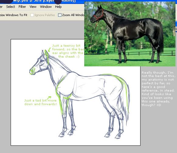
I like green better, so here's a teensy greenline in stead of a redline! Just slight nudges, really, since you're pretty much there as is. :)
The length of the legs look good to me, although you could maybe lengthen them just by a few pixels, see if that looks better?
Anyway, I know it's not much, but I hope it helps a little! Looking forward to seeing this finished, I do so love your art <3
http://img.photobucket.com/albums/v.....dlinesdogs.jpg

Canned reply: I can do better. I know I can do better. I have DONE better. Good enough isn't good enough, and yet I can't seem to find the answers so I'm asking to see if someone else can help me fix it by seeing things from their own POV. :)
Actual reply: I'm really trying to attain the same success with this as with my Highland Pony picture. I love that picture, I enjoyed making it and it shows me I can do wondrous things. I need that self-made boost right now...I feel so sure that if I can do what I need to do with this picture I'll be over this horrible art slump.
The devil really is in the details, too.


*scruuuutinizes*
Okay. Here's the best advice I have, I hope you find it useful~
Face: Eyes probably need to be scooted further down the snout. They look too close to the ears to me. Where the nostrils start at looks fine, but most of the rererences I'm seeing have it go a little deeper back on the side, rather than flaring out as much. Maybe they just need to be a bit larger?
Neck: I think your neck is fine, really. What may be throwing it off is the size of the head itself. It seems maybe a touch too small in comparison to the body.
Shoulder: I think the 'elbow' needs to be moved down maybe six inches (in the scale of the horse of the picture, on screen it looks more like 30 pixels down. Like, bringing it more in line with the knee.
Topline: Maybe take where the hips start and make that your highest angle on the back, and from there you can get the swoop in of the spine and maybe even angle the hips back a little more for that 'counter-swoop' look. I guess look at horse references? I don't know the difference between horse breeds and yadda yadda, so this advice may not apply.
Pasterns: I definitely had to look up what the heck that was. But I think your pastern angles are fine, but how the angle is working with the rest of the leg's angles and how it bares weight looks wrong. Maybe if you were to angle your forelegs and hindlegs back just a bit it might convey the weight better.
Hock-to-fetlock: Maybe if you pull the knee forward towards the elbows on the rear hindleg? I'm not too sure about this area, as I've been struggling with it for a while myself. It's actually a lot easier to fandangle from any angle other than profile, it just requires a lot of gesture sketching first. But. Um. Horse references? :'D
I get really annoyed with my anatomy skills all the time. I find that those are the times that it's good to try a different way of drawing, like being more gestural and paying more attention to the silhouette of the figure only before worrying about the anatomical details. Also, mirroring your drawing every once in a while can help you to see mistakes a lot better, since you're looking at it from a different perspective. 8D


Great pic!
Rump needs to round up a bit more to set off the dip in the back, and would probably correct (to the eye) the straightness of the back & shoulder.
The chest needs to keel out a tiny more, there are many muscles between the forelegs and on the side, makes a horses chest come forward a little into a keel. :)
Perhaps a slight more rounding to the belly, the line seems slightly too sharp, making the belly appear flat & ridgid, needs a gentle curve and perhaps a little thickening by the stifle area.
<3 this pic, looking forward to seeing it all dones :D
Comments