 FA+
FA+
2697
Views
Views
362
Favorites
Favorites
Category
Artwork (Digital) / All
Species Unspecified / Any
Size 631 x 750
File Size 90.1 kB
Report this content
More from arphalia


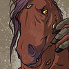
This is a retardedly unfinished grayscale tint that I am playing around with to get a feel for kinda/sorta what I'd like the interior for Marble Town to look like. It'll likely not have the color tint in this manner, but rather a more cell style with shadows and whatnot. But! It was fun to play with while killing off a bit of sleep resistance! Its also pretty cropped off at the top, but for the sake of space.. c_c
Not going to say whats going on and this it going to be the only page I'll let myself mess with and post until I get a LOT more headway. But I figured it was fun to see what some of the character variations look like, since I hardly ever post them. ;p
Not going to say whats going on and this it going to be the only page I'll let myself mess with and post until I get a LOT more headway. But I figured it was fun to see what some of the character variations look like, since I hardly ever post them. ;p
Category Artwork (Digital) / All
Species Unspecified / Any
Size 631 x 750px
File Size 90.1 kB


It is not that hard to have two-tone stuff, I'm doing that for all of Absinthe. A lot of it is just figuring out how to do it quickly and easily. I haven't tried it in Photoshop but the back of my head is wondering what would happen if you set up a duotone, picked colors for each plate carefully, and did sloppy greyscale painting in each plate?
Also you could try a cel-shaded greyscale base, with a tone layer applied to it - paint/erase areas in the tone layer to give you control of warm/cool grey. But I dunno, I mostly work in AI!
Also: pretty.
Also you could try a cel-shaded greyscale base, with a tone layer applied to it - paint/erase areas in the tone layer to give you control of warm/cool grey. But I dunno, I mostly work in AI!
Also: pretty.
Oh man, if I had done this without a tablet, I fear how long and tedious it would have been! Long part seems to be sketching it out on paper. Its like some days it happens fast and others its like arrrrrrrrgh so slooooow. I feel like I'm still messing around with things. I like this page but like RGibson was saying, Vetiver's head is too high up on that blank wall. I'm hoping some shadows will work later on cause, dangit, I don't wanna redraw it! May have to.. x_x
And thank you for the color tips and ideas! I'm going to have to play with this a few times until I settle on something.
And thank you for the color tips and ideas! I'm going to have to play with this a few times until I settle on something.


Such wonderfully expressive body language!
I agree about changing the composition to provide a clear backdrop for the central figure’s head. Since I don’t know the context I can’t suggest a definitive solution, but I can offer suggestions: She could be sitting or kneeling, which would lower her head; the wall could be taller, which would raise the rail and other characters; the wall could be lower, about shoulder height, but the other characters are more separated, clearing her head.
I agree about changing the composition to provide a clear backdrop for the central figure’s head. Since I don’t know the context I can’t suggest a definitive solution, but I can offer suggestions: She could be sitting or kneeling, which would lower her head; the wall could be taller, which would raise the rail and other characters; the wall could be lower, about shoulder height, but the other characters are more separated, clearing her head.


Comments