 FA+
FA+
1090
Views
Views
25
Favorites
Favorites
Category
All / All
Species Unspecified / Any
Size 800 x 1218
File Size 543.1 kB
Report this content
★
More from Eggplantman


Listed in Folders


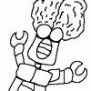
A little more on the two girls and we get another flash of how Leo's report is doing. We'll continue to bounce around like this for a while. I think it keeps it interesting.
All fifty first pages plus all the bio pages and some art not seen here is available in printed form from Indyplanet. Only $13.99 http://www.indyplanet.com/index.php?id=1805
<<< PREV | FIRST | NEXT >>>
All fifty first pages plus all the bio pages and some art not seen here is available in printed form from Indyplanet. Only $13.99 http://www.indyplanet.com/index.php?id=1805
<<< PREV | FIRST | NEXT >>>
Category All / All
Species Unspecified / Any
Size 800 x 1218px
File Size 543.1 kB
Listed in Folders


The art certainly doesn't look rushed, looks quite fine to go with the nice writing. Hmmm I wonder how things will end up as Scorpio works on her rough edges and some of less than honest behavior, and I imagine with those predictions earlier in the strip seeing who surprises you fitting the bill of each will be quite surprising (since they're rarely the ones you'd think would be the obvious choices).
Probably be a good idea to keep Libra away from Cancer then, given the kid's likely to corrupt him just trying to use Libra as a way of getting naked female teammates to ogle (and I wonder when there'll be an 'accident' with the clothing switch technology while Cancer's conveniently nearby...).
Probably be a good idea to keep Libra away from Cancer then, given the kid's likely to corrupt him just trying to use Libra as a way of getting naked female teammates to ogle (and I wonder when there'll be an 'accident' with the clothing switch technology while Cancer's conveniently nearby...).
Oh, I couldn't keep Libra and Cancer away from each other. They're buds! And the fact that when they are together they both act even more immature than normal is funny to me. Keep them apart? That's good advice if you were talking to Leo but as a comic writer, I've got to go there.
*chuckles and nods* Well of course what would be best rarely happens in the comics (otherwise Reed Richards would have made Marvel Earth a paradise a long time ago), and I imagine Cancer would find a way around things to get at Libra since he's the only one he could possibly succeed with his antics on (since he knows Scorpio would fix him with her bare claws ).

Back again! I'm gonna see how many of these I can do before 1:00 AM. Let's begin!
Panel 1: Another commendable effort on 'upgraded' backgrounds! It's not overly sophisticated yet is quite effective at establishing depth and setting. Most importantly, it instantly tells us that we're no longer in Cap's house. The girls look good as usual here, although something about Scorpio's right elbow looks a bit strange... it might be the fact that we see the arm, but not the hand. I've been guilty of this as well, but in this case the mystery of the missing hand is possibly why her right arm looks a bit odd.
Panel 2: Capricorn's loose sleeves do emphasize the austerity of her garb, and the fact that Scorpio is considering a little spaghetti-stringed black dress for her is a good bit of subtle humor. Their faces, gestures, and anatomy all come together quite well here, quite an effective panel.
Panel 3: Again, a good panel, only this time with a good, expressive posture on Scorpio's part. Although I haven't mentioned this, or really taken great notice of it before do you normally omit pupils from your characters' eyes when they're at a medium distance? I was wondering if this was something new that you're trying out or that it's something you've always done, but in any case I wanted to mention that I noticed it.
Panel 4: Uh oh. LeSonne's munching on sweets again... a LOT of sweets. The guy must have one exhausted, but very wealthy dentist. Seeing a gator with a cheek puffed full of candy is a rather amusing sight here. Ramas and Hain also look good here, and showing Leo's back here, while it's the same perspective you used on the last page, is more effective here, possibly due to the distances and circumstances involved in the characters.
Panel 5: A solid panel with a good pose, but it's big contribution is that it emphasizes the dialogue well and keeps us focused on the story being told. Sometimes the words have to be the stars, and you served that purpose well here.
Panel 6: A classic pose pulled off nicely, a simple panel pulled off seamlessly. Very clean work here, I like it.

Comments