 FA+
FA+
232
Views
Views
1
Favorites
Favorites
Category
All / All
Species Squirrel
Size 751 x 599
File Size 51.4 kB
Report this content
More from Relee


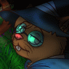
This is a work in progress drawing of the mascot for my professional business. I'm uploading it here to get some exposure and commentary. I'm an amateur artist; I'll probably subcontract any major artwork for websites I do, but I want to do the art on my own site myself.
If you're an artist, could you tell me what you think of this? The line art for the squirrel is 'complete', or is it? I think it's ready for colouring, but is there anything 'wrong' that I'm missing or overlooking? Sometimes I don't notice problems when I want to get a job done, and end up producing a lower quality product, and I like to get a second pair of eyes to look at it. ^.^
Also the tree. The first time I tried to draw an image like this, people complained a lot about the treebranch. Does it look okay? It's only a sketch, I'll put a more detailed tree and branch in later, but are the shapes correct? What about the little branch with leaves, is it too noisy? Out of place? I want to have a branch with maple leaves to show that it is a maple tree specifically, but I'm divided on if I should have a branch going up like that, or maybe a single twig with two or three leaves coming off the bottom of the branch. What do you think?
Category All / All
Species Squirrel
Size 751 x 599px
File Size 51.4 kB

I think the branch this time is a little too much on a perfect right angle. If the last tiny bit at the base dipped downward as it met with the trunk it might look much more natural. I have a maple tree out my window as I'm typing, and all the branches grow upward out of the tree to varying degrees, but always at least start at the base growing upward. But you are much closer now. Also, I like how the branch fades out, giving a sense of there being more the the "world" than what is expressly in the drawing itself.
I like how the line widths are varying a little more in this attempt than the last. It's starting to look more like a toony drawing that way.
on the squirrel: I like the toony anthro squirrel for this purpose. It works well. I like the dynamic pose. The belly patch looks very cute and the lines are nice and smooth. However, I'm not sure how well the "double smile" effect you have going on is working, and I'm worried it will look worse rather than better when you color it. I'd suggest trying to merge the two conflicting lip shapes on the upper lip into one somehow. The highlights on the eyes are a nice touch, but they are odd looking. It seems to behave as if the eyes end at the iris rather than the eyelid, which is throwing me off. Also, the shape of the pupil and iris look a little wobbly to me. If there's anywhere you want clean, smooth ovals, those are the places you want them. You may also want to pay a keen attention to where your squirrel is looking. Eyes that focus on a specific point (the key? the viewer?) are just plain cooler than kinda... I donno what. The hands are really cute, with little childlike fingers, a great choice for a squirrel. I love the arm holding the key, but the other one looks a little different. The arms are not the same width at the shoulder and there are more curves that don't quite look like muscle or fat. Clean and simple are your friends in this drawing. Try reducing the number of curves and either lifting the top of the left shoulder or dropping the armpit a tad and see how you like it. The round little oval footpaws are precious! but the right one doesn't look like it's grabbing on to the branch quite. If the branch could curve a little toward the viewer it could make for a dynamic pose though. The legs in general, however, don't look as nice or careful as the rest of the drawing. You know where the hips are, and where the feet are, but you need to have a clear sense of where the knees go. From there, the rest should kinda fall into place. Also, I recommend an arch rather than a v-shaped split for the crotch. It will give you a softer, rounder, cuter look. Oh, and the ears kinda look not as attached to the head as they could be. Play with erasing part of the line that separates the left ear from the head at the top and/or middle section of the ear until you get a good flow to it.
Oh, and the branchlet with leaves: I'd like to see it come out at a tad more of an angle. Keeping it on the top or dropping to to the bottom depends on how you're going to use the art. If it stays in a little frame by itself, leave it on top. If it sits at the top of the page and leads down into some text, putting it on the bottom might be cool. I generally like the shape of it though.
So there you go. You said you wanted it to look professional, so I'm being mercilessly super-picky. I hope I wasn't too rough or overwhelming on you =^.^;=
Drawing a branch termination is excessively difficult. They just kind of fade to a point, and they would fade to that point very far from anywhere you would want to stand, so it's outside of the picture this time. ^.^
I'll try making it go more upwards. This time I didn't use a reference for the tree, just drew it freehand from my imagination.
I did vary the line width, though flash has no option for varying the width on a single line. Like, it can't taper down from a thick line to a thin line, only jump between the two. I guess that's the limitation of the tool. There is a sort of work around but it's excessively difficult. I'd only use it on very important tapers, but I'm not sure which would be very important. When I learned to draw, using different line widths wasn't included.
The pose and proportions were loosely based on a reference picture. So, I can't take all the credit for the pose. I was lucky that the artist whose style I'm trying to capture happened to have a pose very close to what I wanted to use.
I'm not sure I understand the two conflicting lip shapes? Do you mean how it has the W shape then an additional line behind that? I thought it gave it a cute 'muzzle pouches' look. Does it look bad?
I think the eyes will look better when I colour everything. Right now it's white on white on white, and it's difficult to tell where the eye whites start and where the pupil is. When I draw in pencil I usually do the pupil in black and the iris in grey and that makes it much clearer what everything is. I haven't even coloured that yet so it doesn't look as good.
She's actually looking towards the bottom left, which is basically where I wanted her to be looking, but now that you mention it I never even considered where she was looking. I'll think about it, but I kinda like her looking off into the 'distance'.
I'm glad you like the hands! I was worried about them since they're so hard to draw. ^.^;;
One is much closer and the other is further away. The reference I used for the pose had both hands obscured so I had to figure them out on my own. Do you think the far away hand is too small? I wasn't sure about that one.
I was going for that baggy 'fuzzy pantaloons' look that some furries/actual animals have, with the legs. I guess it's not working for you? I wonder if it's just the black and white. Or maybe I should put little squiggles where the knees are to represent fur and draw the eye to them?
Now that I look at the ears I forgot to deal with the line on the left (right from our perspective) ear. I was originally planning to alter it, it shouldn't have a solid thick line like that. The right (left from our perspective) ear is supposed to be on the other side of the head, so it shouldn't look entirely connected.
You were specific and helpful and not judgemental or sarcastic, I think you did a great job. Thanks Frai. <3
On the arms, the difference in thickness makes the right one look way shorter than the left. I'd consider extending the right arm, slimming it a little and widening the left a skosh. Also, the line on the right side should continue upwards to the armpit, rather than the line at the bottom of the right arm overlapping it.
As far as the legs, I think if you added a line for the crotch area, that'd help significantly.
The head mostly looks just fine, except I'd make the right ear a bit bigger. Not only to keep proportions, but because the way it's so close to the tail line almost makes it look like the tail's in front.
I'll send an email with my suggestions, since it's a bitch trying to describe them verbally...

Comments