 FA+
FA+
1938
Views
Views
121
Favorites
Favorites
Category
Artwork (Traditional) / General Furry Art
Species Unspecified / Any
Size 1024 x 820
File Size 788.5 kB
Report this content
More from ChrisGoodwin


, Boston\"")


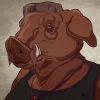
14" x 11". gouache.
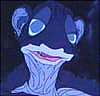
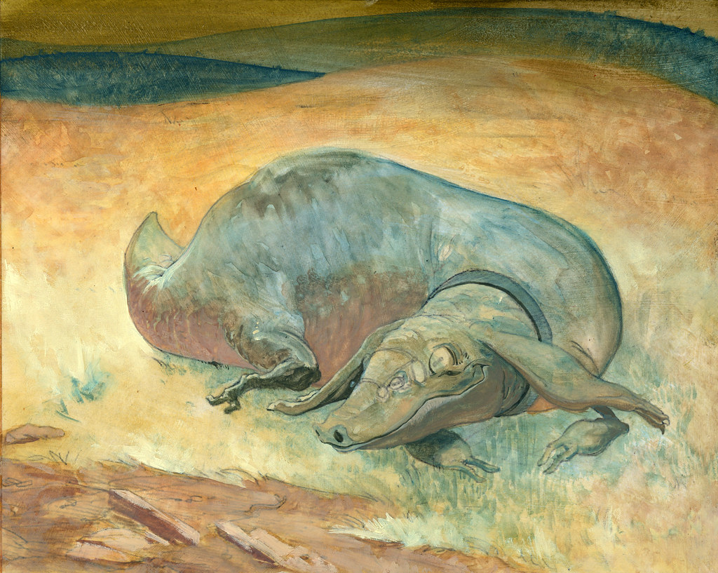
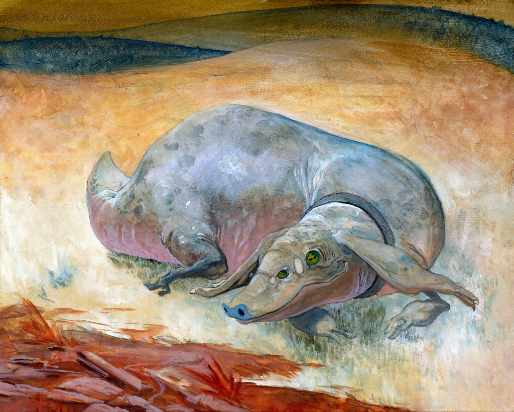
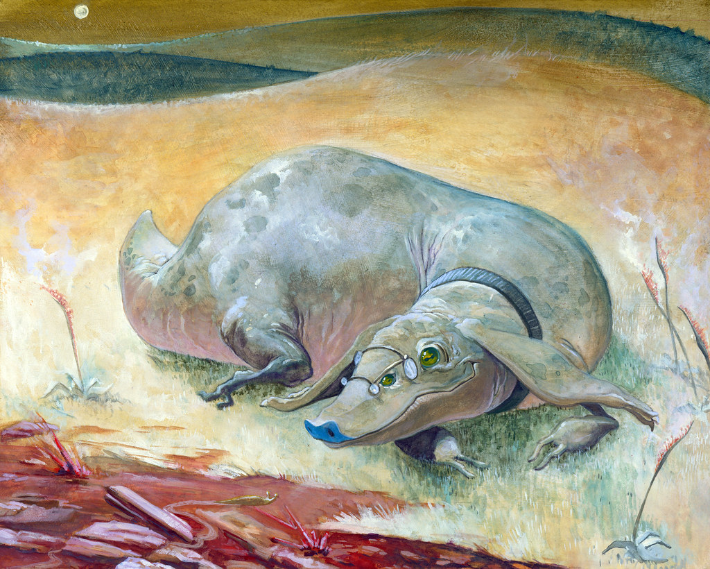
A portait of slug's character, as commissioned by kantrawulf.
Reference I was pointed to:
1. Character sheet
2. More recent image.
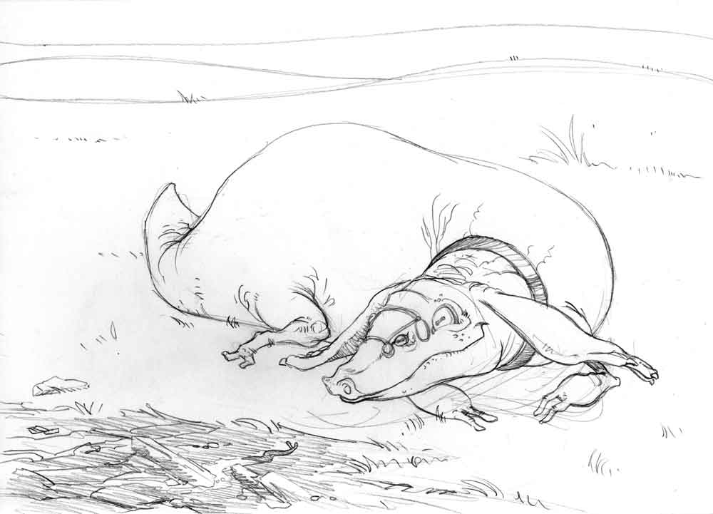
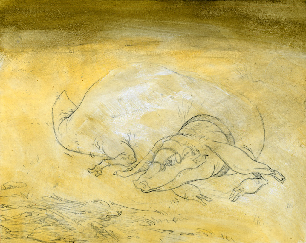
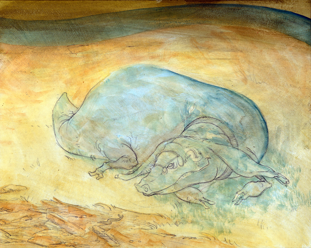
Stages of the work-in-progress:
1. WIP#1 - The initial drawing, as approved by client.
2. WIP#2 - I cleaned it up digitally, and then I printed out a laser copy at
final size and 50% lighter. This was affixed to board and covered with
two coats of matte medium, each applied in a different direction.
3. WIP#3 - I toned the whole image with a layer of watercolor (cadmium
yellow mostly, with a little prussian blue to muddy it a bit at the top). The
point is to make a simple gradient to help warm the image over all.
If it were a winter scene, or something mechanical, I'd wash it all
down with blue to start with instead, etc. This then got a coat of
workable fixative to reduce interaction with later layers of paint.
This step is done to prevent the "glare" of the white of the paper
that might show through, and to help unify everything with a
consistent undertone.
4. WIP#4 - I'm beginning to block out the most general areas of light and dark.
5. WIP#5 - More detailed sorting out of lights and darks. Still just using red
ochre, ivory, and prussian blue for now. (This is basically a primary
palette of red, yellow, and blue, something I learned from
Thomas_Blue)
6. WIP#6 - More working things out, explaining the lighting situation more
clearly, etc. I'm starting to make the dark areas darker and the light
areas lighter. I take certain specific elements very close to finish
(the line of the mouth, for instance) because it helps me to have some
"solid" anchors (even though these might still change!)
7. WIP#7 (Final) - Finishing touches, detailing, and so on.
A portait of slug's character, as commissioned by kantrawulf.
Reference I was pointed to:
1. Character sheet
2. More recent image.
Stages of the work-in-progress:
1. WIP#1 - The initial drawing, as approved by client.
2. WIP#2 - I cleaned it up digitally, and then I printed out a laser copy at
final size and 50% lighter. This was affixed to board and covered with
two coats of matte medium, each applied in a different direction.
3. WIP#3 - I toned the whole image with a layer of watercolor (cadmium
yellow mostly, with a little prussian blue to muddy it a bit at the top). The
point is to make a simple gradient to help warm the image over all.
If it were a winter scene, or something mechanical, I'd wash it all
down with blue to start with instead, etc. This then got a coat of
workable fixative to reduce interaction with later layers of paint.
This step is done to prevent the "glare" of the white of the paper
that might show through, and to help unify everything with a
consistent undertone.
4. WIP#4 - I'm beginning to block out the most general areas of light and dark.
5. WIP#5 - More detailed sorting out of lights and darks. Still just using red
ochre, ivory, and prussian blue for now. (This is basically a primary
palette of red, yellow, and blue, something I learned from
Thomas_Blue)
6. WIP#6 - More working things out, explaining the lighting situation more
clearly, etc. I'm starting to make the dark areas darker and the light
areas lighter. I take certain specific elements very close to finish
(the line of the mouth, for instance) because it helps me to have some
"solid" anchors (even though these might still change!)
7. WIP#7 (Final) - Finishing touches, detailing, and so on.
Category Artwork (Traditional) / General Furry Art
Species Unspecified / Any
Size 1024 x 820px
File Size 788.5 kB

it is regular printer paper, and you're right it can't handle heavy painting directly.
but(!) it's under two layers of acrylic matte medium, which is what's holding the
paint (acrylic gouache).
it's also what's holding the paper to the board. acrylic medium is awesome.
- i prepped the paper by spraying it down with water first, so it can swell and expand.
- then slopped on the medium to the board, evened it down to a thin layer,
- carefully placed the still-damp paper onto it and smoothed out any bubbles
- then painted on medium in one direction, let it dry.
- painted on medium in the cross direction, let it dry.
the point to wetting the paper first is that it will expand. if you try to put it on dry,
it will buckle and spread and wrinkle and you'll never get them out.


Really Chris, I'm still blown away by how this turned out. Also, the breakdown of your process was really inspiring :3 Seriously, the form and flow of the composition is just beautiful. And Slug was right about the red. It's soo balanced that no portion of the colour scheme becomes a focal point, it all adds to the body of the painting <33


Comments