 FA+
FA+
4044
Views
Views
117
Favorites
Favorites
Category
All / General Furry Art
Species Vulpine (Other)
Size 886 x 899
File Size 108.5 kB
Report this content
More from scream


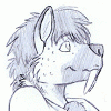
Just a small doodle that turned into a finished peice. I made a little bit of an experimentation with the shading... some of it seems out of place, but i think it turned out quite well!
Category All / General Furry Art
Species Vulpine (Other)
Size 886 x 899px
File Size 108.5 kB


As I said before, the anatomy looks great! Along how well you made the lineart ^^
Now you got a nice coloring and the shading is simple but it does its jobb and fits very well with the picture
The smiley made me laugh even thou that was the last thing Ive noticed when looking over the image XD
I always start by looking at the characters faces in pictures and Ive always been very fond over the way you draw those ;)
Good work man!


the darker 2-tone-ish shading does look a lot better, and though as ou said it does look misplaced in a few places, namely the tail, it looks flat and you missed on the front of the shirt below the arm i think should be shaded like the rest of the front as it is also facing down. also right below the hair on the front of the face. dont be afraid to shade in more places, and keep where the ligth is comming from in mind.
also, if i had that smiley anywhere near my crotch, freak out mode would be initiated
also, if i had that smiley anywhere near my crotch, freak out mode would be initiated


XD wat? no awesome.png there instead? :o i like the idea though xD ah how many times its been used and i've laughed a good one about. :) i really like how her legs came out though >.> besides a boob man. i love nice thighs. and these are a very nicely drawn pair of thighs. and the coloring. it came out pretty decent. maybe add some highlights and you'd be all set :)


I personally hardly like this picture at all to be brutally honest. o.o'
I would have to look at your gallery again to figure out why this seems like an eyesore. But it may simply be for two reasons. A big, thick lineart and sharp differences in color on shading, two big no noes in my art book. XD
But hey! Do not mind me. Everyone else seems to love it so keep going!
You still did a good job in preserving the character's fine physical shape in my opinion. *looking at the hands and legs*
While some have pointed out what you've said, others really liked it. It hard to please everyone.... D:
The hardened lines, solid toned colors and shading was just an attempt on a different style. It has its ups and downs, but i have learnt alot from this which could really help me in the future. We will see how the next peice goes :P
thanks for the comment ;)
The hardened lines, solid toned colors and shading was just an attempt on a different style. It has its ups and downs, but i have learnt alot from this which could really help me in the future. We will see how the next peice goes :P
thanks for the comment ;)
Thank you for understanding dear Scream. I try to be as honest as I can with the people I watch.
Totally understandable. People did not like my own attempts at shading like this on my main gallery unlike you. But I did not like it to begin with.
I hope things go well for you. ^^
Totally understandable. People did not like my own attempts at shading like this on my main gallery unlike you. But I did not like it to begin with.
I hope things go well for you. ^^


Comments