 FA+
FA+
420
Views
Views
43
Favorites
Favorites
Category
All / All
Species Unspecified / Any
Size 853 x 1280
File Size 139 kB
Report this content
More from radium


Dizzy Deezul! For Dizzy on SL because shes awesome and commissioned me~
Category All / All
Species Unspecified / Any
Size 853 x 1280px
File Size 139 kB

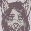


If I were to critique this, and I am upon request, I'd start off by encouraging you to develop some new/clearner lineart techniques. As it stands, messy, scribbly lineart only makes a picture have undertones of haste and waste. It can make a perfectly cute/harmless character seem crazy or demented in an unintentional way. It also helps make it seem like a lot more effort were put into the drawing with crisp, clean lineart. Not exactly a priority among most artists, but it's something to think about.
Your coloring could also stand for some cleaning up. As I look over the image I'm confused as to where the light source is coming from. Look at the head in comparison to the tail. The head shows highlights from above, while the tail clearly is getting no light from above. The hair, while decently textured, in the end just looks dirty because it lacks any substantial highlights or shadows. It just remains constant over her entire head.
And as for the anatomy... Good job on the legs and hips, although I will warn you the perspective at her belt gets rather wonky. It looks as though the perspective goes from 3/4ths to 1/2 all of a sudden right there. She's bending her leg, so that should actually give her more mass in that region instead of less. I'm going to say the same for the shoulder/collar area. You tried to somehow go from 3/4ths perspective to 1/2 again. From this angle, we would be able to see at least a small portion of her shoulder and arm.
Her right hand also seems a little odd to me, as if the wrist is bent at too harsh an angle behind her. Holding your hand in this position at any length of time would be very uncomfortable, and only serves to make the pose in this image look stiff and unnatural.
There I critted. Excuse my grammatical fuckups as I am still sick atm.
To start, I agree with the lineart aspect of the critique, but as a commission the unfixed lineart is a part of what is being offered to the buyer before hand. It is a "colored sketch" as it stands, so it was intentionally done without any clean up to the lines what so ever. Though I do need a lot of work done to my lining style, so I do plan on taking all kinds of tips how to make actual line art better, since lining is one of my biggest enemies. I've been experimenting in various ways of making a more "complete" looking line art, but as of yet I haven't found a way of doing it that looks good.
For the hair, do you have any suggestions as to how I could better represent where a light source were coming from? I am not a fan of over accentuating the shine on it, since in real life your hair doesn't gleam in the sunlight, but I haven't figured out how to represent a light source without doing so.
For the angle: You mean to say that at the angle she is shown, I should show more of her other shoulder in it? Looking at it, I think I can see what you mean, but I am not really sure how I could execute it. Maybe if I had added in a hint of her shoulder leading down to her arm, since the body is turned in a way where you can see her whole chest. It makes sense, that way, I think?
I agree about the hand. :D
Thank you for the crit. Its always much appreciated, since I know you are willing to rip it apart. <3
Light sourcing hair is tricky. Not only is hair made up of thousands of individual parts, but each single strand is reacting to light in a unique way.
Primarily, what's catching light in healthy hair is the natural oils on each strand. This is what gives healthy hair its sheen in the light--something that anime artists exaggerate so that characters can have simple to animate hair, yet it's recognizable as hair. You shouldn't be against accentuating shine because it does happen in reality. What you should be against is using it as a lazy substitution for detail in your art, as most artists that imitate anime do.
Think of hair as somewhere inbetween organic and liquid shapes as far as catching light goes. Let's look at an example.
http://www.suzannesfiles.com/wp-con.....es/edmonds.jpg
I've found that when learning to shade hair, dark hair is best to start with. Notice how the detail of each strand disappears in the darker area of her hair, and how they really pop out in the lighter areas. These lighter areas are where the bend in her hair is closest to the light so it catches it the most.
http://beaut.ie/blog/wp-content/upl...../shinyhair.jpg
A little lighter shade. We can see the same thing happening here as in the dark hair. The detail is more visible in midtoned to lighter areas than dark. Though here we can still see hair detail in the darker areas because of the hair's lighter tone--they just do not pop out to the eye and our point of focus is drawn to the lighter areas.
As for the angle, it would help you if at the sketch stage you set up your perspective. Vanishing points and horizon lines affect every picture of anything you'll ever draw, and while it's not necessary to plot them out on each picture before you begin them, it's necessary that you keep them in mind.
I've done a quick redline to explain my view on the perspective:
http://bo0b.org/images/dizzyredline.jpg
And just for thought: I've found that when I'm doing the base sketch for a female figure, using spheres a LOT will make the end result look a lot more curvy and feminine and less boxy and masculine.


Comments