
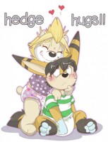
same as before, but with the lines in there!
>.> except the speech bubble lines. hmmm
>.> except the speech bubble lines. hmmm
Category All / Baby fur
Species Vulpine (Other)
Size 1280 x 982px
File Size 320.8 kB
Listed in Folders
Like the way this one came out easier to see then the other one. The other was to light for my eyes, I know i am mostly blind in one eye but the way it looked was more blurry where this one with the hard color comes more clear. It looks good. Kinda feel bad for rev, His poor ears... " These ears are not just for show you know!" is something my little imp says alot when people are shouting lol. I might need to steal that quote of " these ears can hear into tommarrow " if you don't mind lol
I can see cases where the line-less style could be really artsy and neat, but I think some things (not necessarily everything) kinda needs the lines to help them pop better. In some cases the lines help to define some of the objects more clearly such as when the hair is in the characters faces, mouths, some kinds of facial expressions and similar things. it also helps "pop" the character off the background as well.
If you want a good example take your first panel from this version and the other version lay them one behind the other and flash between them and you can kinda see which details disappear or blend into each other. To me in the line-less version the distinct nose disappears and the mouth looks kinda strange as well as the hand is far less distinct on Reva. these issue are less noticeable on the female character due to coloring differences and maybe head position (not really sure but i am gonna go with that as my excuse). If you try the same thing with the third panel you may notice some other things that become less distinct.
On the other hand i like how the on the line-less version it softens the impact of the shirt and the diaper a bit and how it softens the color changes in both of the characters fur.
maybe you might try a "hybrid" of two styles to see which lines can go away and which ones help to define the scene better. the other possibility is maybe to make the lines thinner (if you can even do that without it being a total pain which is probably a no)
just my wooden nickel's worth of thought.
P.S. have always enjoyed your art just never really said anything so i think now is as good a time as any to say thanks for letting us look at your awesome work.
this one has more clarity while the other one doesn't have the dark lines to solidify what we're seeing. Good concept, but if you were to go with the other style, I think something needs to ground the characters or whatever we need to see first.
You could try a mixture of both where your lines in this one are color coded except for the outlines which will be black! Or even a mixture of vibrant and neutral colors.
I personally like this one because I love vibrant colors and easy to read. Good work <3 Very cute.
You could try a mixture of both where your lines in this one are color coded except for the outlines which will be black! Or even a mixture of vibrant and neutral colors.
I personally like this one because I love vibrant colors and easy to read. Good work <3 Very cute.

 FA+
FA+











Comments