 FA+
FA+
3975
Views
Views
117
Favorites
Favorites
Category
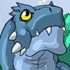
Artwork (Digital) / Transformation
Species Western Dragon
Size 1280 x 1024
File Size 192.6 kB
Report this content
More from AmethystBouncyBunny
")


")


A complete redo of one of my pieces (Pleasure Island Soda, from 2001).
Category Artwork (Digital) / Transformation
Species Western Dragon
Size 1280 x 1024px
File Size 192.6 kB


OH wow.. I LOVE how you drew his midsection.. It loosk TOTALLY bloated and awesome.. @_@
Great job with the draggy 'weird' tail.. :O
(Something abou t the old version, when ti was more 'shocking' and terrifying/powerless was exciting, too)
My bitching aside, total fave folder.
Great job with the draggy 'weird' tail.. :O
(Something abou t the old version, when ti was more 'shocking' and terrifying/powerless was exciting, too)
My bitching aside, total fave folder.


You seem to be using the term 'sexy' when asking questions. I'll use the term euphoric/euphoria/happiness as a general term.
And now time for me to break it down (no, I won't start dancing).
1. Expression - The guy has his eyes closed, but not tightly. This points out he's not in pain. In addition, his mouth is slightly upturned. He's enjoying it, but obviously not trying to express that to someone. In the original the mouth was simply open and the eyes looking at the sky. That mainly means surprise, to me.
2. The hands. In the original the hands are closed-fingered in one hand, and undetermined on the other. In the new one, one hand is feeling, the other open fingered as to simply hold it all. Closed fingers, like the first, on the belly area would have tended to indicate cramps or pain.
3. Dragonic features. In the original, you had really pointed toenails and no yellow doodads - it looked like he could be turning into a strange demon thing, something a lot of people may not want as much. You've made the end result more "child friendly"
4. Lighting. Simply put, it adds a magical/heavenly appeal, versus a - I-cantseewhat'shappeningtomeaaaaaa feel. You can clearly see all parts, independent of shadow.
5. Soda dispenser: You've made it more appealing, and more likely to attract kids.
6. Overall, the colouring went from a hard neon green and dark red to pastels, and that makes the piece less "angry" to the eyes.


Comments