 FA+
FA+
928
Views
Views
55
Favorites
Favorites
Category
All / Fanart
Species Lynx
Size 1280 x 865
File Size 667 kB
Report this content
★
More from Beast City Art


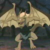
Even bad guys -- or in Fang's case, reformed bad guys -- need a vacation every once in a while.
Category All / Fanart
Species Lynx
Size 1280 x 865px
File Size 667 kB


I know, I know... but it doesn't line up. His lower scapula should be resting against the deck chair, which would bring his wing down closer to the chair arm. The upper wing edge should be aligned with his elbow.
(shrug) It just doesn't line up, to my eyes. Not a huge problem, but it doesn't. (Heh. For a real problem, try my opinion of how the Korean studio animated Elisa in "Seeing Isn't Believing". Rotoscope ahoy!)
(shrug) It just doesn't line up, to my eyes. Not a huge problem, but it doesn't. (Heh. For a real problem, try my opinion of how the Korean studio animated Elisa in "Seeing Isn't Believing". Rotoscope ahoy!)

You are most welcome. By the way, what do you think of my Raven gargoyle pics? http://www.furaffinity.net/view/2734153 http://www.furaffinity.net/view/2726552 http://www.furaffinity.net/view/2723329 http://www.furaffinity.net/view/2722105 http://www.furaffinity.net/view/2713609 http://www.furaffinity.net/view/2716940 http://www.furaffinity.net/view/2718098 .
I tried slightly different methods each time and attempted for a screen capture look. I still think I could do better with the coloring and shading but I am not sure what to do next or how to shade such odd shapes. Also I have difficulty with getting the colors right and never can be satisfied on the color schemes. It is so hard for me when it is black or white. It could be the line art throwing me off. Your lines seem so smooth and mine stay jagged and uneven. Also, you cell shading is just right and shades the areas to give it a 3D effect whereas mine seems uneven and incorrect and a bit much and non-subtle. What tools and settings do you use in your art, and with what program? ^\/^.
I tried slightly different methods each time and attempted for a screen capture look. I still think I could do better with the coloring and shading but I am not sure what to do next or how to shade such odd shapes. Also I have difficulty with getting the colors right and never can be satisfied on the color schemes. It is so hard for me when it is black or white. It could be the line art throwing me off. Your lines seem so smooth and mine stay jagged and uneven. Also, you cell shading is just right and shades the areas to give it a 3D effect whereas mine seems uneven and incorrect and a bit much and non-subtle. What tools and settings do you use in your art, and with what program? ^\/^.


Comments