 FA+
FA+
34203
Views
Views
800
Favorites
Favorites
Category
Artwork (Digital) / Comics
Species Unspecified / Any
Size 760 x 1080
File Size 333.8 kB
Report this content
★
More from Anhes


")

Listed in Folders


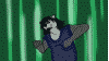
I'm working at improving my comics. This is a little idea to experiment with styles. I know the japanese onomatopoeias are maybe too much, but take it as a parody (and they make it look so epic =P)
And as always some extra content related to this pic can be found here (for my patreons):
Line art
HD versions
Designs
If you like work, please consider to support me on Patreon:
https://www.patreon.com/anhes
You can download this and other pics in HD, alternative versions and sketches, also make requests and suggestions about characters and thematics.
Thanks in advance.
Category Artwork (Digital) / Comics
Species Unspecified / Any
Size 760 x 1080px
File Size 333.8 kB
Listed in Folders


The japanese onomatopeia aren't too much just too ... straight? You know, giving them some effect and all, not just put them here as word, "tremble" could be a bit "blurr" and letter could be a bit "away" from each other, a bit to the left, another bit to the right, and turned in a bit to make it like shaky heartbeat could have a bit bigger one but a bit transparent like the word is beating itself and the translation of them right under it is kinda weird, why not put them under or next to the panel, I saw a lot of translated comics like this with "SFX: tremble" or things like this
But still, nice work, look really good, wanna see some, not about this one because you said it's a parody, but a full story maybe? it doesn't have to be long~
But still, nice work, look really good, wanna see some, not about this one because you said it's a parody, but a full story maybe? it doesn't have to be long~


Comments