 FA+
FA+
7071
Views
Views
277
Favorites
Favorites
Category
Artwork (Digital) / Macro / Micro
Species Digimon
Size 1500 x 1000
File Size 925.2 kB
Report this content
★
More from Snowball


Listed in Folders


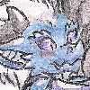
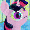
Pic from one of the last streams.
Started out as a practice sketch but ended up well enough to give it a little action and even some color. Definitely one of the more satisfying coloring experiences I've had lately, so I took my time with this one to finish it as much as possible.
Anyway, hope you like it
Art © me
Digimon © Toei Animation
Category Artwork (Digital) / Macro / Micro
Species Digimon
Size 1500 x 1000px
File Size 925.2 kB
Listed in Folders


wow, nothing bad and i must say that of some form Cherubimon made so big for that he has the size of want to grab the Earth using your big hands, makes a good time that i didn't see a good drawing of you and specially when you show to one of the best Digimon villains of the franchises, hehe, and think that Cherubimon he was a noble heart that later was corrupted for his anger and impotence for that later Lucemon could convince him for that he uses that power for destroy the Digiworld and rebuild it to his whim, well, we see what he'll make now that he has the power and size sufficient for dominate the Universe and not only a planet,hehe


Well, that certainly seems ominous! D:
Have to say, the coloring is absolutely lovely, and the lighting is top-notch, as well. It’s a good contrast of darker and lighter colors that’s very pleasing on the eyes. I especially like the glow around both objects of note (for the lack of a better expression); it gives the picture some sort of...feeling, I guess? Like how the purple glow gives off an unsettling and omnipresent vibe, while the blue glow is just a small light against that encroaching darkness.
Definitely one of my favorites of yours when it comes to coloring. Incredible work!


Comments