 FA+
FA+
29251
Views
Views
720
Favorites
Favorites
Category
Artwork (Digital) / Vore
Species Housecat
Size 800 x 1077
File Size 663.8 kB
Report this content
★
More from Fid


")


Listed in Folders


<<< PREV | FIRST | NEXT >>>
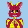
This short series is my excuse to practice working with the tools of Clip Studio Pro. This will be the standard style of my lineart now, with tones, gradients, and all that good stuff. I will have another style that is a lot more sketchy, which is actually a step in the creation of a comic of this caliber!
This short series is my excuse to practice working with the tools of Clip Studio Pro. This will be the standard style of my lineart now, with tones, gradients, and all that good stuff. I will have another style that is a lot more sketchy, which is actually a step in the creation of a comic of this caliber!
Category Artwork (Digital) / Vore
Species Housecat
Size 800 x 1077px
File Size 663.8 kB
Listed in Folders


Damn man, couldn't say exactly what's done it, but I definitely think CSP's going to be a great platform for your stuff from now on with results like these! Everything just feels a lot more crisp, pops out a little more (though I suppose that should come as no surprise with more shaded tones like this heheh), but regardless man I'm definitely looking forward to more!!


This may be due to the background and the larger portion of white on her body, but I feel as though there's more difficulty in picking out the details on this piece. One such thing I notice is that the various tones of grey behind her blend in too much with her own darker portions, blurring the lines a little too much. For instance, she's still wearing her bra, but it's not immediately noticed. The heavy use of shadows also obscures a few details on her. I feel that when I compare it to Malgam's recent Sylveon pic, which doesn't have a background, the Malgam pic has more that immediately draws the eye to his belly, expression and the little nuances in his form. Here, there's just enough going on in the background, and the tones match up just enough to make the eye wander a bit too much.
I know that you're attempting the new style to match manga, and the previous pic did that very well. The 'racing lines' effect highlighted the feline very well in Tapout 1, and the bottom portion of that pic, with the facial close-up, really demanded the viewer's attention in a compelling way. I think you should continue to use the style in pieces where something like an enormous belly isn't the main focus, or where the changes in the character's body (i.e. pre-vore versus post-vore) are not competing with a background tone. Toning down on shadow use on the belly itself may also help out with that weird feeling I'm getting from this piece.
Again, this is just my own opinion regarding one specific piece. I feel it really worked well in the previous one, but there's a lot of competing elements in this one that make it feel a bit too much!


Comments