 FA+
FA+
2348
Views
Views
75
Favorites
Favorites
Category
Artwork (Digital) / Fanart
Species Skunk
Size 2000 x 1333
File Size 700.5 kB
Report this content
More from Greycat_R


")


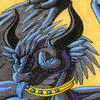
Despite being the original "skunk casanova" Pepe seems to be a bit less 'hunky' than his follow ups ^^'
Plus you can't say I only draw hot girls ^^
Pepe, Pitu and Johnny Skunk © WB
Plus you can't say I only draw hot girls ^^
Pepe, Pitu and Johnny Skunk © WB
Category Artwork (Digital) / Fanart
Species Skunk
Size 2000 x 1333px
File Size 700.5 kB


Honestly with the "New Looney Tunes Show" I'm not really a big fan of how everything is redesigned. I remember how much initially people had a problem with the setting of the 2010 LTS, for me the bigger problem is the redesign where a lot of characters honestly feel like "let's say this character is X".
It actually makes me think that they did this to mimic what Disney did with the Mickey shorts. I'm not saying it's bad, it's just off for me.
It actually makes me think that they did this to mimic what Disney did with the Mickey shorts. I'm not saying it's bad, it's just off for me.
To be fair It's not like the LT characters didn't evolve visually (and sometimes dramatically) in the old shorts. Try comparing the egg-headed Bugs seen in the early 40s Tex Avery shorts to the droopy-eyed, smirking one seen in the 50s era Chuck Jones shorts. It's like they came from completely different visual universes. It's only by the point merchandising became the main venue the LT characters appeared in that their model seems to have "set".
I know I' just talking in perspective. In the first season of the 2010 series people wouldn't shut up that Bugs fur was slightly tinted lavender to the point they made him pure grey in the second season XP
I also don't mind them being slightly more cartoonish looking (same case with the Mickey shorts) or with Porky closer to his 1930s look, but with Pepe he got so much overhaul on his design he might as made him another of Pepes relative. I think it's the hair what sticks to me since it was pretty much consistant since his debute, now suddenly it's needs 2 stripes from both sides.
Basically from a character design, it's one of those key features that lets you know if it's a new design for an established character, or a new character with a legacy name. That's also why people can tell apart Wile E Coyote and Ralph the Wolf - one has a black nose and the other a red one and by canon they are cousins.
I think with Pepe they're deliberately trying to avoid a certain crowd you -know- will give them grief if they even -hint- at any of Classic Pepe's elements.
So they give us something so divorced that it's basically a new character. But that seems to be standard issue for revivals these days, alas.
(Good grief, I saw people on TV Tropes complaining that Tiny Toon Adventures deeply offended them when they watched the DVDs. I shudder to think what they'd make of the old Pepe shorts.)
Comments