 FA+
FA+
1088
Views
Views
85
Favorites
Favorites
Category
Artwork (Digital) / Fantasy
Species Vulpine (Other)
Size 553 x 800
File Size 218.8 kB
Report this content
More from Darby


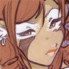
Ee, so this is the piece I ultimately ended up creating for the aforementioned November 1st deadline... but apparently I got that wrong, LOL. Which is great and awful. I lost over 15 hours of work on this thing and had to redo it all so I was rushing and literally have been working all day sans 3 hours today on it.
Anyway, since the deadline isn't quite when I thought it was I'm going to let it sit for a day and check it out tomorrow or Thursday to see whether I'm truly happy with it or not.
Let me know what you all think! I'm doing one more quick thing (a bust of Darby, pencils all done already) and then I'm back on commissions of all sorts, oddly I'm totally excited. :3 This is the first time in a long time I put myself into my work. : p so to speak.
Notes: I decided to go with design over total mesh with the white of the kimono since the image was very design heavy in its aspects. Aside: I did have a fully shaded version, but it looked bizarre.
The lines aren't nearly as clean as I'd like them as I had to streamline and even that picked up my paper texture. Before I'd lost my work I'd cleaned the inks in full... backups from now on. ._.
This JPEG version is super low res (which mocks all of the detail I put into it) since the intention of printing/prints is in its future.
Lastly! I welcome any and all suggestions, though of course I can't do anything dramatic to this image in its current state so just minor ones if you have them please. <3 Thank-you! <3 <3
Category Artwork (Digital) / Fantasy
Species Vulpine (Other)
Size 553 x 800px
File Size 218.8 kB


AAAAAAAAAHHHHHHHHHHH!!!
So good it burns the eyes! Every piece I see of yours has such powerful linework. Your work is what I aspire to. In that, I cannot begin to make suggestions. I love the design on the kimono. Having lived in Japan, I saw many of them and they're always a treat. Even though the obi looks like the ties in the back originate low, it still looks right. Love the pattern, love the pose. Love the pic. I just don't understand how you can make simple, concious shading choices and the result be so deep.
You art has a vector flavor with a traditional look. You must be mcdonald's cause "I'm lovin' it!"
Hee, I actually ran back to find this comment because I knew there was something wrong with the positioning of the obi, but I couldn't remember what you said. It doesn't look right here, lol, but since I am drawing another kimono and I'm sure to draw more in the future this is pretty invaluable advance. Thank-you dearly.


Fantastic kimono design. The design and the strong varying line weight from all the main lines on the kimono and body look really good. The raven hair spread out like that adds a nice element of her sudden fall. The only thing I can think of is with the strong contract in the hair the lighter contrast in the folds of her dress looks a little off. The shading in her body looks ok, but that's partly to do to the richer color change.
I had a hard time articulating what exactly felt off about the kimono. Now that you mentioned the soft silk, it fell in to place.
I would say that you've accomplished the soft sheen of the silk robe but sacrificed a little of the shading. That is, since silk is more light sensitive of a fabric it produces more soft color changes in areas that normal fabric would look flat. The soft change you made in the red show off this sensitivity, and reflective surfaces, to the light but I think some areas (such as some overlapping folds) it looks like part of the sheen and not the shading.
:/ er, I think that was clearer. Still though it's minor and you've accomplished the look of silk rather expertively. It�s rather impressive that you handle the color change in the fabric so well. (...not sure if expertively is even a word though, but I think it�s intent is clear.)
oh and you're welcome :)


Comments