 FA+
FA+
2588
Views
Views
83
Favorites
Favorites
Category
All / All
Species Unspecified / Any
Size 1280 x 716
File Size 177.7 kB
Report this content
More from Eyrich


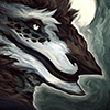
Keep your shapes in values simple. A good composition is determined by how well it can read. If the themes of your picture don't read (in this case the conflict and power differential between the monster and the characters) and if the characters themselves don't read as a three value structure, try again! Simplify, combine shapes, consider your directional forces!
Art and study © Myself
Art and study © Myself
Category All / All
Species Unspecified / Any
Size 1280 x 716px
File Size 177.7 kB


I actually use a combination of "Black and white" layer and then a "posterize" layer set to around 3-6 in order to check. The posterize reduces your color uses to the number that you set it to. So if it's set to 3 it will only show 3 colors (in this case it is set to 4 colors: Black, white and two medium greys). This works really well for these "3-value structure" studies!
I sometimes do start in greyscale and then add in colors later but that's not entirely relevant to the study~
I sometimes do start in greyscale and then add in colors later but that's not entirely relevant to the study~

Nah the objective isn't exactly to make the monster creepy, though that's certainly a part of it, "Bloodborne fanart" so it has to borrow some of the lovecraftian language from the game.
The objective for this is to establish a power differential between the two entities. While the monster is taking up the most space, giving him a semblance of power, the composure of the two characters in the front coupled with the fact that they have the most value contrast, gives them the greatest visual presence, a different kind of power!
The objective for this is to establish a power differential between the two entities. While the monster is taking up the most space, giving him a semblance of power, the composure of the two characters in the front coupled with the fact that they have the most value contrast, gives them the greatest visual presence, a different kind of power!


Comments