 FA+
FA+
2263
Views
Views
210
Favorites
Favorites
Category
All / All
Species Unspecified / Any
Size 929 x 740
File Size 302.5 kB
Report this content
More from Vantid


"Varaha (Sanskrit: वराह) is the third Avatar of the Hindu god Vishnu, in the form of a Boar. He appeared in order to defeat Hiranyaksha, a demon who had taken the Earth (Prithvi) and carried it to the bottom of what is described as the cosmic ocean in the story. The battle between Varaha and Hiranyaksha is believed to have lasted for a thousand years, which the former finally won. Varaha carried the Earth out of the ocean between his tusks and restored it to its place in the universe. Vishnu married Prithvi (Bhudevi) in this avatar."
http://en.wikipedia.org/wiki/Varaha
>Banishment of fear
>Protecting the world's ecology
>Intelligent use of the world's resources
>Freedom from the fear of dirt and darkness
~~~~~~~~~~~~~~~~~~~~~~~~~~~~~~~~~~~~~
A late sketchbook commission from FC that I finally finished.
I was pretty happy with how the coloring turned out. It is the most work I have done with markers yet (with a tiny bit of colored pencil) and then I scanned it and...
Crap. It looks like crap. All the color changes and subtle details gone. Why do i bother doing real media again? Oh well. *uploads*
Edit: oops...Hey Smart Snark...just so you know, I agree with you guys on all points. :3 I sketched and inked this at the con and my con work is never...as good as I'd like it to be. The wonky anatomy/terrible perspective bugged me the whole time I was coloring it.
The scene is supposed to be on some celestial plain near the edge of the cosmic ocean. The image I was supplied with shows the avatar in a field lotus blossoms, so I wanted a sort of never where feel to it, hence the lotus going off into oblivion and the water of the lotus field turning into stars. At least, I tried to make it kinda cool. :/
If you have any critiques, please feel free to leave them here!
Category All / All
Species Unspecified / Any
Size 929 x 740px
File Size 302.5 kB


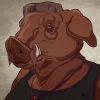

Great interpretation of the third Avatar of Vishnu. I'm speechless. He's a deity that resonates with me...and your work is both respectful to the idea of Lord Varah and beautiful. I have my own in the works, going for the anthropomorphic form he's also been pictured in. I'm glad someone commissioned this art. It makes my day.


As per request, critique!
First of all, the marker rendering is absolutely stunning! I wish like crazy I was that talented with real media, especially something as unforgiving as markers.
But I'm really confused about what's happening to its back end. Is it.. flying through space..? Were you going for a "leaping out at the viewer" perspective? If so it's not working. The torso is almost the same size and shape as the head, just not as detailed. It's almost like a fuzzy cone-shaped hat. :s Perhaps make the shading under his chest/belly a little darker so it doesn't look as flat? Next time try to capture a little more movement in the animal's body. If this thing is flying through space, he should have a little more curve in his back instead of being so stiff, like he was shot out of a cannon. I know boars are pretty stocky and strong, but for sake of the image's flow, don't be afraid to bend the anatomy a little bit. It's an exciting scene! Let the character show it! :D
As far as the head, his eyes and fur are absolutely gorgeous! But the mouth is a little confusing. I'm not an expert on boars but don't they have more teeth than that? Also his bottom tusks seem unevenly placed, or perhaps the perspective on the closest one is skewed.
The background is just so beautiful and I like the transition between the lotuses and sky/sea, but that one random shell is... distracting. It's not really colored/shaded the same way as everything else so it's just kinda out there. With the way it's positioned it almost looks like it's stabbing him in the arm. D: I'm glad you didn't color his other hoof and let it be part of the water, otherwise the brown in the middle of all that blue would've been too distracting. It's like he's flowing into the sea, which works very well for this story.
Overall the coloring is BEAUTIFUL and you are extremely talented with markers, miss! The animal anatomy and perspective just needs a little more work. Really cool interpretation of this god, I love the story behind the image. :3
Thank you for saying it to my face, so to speak! At the risk of making excuses, I did draw this at a con with the intent of getting it complete there, so it was done very quickly with little reference and even less sleep. I usually try to be a stickler about animal anatomy because I love it so much and the quality of the initial line art suffered in my haste. Such is con sketchwork. Boars do have some more teethers, little pegs that i don't know would show in the upper jaw, and probably would show in the lower jaw that I tried to, belatedly, ink in.
Oh perspective. That is something I am battling right now with another piece (http://conceptart.org/forums/showth.....d.php?t=165465) and I think the issue of the back big too straight is still present. All I see with this boar is how long the body is and how the tail comes out of the wrong spot and ugh...I could go on and on. It really bugged me when I was coloring it so I did the best I could do with the markers. I got to use MAGENTA. I never get to use magenta!
The shell? I still like the concept, bad execution.Its supposed to be floating along with the avatar, but you are right, it's stabbing him. :C
Thank you again for taking the time to write a thoughtful critique. It's much appreciated here!
Oh man I have problems with perspective too. I know how hard it is to get something organic to look good at dynamic angles! /wrist In those cases just try to use that box/guideline method like in that link. It doesn't have to be perfect - as long as you get the idea across and it looks good, that's what matters.
Rush jobs happen, it's just part of the art business. I wish we could all spend as much time was we wanted to finish a piece but alas. D: But for the lack of sleep/incoming deadline I think you did pretty well. Real media is especially so difficult under those conditions ugh. I'm scared to death of real media so what you've managed to do is still so impressive. Me, I need ctrl-z lol. MAGENTA IS AWESOME BY THE WAY and I would use it all the time if I could. XD
I like the shell concept too - the idea of transitioning from a field of lotuses to a cosmic sea is really cool, and I see how you were trying to mesh the ideas of universe + ocean. But yeah the placement is what makes it distracting.


Comments