 FA+
FA+
7572
Views
Views
956
Favorites
Favorites
Category
All / All
Species Unspecified / Any
Size 1600 x 958
File Size 932.4 kB
Report this content
★
More from latex


 wolfbeast
Category All / All
Species Unspecified / Any
Size 1600 x 958px
File Size 932.4 kB


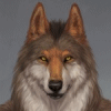


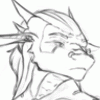
I understand why the profile view in this picture from an artistic point of view, I think I understand what is going on in the picture also. The main character on the right is turning to run from the wolf in the background. What gets me is the way he is facing. While his expression tells me he is frustrated he has been spotted it is not immediately understood why. I have mixed feelings about this.
On one hand, it makes it so the viewer has to look around to understand what is going on. Which is good. You get to take in the whole picture.
On the other hand it is at first confusing and forming your own theories of what is going on might not be easy.
tl;dr: It is thematically confusing at first, but overall amazingly well done. I truly love the setting and style.
(In hind sight I scrolled back up and the main character maybe be running or maneuvering through the platform. Still hard to tell, but I want to know so bad. >~< )

beautiful work! your skill is top notch for this genre of painter style work!
Now, you asked for critique and I do have something I could say that may be of some use to you. As a comicker this is something I pay attention to. You have a guy in the background that looks like he is aiming a gun. Couple issues with that that disrupts your composition here: 1. He has drawn this weapon in a clearly dramatic fashion making no attempt to hide it. No one seems to be reacting to it though. I get that maybe it's suppose to be that moment just before everyone reacts but that doesn't translate well. The guy with the newspaper should be dropping it and they both should be starting to duck and lunge for cover or looking to escape and should show some form of distress. 2. Your main focal point character in the foreground IS reacting which is good, but your foreshortening on the guy with the gun is not right so it's not looking like he is aiming at the main character. He is looking at him, but aiming off to the side. This seems like a minor nit-pick but the problem is it creates confusion in this piece and not the kind of confusion you want.
My advice: Work on character expression and action. Try to have people doing things and reacting to things. Also, work on line of site and having characters look at each other/point/aim at each other so as to make those connections between character actions more solid and realistic.
You have great work here and great technique, but like a lot of more painterly artists, you show awesome light theory and color technique while letting some of the details of your work go a bit. If you can synch those up a bit, your work will be among some of the top notch stuff out there. =^.^= Cheers and I hope this helps you some.


This... is amazing. A very lovely and vivid image. Lot's of spectacle, detail and action. I love how the busy frame does not come across as crowded! The fact the characters are all clearly being shaken up from a day to day routine brings it to life. And let's not even attempt to touch upon the subject of lighting! The main protagonist in this image clearly has some lovely sun on him, without overindulging in light effects. (an issue I have in the material I create, along with coherence XD) And the colors you've used clearly hint at how far the characters are away from us, the viewer.
If I were to bring up critiques as requested:
- The 'busted' wolf to the right is clearly dressed differently than the rest, yet reacts as if he's mad he's noticed. A slight imbalance there. More a nitpick than anything.
- Perspective of the gun-drawing wolf in the middle, especially where he aims his weapon, seems off angle, as if aiming for the person behind the one who's busted.
- Perspective of the train. The roof of the light fixture on top of the front of the train seems to aim upwards compared to the rest of the machine.
OK, enough nitpicking. It's moments like these where I wish there was a grading system akin Sofurry has. If only to give this image an 11/10
It would've been 11.1/10 if it weren't for my OCD finding minutia.
Regardless, this is an amazing piece.


Comments