 FA+
FA+
5640
Views
Views
464
Favorites
Favorites
Category
Artwork (Digital) / Vore
Species Pokemon
Size 1400 x 933
File Size 1.09 MB
Report this content
★
More from Snowball


Listed in Folders
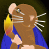
!['Zard Snacks - [Patreon 02/2017]](http://d.furaffinity.net/art/s2-freak/1548163363/1548163333.s2-freak__zard_snacks.jpg "Click to change the View")

'Zard Snacks - [Patreon 02/2017]
Remember this being pretty much just a coloring test since I've not had any confidence in coloring back then.
Liking the result here, but I couldn't really get into it. My stuff these days is a bit more cell-shady and I put a lot more emphasis on hue, lighting and contrast, I think at least xd
The tier for colored pics now doesn't exist anymore since back then patreon was too big a thing for me to handle, but I'm thinking about bringing it back after the experiences of this month, maybe together with one more other tier,
soooo keep an eye out for that I guess~
Anyway, hope you like a whole lot of zards lately
Art © me
Pokemon © Nintendo
______________________________________________________________________________________________
 patreon --> www.patreon.com/S2_Freak
Category Artwork (Digital) / Vore
Species Pokemon
Size 1400 x 933px
File Size 1.09 MB
Listed in Folders


I have to be completely honest here, it looks amazing, but it's nothing comparable with your greyscales. You have a way with shadows that just looks pleasant to the eye, even when you use high contrast. Not saying it's not good, it's really awesome and better than other pieces of art I've seen.


Learning new things is never easy, but we have to suffer through those early phases of learning all the time we start some thing new.
Thought I see the weak points in your colored art I have to admit I'm suffering the same issues atm.
Having the shading on separate layers to be able to play with blending modes helps as well as shading with darker versions of the same colors in stead of black.
Black makes the art look more dirty in stead of shaded when used without blending mode.
Don't know if that helps or you knew it already but your line work and anatomy are so brilliant, that I have a hart time to understand why you have issues to draw in the first place.
My art skills need so much more work. (including shading)
Yeah trying to figure out which mode to shade with and how many layers to use can be difficult to figure out at first.
I don't use blending, though, just the actual shading mode, one for smooth shadows and one for cell-shading.
Don't know about this pic, but my currenct colored pics have about 10-15 layers, sometimes a bit more.
I don't use blending, though, just the actual shading mode, one for smooth shadows and one for cell-shading.
Don't know about this pic, but my currenct colored pics have about 10-15 layers, sometimes a bit more.

Comments