 FA+
FA+
4735
Views
Views
66
Favorites
Favorites
Category
Artwork (Digital) / Portraits
Species Unspecified / Any
Size 1575 x 1224
File Size 635.4 kB
Report this content
★
More from Auto Erotica


Listed in Folders


Cindi & Ashley 2018 Remake
I've seen a lot of artists around doing these kinda self-congratulatory 'look how much better I draw now' comparisons on art sites around the net. I admit it's pretty cool seeing how styles and skill changes but I haven't really done it much myself.
My original picture, shipping Cindi and Ashley as beautiful busty besties all the way back in 2015 has long been one of the pictures I point to when I tell people I draw anthropomorphic cars and they ask 'wtf is that.' I dunno.. I guess one for the fact there's no porn in it, but also because it's sadly one of the few kinda candid pictures I've drawn just showing anthro cars kinda just... being. So if I was going to go back and redo any picture I decided this would be the first one.
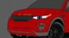
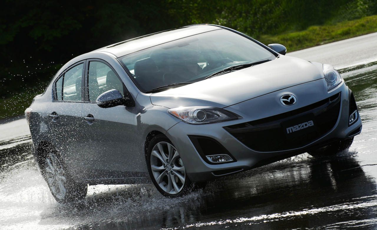
My art style has definitely changed, in a slow hard to pin down exactly when, sort of why. You can tell back when I started I actually had Cindi shaped more like a real Miata with smaller eyes, and Ashley.. well I can't really say she looks more like a Mazda 3 in the original, I actually think she looks more like the real car now actually. But this was the very first picture I ever drew her in so that would explain why she doesn't look quite right.
Probably my happiest improvement is when it comes to shading, something that bothers me about the original nowadays is how flat the shading is, the sun is behind them yet they look fully lit like the sun is right overhead and they're a bit TOO shiny... though not that shiny cleavage doesn't look appealing. Though it's not exactly the correct amount of shine you'd expect to see on a rubber-like material which their chests and bellies are made of, it looks more like metal.
Another big change, I went from drawing with pencil and scanning the line-work in, to using a tablet. Probably one of the best decisions I ever made in my art career.
Small change that's pretty obvious, I bounced Cindi up a cup-size or two to emphasize her as having a larger bust then Ashley. Cindi being Ashley's big dumb big-breasted friend that she can't help but be a bit jealous of being made rather canon.. though not as much as if I'd actually release any of the many comics of the two I've had stuck in my head for years. x.x
What about you guys? See any differences I missed? Be honest, what style do YOU prefer?
My original picture, shipping Cindi and Ashley as beautiful busty besties all the way back in 2015 has long been one of the pictures I point to when I tell people I draw anthropomorphic cars and they ask 'wtf is that.' I dunno.. I guess one for the fact there's no porn in it, but also because it's sadly one of the few kinda candid pictures I've drawn just showing anthro cars kinda just... being. So if I was going to go back and redo any picture I decided this would be the first one.
My art style has definitely changed, in a slow hard to pin down exactly when, sort of why. You can tell back when I started I actually had Cindi shaped more like a real Miata with smaller eyes, and Ashley.. well I can't really say she looks more like a Mazda 3 in the original, I actually think she looks more like the real car now actually. But this was the very first picture I ever drew her in so that would explain why she doesn't look quite right.
Probably my happiest improvement is when it comes to shading, something that bothers me about the original nowadays is how flat the shading is, the sun is behind them yet they look fully lit like the sun is right overhead and they're a bit TOO shiny... though not that shiny cleavage doesn't look appealing. Though it's not exactly the correct amount of shine you'd expect to see on a rubber-like material which their chests and bellies are made of, it looks more like metal.
Another big change, I went from drawing with pencil and scanning the line-work in, to using a tablet. Probably one of the best decisions I ever made in my art career.
Small change that's pretty obvious, I bounced Cindi up a cup-size or two to emphasize her as having a larger bust then Ashley. Cindi being Ashley's big dumb big-breasted friend that she can't help but be a bit jealous of being made rather canon.. though not as much as if I'd actually release any of the many comics of the two I've had stuck in my head for years. x.x
What about you guys? See any differences I missed? Be honest, what style do YOU prefer?
Category Artwork (Digital) / Portraits
Species Unspecified / Any
Size 1575 x 1224px
File Size 635.4 kB
Listed in Folders

Cute! Though I personally prefer the old style to the new one. Much cleaner lines and the blockier heads make them look more like cars instead of expies of Stewie Griffon. I do agree on the chest sizes though, Cindi really took to the bigger sizes to make her stand out with her comparably heavily-chested friend, looking back on it!
Well it's an intentional style change, from pencil drawing to more of a painting look. I find that taking some things away leaving more to the imagination is a big sexier, like you'll notice I left out the line of the hood on Ashley now. But her head now as opposed to before IS more accurate to how the real car looks. Honestly Cindi's head has never been accurate to the real car very much in either version. I don't think she's actually faithfully looked like a Miata since her initial porno debut pictures as 'Wardrobe Malfunction Miata' which I don't even really consider Cindi at this point.
The lines are a bit thicker, a bit softer, but there's no less detail in the picture, in fact there's more in the newer one.
Mmm, yeah, big ol boobed Cindi. <3
The lines are a bit thicker, a bit softer, but there's no less detail in the picture, in fact there's more in the newer one.
Mmm, yeah, big ol boobed Cindi. <3


Huh, I didn't actually see the difference at first, but I can honestly say that I like the 2015 one better, though the bigger boobs and better shading are always welcome! Especially the boobs.... Oh, I also like how the new one shows slightly more tongue, car tongues are good! <3
That's the magic, spotting the subtle improvements. The tires are no longer misshaped, Ashley's head is better more accurately shaped, the boobs are more plump perky and full, Ashley's upper arm is is better shaped, and of course the better shading.
I appreciate the honesty, but can you at least explain why you think that? I mean you're basically saying I've gotten worse but then not explain one bit why you think that. It's not very constructive on my end.
I appreciate the honesty, but can you at least explain why you think that? I mean you're basically saying I've gotten worse but then not explain one bit why you think that. It's not very constructive on my end.
I mentioned to someone else, the boobs are TOO shiny, they look like they're made out of metal. You don't want metal boobies do you? You want big bouncy jiggly ones right? So I've learned since then to match the luminacity to the material. Anthro-Cars have rubber bellies or a rubber-like material. Rubber is not shiny, the shines are muted. The boobies still have some highlights to them, they just don't gleam like metal.

Wow you certainly didn't hold back did you? Guess I asked for it. Hopefully you'll be alright with me responding in an equally harsh manner, I deserve to defend position right?
Firstly maybe this wasn't the best way to demonstrate my improvement as I'm naturally not going to pour a ton of effort into a picture I've already drawn. That or the things I value on being improved are different then what people in general look for. To me there were so many problems with the original that taking things out like tire treads were hardly a loss. I could have put them in, it would have been like what I did on Blake's ignored picture. https://www.furaffinity.net/view/29872160/ To me I'd rather not have certain details put in if they're not going to look good. That old way I used to draw treads wasn't even accurate to how treads look, it's just zig zagged lines and they're far too spread apart. Well correction only the tire on the lower left has actually real tread pattern..see I couldn't even be consistent in the old drawing. The tires in the old version were lop-sided and misshapen, there was no shading or anything to even make them look round.. they look like flat bars. I didn't put tread on the tires on the new ones but I added lines on the edge to show a curved surface and shading to make them look round like tires.
What background is there for them to blend into? I don't understand, the trees? I personally hate backgrounds.. they're the thing I'll put the least effort into drawing if I have to draw them unless they're important to the setting of the picture. If you say they blend into the background because of the same thick lines being used on the background objects as on the characters, the same line width was being used on the characters as is the background in the original too though.
Again about the shininess, I'd rather do realistic shininess or not do it at all. I can do shiny cars, look at the Tesla picture for example https://www.furaffinity.net/view/27948325/ but Cindi and Ashley are not show-room where they look like mirrors with flawless clearcoats because they never leave a garage. The girls are image conscious sure, but they're still daily drivers, they've got the oxidation of an outside car that actually spends time outside. The shininess as you call it is unrealistic, they look like they've had vasoline blobs smeared on them, the shines aren't sharp or even detailed enough to look like real shines. I hardly shaded to where most of the 'popping' that the original has is because my shading was almost nothing but highlights. I also took material into consideration. The girls' chests and bellies are made of a soft bendable jiggly rubber material, anthro-cars bellies have always been made of rubber. Unless the girls cover their bellies in tire-shine, rubber is not going to have big deep hard reflective highlights on it like it does in the original.. their boobs look like they're made of metal in the original with how bright those highlights are. Speaking of which look by Ashley's sideboob, the highlighting is so bright there that you can hardly even see where her belly meets and turns into the painted side of her body unlike the remake where it's defined.
My last thing about the shininess, look a Ashley's face in the remake and then on a real Mazda 3.. https://hips.hearstapps.com/amv-pro.....s-original.jpg it's not a mirror with a huge array of shininess. There are shines on Ashley's face, on her cheeks, the top of her lip and head. Then you've got the light bloom on top of her head from the sun behind them.
The lines are thick but that doesn't mean they're not detailed, there's more detail in the new one then there is in the old one. Not to mention more accurate. Look at Cindi's turn signals in the original they're not even the same size for Christs sake. The gleam on Cindi's plastic cup has a literal line drawn around it. The crumpled bra-string fabric under her bikini bra-cups is actually ruffled and defined rather then a straight flat line. The cup actually has accurate tension folds coming down from the shoulder strap demonstrating the weight of the boobs pulling down.
Anyway, same, don't mean to come off as defensive, I appreciate you stating your opinion. I'm just equally shocked at people's reactions. I kinda feel like the things I value in a drawing like symmetry, fabric fold accuracy, proportions and such.. aren't what most people seem to care about as much.
I'm also curious as to what my picture looks like on your screen. You say they look drenched in darkness, do you just need to turn the gamma up on your monitor? Or is mine super bright compared to others by default? I mean there's more shadows, but their backs are to the sun.. it should look like that but it definitely doesn't look DARK... they're just backlit. The tops of the girl's metal heads are in so much light there's BLOOM.

I'm pretty sure people are preferring the old style due to the resolution difference. It looks like there are just many more pixels on the right, either that or you intentionally made the left more blurry. Though the individual aspects of each car is superior on the left, the overall look is decreased.
They're actually the same resolution, the new picture was drawn over-top of the original. But the original was a scanned pencil drawing, with the initial scan being some gigantic resolution which was downsized.
Also you're right, I use a soft brush now. I like drawing in a style that looks like a painting.
Also you're right, I use a soft brush now. I like drawing in a style that looks like a painting.


Comments