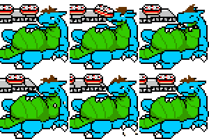
Another commission for  rykken, whom wanted to see Simon from the most recent story commission. He's hugging up against the wizard tower, just like he did in the story! Yay!
I really wasn't sure exactly what I was doing with this one for starters, but it came together well once I doodle up the tower and everything else first, then got the big burly fellow in there afterward. He just barely fits! Yay!
So yes, enjoy the big fatty-fat dragon. He's certainly happy with the situation.
 rykken, whom wanted to see Simon from the most recent story commission. He's hugging up against the wizard tower, just like he did in the story! Yay!
I really wasn't sure exactly what I was doing with this one for starters, but it came together well once I doodle up the tower and everything else first, then got the big burly fellow in there afterward. He just barely fits! Yay!
So yes, enjoy the big fatty-fat dragon. He's certainly happy with the situation.
Category All / Fat Furs
Species Dragon (Other)
Size 1034 x 802px
File Size 353.3 kB
Devil's advocate here, since everyone seems to be approving the content, I'll comment on the execution, especially since it's a commission.
http://i50.tinypic.com/126e6c4.jpg
When you draw, what kind of structure do you use before you get down to lining? I think you'd benefit from using 3D structure rather than 2D, as it will help give a sense of form. Currently, the tower looks like a cardboard cutout, since there is no suggestion of form. Is it a cuboid, or a cyllinder? The art doesn't tell me this, and it remains ambiguous. Try to visualise it as a whole form, front and back, sides as well.
Try to draw clearly and concisely, case in point would be the stairs and path leading to the tower - curve it so that the eye is lead back into the picture. As you have it now, it kind of jars, especially with the lack of ground. (don't be afraid to add ground! A character doesn't have to take up the entire space to look big)
On the subject of ground, composition is helped if you have more negative space - more ground will give a sense of space, and more sky will weight the subject more (an example given in design class was a mountain range. If you had too little ground underneath it or too little sky above it, it looked like the mountains were just about to rocket off into the sky. Space will give more gravity to a picture).
One recurring problem I'm seeing is that you really fill up space in the picture regardless of the action taken within. Negative space is a good thing - the empty space can give more dynamism or even anticipation to a still image. If nothing else, it would give the viewer some breathing room so that they're not overwhelmed by the image.
Another thing is you use stock cloud stamps - which is analogous to the grass brush. It looks alright, but it also looks like a cloud stamp. Very dull and pedestrian. Experiment with creating your own cloud brushes - I find a scattered, low opacity brush with noise and low flow creates some very nice clouds. Don't rely on stock effects to create your picture - you've got to make your own mark! Would you copy and paste quotes from Poe and Hemingway when you wanted to create a written scene? Of course not, you'd take the style and make it your own. The same applies to art! And Lens Flare? The artistic equivilant to "It was a dark and stormy night".
Remember your colours, also. Pure red, green and blue look terrible, and don't exist in real life. If the light in the scene is bright enough to create that lens flare, the parts that hit the guy will cause the light to become yellow-green rather than green. Hue shift! Really craft the scene in a way that will make people's mouths water, and the simplest way to do this is to play around with the colours. It's not enough just to say something is green - labour to make it the RIGHT shade of green.
Keep going. You're not quite there, but it's just a matter of breaking through the habits you've built up and really think about the art of it, rather than the content.
Ooookay, I'm getting really tired of these lectures of yours being placed on everything I do. Have you perhaps stopped and thought that perhaps I don't want to be told how to do every little thing? I just know you're going to hide behind some defense of "constructive criticism" just like every other time, but I'm really getting sick of it. Thanks for defacing my artwork through your link there too, real dick move.
Your opinions and self righteous commentary is really not welcome here. Please just leave me alone, you're bothering me.
Your opinions and self righteous commentary is really not welcome here. Please just leave me alone, you're bothering me.
Sorry bruv but that is constructive criticism.
I'll give a couple of examples of constructive and non-constructive criticism, using my own stories as reference so no one feels offended.
Constructive: "You start too many sentences with you, consider using more verbs and nouns."
Non-constructive: "STOP USING "YOU" SO MUCH IT MAKES THE STORY SUX"
I'll give a couple of examples of constructive and non-constructive criticism, using my own stories as reference so no one feels offended.
Constructive: "You start too many sentences with you, consider using more verbs and nouns."
Non-constructive: "STOP USING "YOU" SO MUCH IT MAKES THE STORY SUX"
Don't take it personally, Tombfyre. I was just doing what other artists and my lecturers do to my work, which is evaluate and critique. I mean, I know I'm not the greatest artist, but the comments section is for more than just blind praise, and aren't we all supposed to strive for improvement?
I'm not sure how to take your implication that I'm attacking you, and that constructive criticism is a mask that hides my true, sinister intentions instead of being the goal. I don't even know why you think what I'm saying is self-righteous. Sure, I know mostly what I'm talking about, but if I didn't, I wouldn't be trying to help :P. I wouldn't try and point out design flaws in a car, for instance since I wouldn't be knowing what I was talking about. But I am trained in the field of art. Why wouldn't I try to help? Humans are social creatures, we learn best by cooperating!
The redlined picture is something I picked up from my experience with other artists. It's a visual critique, not defacement. I'm not even drawing over the original picture, so nothing is defaced or lost. It demonstrates the point where text isn't so precise. Other artists also find it useful.
And finally, if the opinion of an artist trying to aid another isn't welcome, what is? Take that away, and you're left with blind praise, and apathy (since vitriolic negativity is never welcome). Think about it.

 FA+
FA+


Comments