 FA+
FA+
1164
Views
Views
47
Favorites
Favorites
Category
Artwork (Traditional) / Animal related (non-anthro)
Species Tiger
Size 800 x 1000
File Size 760.2 kB
Report this content
More from melo666
")


")
")


Sapphire WIP (Colored Pencils Pt2 + acrylic highlights)
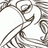
Ok! Sorry for the messy mish mash of pics and arrows, but Itll help me explain better :D
First off: It is important to leave the white ink for last, because as you work with colored pencil, it has a tendency to have loose pigment. Your bold white will be "contaminated" with color pigments(since they sometimes brush off), thus reducing the detailing effect. I also added a small shot of workable spray fixative, in order to seal all that hard work I did layering the pigments. The wet paint brush might drag out some of the pigment. I don't want that to happen ok. 8|
in 1a. The arrows are pointing to the eyes in order to note how dull the shines look.
Secondly, at this stage, a second layer of darker warm grays were used to bring out more fur detail. I also colored in the hair and added a base highlight with white colored pencil.
In image 1B, I am drawing attention to the messy brown overlapping the white. I will go over this, and other similar areas with acrylic inks throughout the ENTIRE drawing. I use DR. Ph Martin's Pen White. Other acrylic inks are fine, and so is acrylic paint. I just have a preference to this.
It is very opaque, and can be added with water inorder to get something more transparent.
2. Draws attention to the difference the highlights make when using acrylic inks. In picture 2, the arrows are pointing to areas where I added some of this. The eye shinies are very opaque where the two dots are. Then I dilute the ink in water to create a transparent tone, and add a few more shines in the eyes. I also started to add the eyebrow whiskers, and reinforce the overlapping white fur over the brown stripes. Eye lashes and fur detail was also added to the eyes.
3. I use a 0 winsor and newton sable brush for details.
Picture 3 shows the extra fur detailing strokes I previously mentioned. Again, this is done everywhere in the image(stripes, ears) to bring out more detail. The paint is a bit diluted for the most part, and not at its complete opacity. This allows for the base color to come through and look natural.
4. Picture 4 points to the chin fur/whisker detailing, and the other arrow points to the difference it makes when you add acrylic ink to the jewelry shines(compare it to 1A,1B).
5.Pic 5 shows the opaque white whiskers. The ink comes straight from the bottle, no water added. This way it adds a nice contrast and depth to the rest of the image. It also helps make the other opaque areas pop.
I hope this helped. I will make a much nicer tutorial in the future. All recent WIP'S will be put in my scraps soon.
Category Artwork (Traditional) / Animal related (non-anthro)
Species Tiger
Size 800 x 1000px
File Size 760.2 kB


Comments