 FA+
FA+
519
Views
Views
86
Favorites
Favorites
Category
Photography / Animal related (non-anthro)
Species Canine (Other)
Size 562 x 800
File Size 132 kB
Report this content
More from kurst


Okay photographer
I know you said you like me as a model
But honestly
You can level with me
Do you find something about me,
maybe something special,
you find particular attractive?
----
Updated - Alternative Cut Available Here
I know you said you like me as a model
But honestly
You can level with me
Do you find something about me,
maybe something special,
you find particular attractive?
----
Updated - Alternative Cut Available Here
Category Photography / Animal related (non-anthro)
Species Canine (Other)
Size 562 x 800px
File Size 132 kB


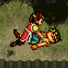


HE HE well everyone has their opinion and what they want i the picture.
That is one thing about photography is great 3 people can take the shot heck the same person can take the shot millionths of a second later comes with a different picture a different feeling.
The angle was intentional - It was taken in hand like that. There are 2 lines of intersection that I wanted to keep straight and honestly i feel they are pretty straight everything else I wanted to be feeling not angled correctly. I want a slight wrongness feel in the background so that it puts people off and make it less of a traditional portraitf If I was told i needed to move the angle around I would move it about 2.3 degrees clockwise. Not very noticeable for most people.
Colors and brightness is always a icki thing for the web. I color calibrate my monitor about once a week but that's not going to help web users ;) I usually look at a mac and PCs I have around the house and work to see if I really like a picture.
In this picture I kept in mind the detail of the off whites and keeping the tones in the chest and other areas. I wanted to go away from my traditional styles. I also wanted the picture to not be "bright and cheerful" to get more of somber mood.
If a professional photographer and a customer came up to me and asked for changes based this is what I would do.
The picture itself would be rotated about 11 degrees clockwise. Because of that the crop changes so you lose the tree in the background (one of things that I wanted to keep but oh well). I would kill the background more because of that. I would expand the color dynamic range a little bit and pull out some of the whites separately. Of course by the time I finish that it looks like a completely different shot making it look completely like a model shot. While not what I intended it indeed a shot i know people would like to me it looks like a lot other shots i have.
I'll post that version up in a few days I would like this one get it's rewards or jeers without that picture's interference.

Thanks for your reasoning behind the shot. As I said, just my viewpoint. He's quite the looker regardless and it's still a wonderful shot :)
I would love to see the other version, but I understand the holding off. I usually post two versions of a shot if I'm not sure how it will be received or if I'm trying something a little more experimental. I put the one I like and was going for up (just as you have done) and then put the other version in scraps or post it later with a slightly different title. Going for a model shot does kind of get old if you have a large base of that kind of shot already, but I gotta say I love your model shots so I'm biased ;)
As for the color/brightness and the web....so so true. It's kind of aggravating to work with as there's no "easy sync" solution for everyone to have the same color profile. That may be a good thing though as everyone perceives color and brightness differently. You're lucky to have so many ways to cross examine your final product in house!


Comments