 FA+
FA+
488
Views
Views
51
Favorites
Favorites
Category
Artwork (Digital) / All
Species Dragon (Other)
Size 700 x 700
File Size 108.9 kB
Report this content
More from Narffet


")
")


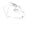
Been playing around with linestuffs since I've been working back into the groove. With the pokébois I kept them super-thin, and I liked the result aside from a few technical errors that really started in the sketch. Here I've added some variation but otherwise kept simple. So I'm looking for thoughts... is the style and the lines:
1.) Fine the way they are?
2.) Need a thick outline around the main figure overall?
C.) Need more figure-wrapping and expressive thicknesses?
ƒ.) I wet myself, please change me?
Also, don't expect this one TOO soon xD; I'm going to get started on owed work shortly and this will be attended to occasionally as I go along. I've rarely been this comfortable with my work before though, but it'll take some dedication to finish.
Category Artwork (Digital) / All
Species Dragon (Other)
Size 700 x 700px
File Size 108.9 kB

I actually had started thickening some of the lines before I'd realized that I didn't want to do it so much >.> But yeah, I think the level of detail would get detracted by thicker lines. Figuring out if there's anything more to emphasize or not will be gone over before I start coloring, though.


if you dont color it this will work perfectly, it looks awesome! the fine lines add a lot of class the the picture^^
but if you plan to color it id make the outer lines thicker, like celpendragon said
but if you plan to color it id make the outer lines thicker, like
 celpendragon said

1. eh no! the lineart is awfully pixelized. possibly you worked on big size. and resizing the lines gave this horrible result.
2. not only around the what-you-say, but also EVERYWHERE on the lineart.
C. em... maybe?
ƒ. pay me one million dollars (that i'll convert into Euros) and we'll talk about it.
2. not only around the what-you-say, but also EVERYWHERE on the lineart.
C. em... maybe?
ƒ. pay me one million dollars (that i'll convert into Euros) and we'll talk about it.
1.) 300dpi initially, reduced for posting. It's not a terribly big concern to me here, though if there IS a better way of doing it I'm open to suggestion.
2.) Oh I know some things need more emphasis, but I also don't want to overdo it at the same time. Also, objects in the back, namely the wings, are staying significantly thinner to remain wispy.
C.) Nah, the anatomy on this isn't stylized enough. And I think some of the detail could get lost unless it was done impeccably, and I'm still working on this particular style so I don't know if I'd do it justice quite yet.
ƒ.) I did this initially for the READERS would want changing :P I'm totally dry... at the moment.
Thanks for the feedback!
1. i was sure. 72dpi and resized with a value of 300dpi for me too. but how i don't line from the same way than you, the pixelisation is almost invisible (my SAI tools are settled by default). i suggest you to line with bigger size of your tool.
2. myeah. better to leave it like that, indeed.
C. *speechless*
ƒ. duh :C
2. myeah. better to leave it like that, indeed.
C. *speechless*
ƒ. duh :C


Comments