 FA+
FA+
298
Views
Views
26
Favorites
Favorites
Category
Artwork (Digital) / Fat Furs
Species Unspecified / Any
Size 461 x 653
File Size 189.5 kB
Report this content
More from Dragonkick


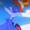
I'm really trying to improve my colouring. Any suggestions?
Category Artwork (Digital) / Fat Furs
Species Unspecified / Any
Size 461 x 653px
File Size 189.5 kB

I suppose it depends on whether you want to go for a more toony look or move towards something a little more rendered. Frankly, your coloring is already quite good, easy to look at and very accurate in regards to light sources.
One of the things you could try is smudging certain edges of the highlights and shadows along smoother portions, for example the gradual contour of her belly and whatnot. Also, if you go for a more detailed background, contact shadows at the feet keep the character grounded, so you don't have the look of 'em floating around.
Obviously, those'r just a suggestions :3
In my opinion, I think your coloring is very cleanly done, and really helps to make this stand out. Nicely done methinks!

Try to make the colours follow how light would behave - less saturated green that's shifted towards yellow for highlights, and more saturated green shifted towards blue for shadows. It's to do with colour temperature. It's sciencey x3
It'll make the picture really stand out and look more 3D than if you used the same hue and saturation for all of it.
It'll make the picture really stand out and look more 3D than if you used the same hue and saturation for all of it.

oooh absolutely adore this drawing, this is downright adorable and really well-drawn proportionate-wise and stuff, I especially like her face.. oh, and the thumb-under-waistband ;)
Years ago I stumbled upon a great coloring tutorial, but I doubt I can find it again. I'll look though.
Years ago I stumbled upon a great coloring tutorial, but I doubt I can find it again. I'll look though.


Your cel-shaded style works very well for your work, and gives a good impression of depth because of how you follow the contours of your character's form. Someone above mentioned using more shifts in hue towards warmer or cooler colors in your highlights and shades, and I agree. Also, you might want to try experimenting with different types of lighting, such as a character lit from below by firelight, or from multiple sources.
Aside from making interesting pictures on their own, it can also sometimes help give you insights as to how to improve your style in your own way.
Aside from making interesting pictures on their own, it can also sometimes help give you insights as to how to improve your style in your own way.
Comments