 FA+
FA+
295
Views
Views
6
Favorites
Favorites
Category
Artwork (Digital) / All
Species Unspecified / Any
Size 1903 x 2989
File Size 1.11 MB
Report this content
★
More from AlphaGodith

")


Listed in Folders


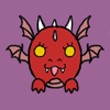
i hate my art style. the most common comment i get is that it is 'cute', and while i obviously am not upset at people for saying that (because it's true and i will never fault someone for simply stating fact), it is a truth i am not happy about. so i want to change it.
now, my current style is not something i put any effort into developing. i was told early on in my art endeavors that style was just something that came through naturally, and i'm hella lazy, so it's literally just what is easiest for me to produce, not something that i designed to even appeal to my own personal tastes. so i guess what i was told is wrong, and you actually have to put in some effort to develop an art style you like XD it seems like nothing that comes naturally to me is good.... every part of my existence is a struggle for even a small amount of satisfaction.
anyway. i was told a few things that could help me fix my style. smaller, less detailed eyes- don't wanna do that cuz i LOVE eyes. more realistic, detailed anatomy-would love to, but i'm lazy. i want something i can do quickly. also, i've seen simpler art than mine that still managed to be wonderfully unsettling (see johnen vasquez), so i think i can do it without having to use photo references all the time.
some things i've noticed myself- my art is full of curves(like my face and body irl, eeeey), and art i like is primarily angular/geometric. i'm REALLY bad at straight lines... but i do think i could do it, if i just don't worry about the lines being kinda sketchy. the other thing is that it tends to be traditional... or at least, monochromatic, and full of sketchy pen lines and solid-black shadows. sketchy i can do, but the solid shadows aren't something i'm familiar with... particular texturized shadows. you can see my first attempt here.
i also love stylized colors, with most being desaturated and one or two fully saturated. that's another one i don't do often cuz i have a problem with people thinking my sona is grey already, so greying her anymore would be counterproductive.... but... i dunno. i worry so much about conveying a particular idea, but nobody seems to like that... they want the stylized stuff, where the thing IN the picture no longer matters, but rather just the overall look and feel of the image itself. not sure how i feel about that... i want people to be interested in what i'm making, not just how i present it.
anyway. tldr; i hate my style cuz everyone says it's cute, and here is my attempt to make it more creepy.
Category Artwork (Digital) / All
Species Unspecified / Any
Size 1903 x 2989px
File Size 1.11 MB
Listed in Folders


Looking at these, I think the key to making things less cute might involve using less saturated colors rather than making a huge change to your style. Saturated colors = cartoony, and it is easier for that kind of stuff to look cute.
My personal favorite of these is the 3rd from the top. ^^
My personal favorite of these is the 3rd from the top. ^^
Comments