 FA+
FA+
2153
Views
Views
77
Favorites
Favorites
Category
All / Muscle
Species Dragon (Other)
Size 1068 x 960
File Size 165.7 kB
Report this content
★
More from Tyr Remora


Listed in Folders


Megaton Zeta Growth 1
Something Inspired by Kitora's Megaton dragon Comic.
Jay and I liked How Zeta looked like, so I offered to enlarge him to match Zeta.
___________
Here is Jay Signing a wavier to agree that Twitch won't be responsible for loss or damage of property, physical image and/or virginity.
Twitch © twitch_the_dragon
Jay Tanoshi © jaytanoshi
Jay and I liked How Zeta looked like, so I offered to enlarge him to match Zeta.
___________
Here is Jay Signing a wavier to agree that Twitch won't be responsible for loss or damage of property, physical image and/or virginity.
Twitch ©
 twitch_the_dragon
Jay Tanoshi ©
 jaytanoshi
You can get early access to pictures I do and at full uncompressed sizes on my patreon!

Click HERE!


Or you can donate through ko-fi!

Click HERE!


Or go to my front page and give me some shinnies!


Category All / Muscle
Species Dragon (Other)
Size 1068 x 960px
File Size 165.7 kB
Listed in Folders


Review because you are on "I love critiques".
The biggest thing here, is to work on anatomy. Right now I see a lot of things that don't quite match up, so more study in that area in needed. When you look at muscles groups really look at the way they play off each other and start thinking of shapes layered on top of one another; mass, shape, volume. That lends the character weight. Remember that the better you know reality, the better your fantasy elements will be. Always. Currently it feels like these are your ideas of muscles, and not the real things. I highly recommend these two books: http://www.amazon.com/Human-Anatomy.....982&sr=8-2 and http://www.amazon.com/Artists-Guide.....ref=pd_sim_b_5 HOWEVER, try drawing from real life as much as possible. If you draw from a picture, your drawing will flatten out- all pictures lose their volume and therefore are not the best study guides. Nothing replaces real life observations.
Line weight: Vary it up. All lines (in a finished piece) should not look the same. The exception is a very stylized approach to art, but I think you should be focusing on the basics first before you move into stylization. Currently it doesn't look like you're very confident with your line, so try longer strokes instead of shorter ones.
Shadows- you have cast shadows, but you don't have consistent shadows moving through your characters. They're only here or there.
Currently it feels like he's standing in a box, not a room. There are also some problems with perspective here.
Limited color pallets are good.
Keep at it and good luck!
bit more than i wanted but good enough XD
Anatomy: thanks but i'm trying to have a cartoony(as in '90s superhero western cartoon with a hint of japanime) style rather than realistic, don't have the patience to make everything look super realistic. though i will say that i did base the muscles off observations and feels of my own body. Remember that the persone you pass criticism has their own style that would most likely by ranging from a bit to completely different
Line weight: I honestly have trouble understanding what that term is XD. I do short strokes because the longer i do strokes the more my lines are "everywhere but where i want them". so yeah i'm definately not confident with my lines.
Shadows: this advise however i will take into consideration, but unfortunately it wasn't unknown, I've only just started doing shading and shadows and i know i need to be more consistant with them.
perspective: I'm not patient enough to put effort into backgrounds. I,m gonna need practice to gain some. You're going to need to point out the mistakes in perspective if i'm going to try and do better
Color: Can you elaborate on "limited color pallets are good"?
Hello!
Part of the problems with critiques is trying to gauge the intent of the artist- whether they want to do cartoons or take a more realistic approach. Something to consider though- most cartoonists have a very good grasp on the way the body works and could draw realistically if they were asked to. Because they know how weight is distributed through the body they can make their stylization look more believable. When you make a stylistic choice it's important to know WHY it works otherwise it looks like you're guessing and the piece won't feel as good. I'm going to add the Animator's Survival Kit by Richard Williams http://www.amazon.com/Animators-Sur.....981&sr=1-1 and Animation 1 by Preston Blair http://www.amazon.com/Animation-Lea.....ref=pd_sim_b_6 to your recommended reading list. All the above stuff I mentioned will definitely help you with your shadows as well- once you know your volumes, you'll know where they cast shadows.
Longer line strokes can be frustrating, and I *STILL* find them annoying to do so. That why we need daily practice. Take a sheet of paper and just fill it up with longer and shorter strokes. Warm up and get used to doing it. One of my professors once said that it takes about 40,000 hours to become a master at something, so this stuff doesn't happen to anyone overnight, unless you're maybe Bernini or some other crazy talented guy; I know I'm not. Do another page of drawing circles in one stroke. That's pain too, but worth it in the end.
Line weight is the thinness or thickness of the line. Usually an illustration will have thicker lines on the outline of the figure, and thinner lines inside- helps define form. You'll want slightly thicker lines on the under side of objects as it gives weight. It also means the line usually with not have the same thickness through the entire stroke.
Perspective: every art piece that has volume should have a vanishing point (or more than one) in mind. Things get smaller as they head out to those points. Right now your room's perspective is telling me one thing (diagonal) but y our figure is standing on a plane so it's not matching. Also the stool's angles would go back to the same point. Here's an excellent book on this stuff: http://www.amazon.com/Vanishing-Poi.....598&sr=1-6 and some illustrations to highlight what I mean: http://www.how-to-draw-and-paint.co....._drawing10.jpg http://www.kunstkurs-online.de/Seit.....s-zeichnen.jpg You'll need to know this stuff no matter what style of art you chose.
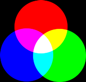
Limited amounts of color let you focus your attention on the piece, while too many colors are distracting. Here's an almost monochromatic painting: http://www.furaffinity.net/view/3345139 and one of a limited amount of colors: http://www.furaffinity.net/view/3285650 (Red, Blue, Green- using all the primary colors from the additive wheel http://docs.gimp.org/2.4/images/glo.....l-additive.png).
Remember that all these things are built up in time, but the sooner you start thinking about them, the sooner they just become part of what you do. The sooner that happens, the sooner you become truly awesome.
Part of the problems with critiques is trying to gauge the intent of the artist- whether they want to do cartoons or take a more realistic approach. Something to consider though- most cartoonists have a very good grasp on the way the body works and could draw realistically if they were asked to. Because they know how weight is distributed through the body they can make their stylization look more believable. When you make a stylistic choice it's important to know WHY it works otherwise it looks like you're guessing and the piece won't feel as good. I'm going to add the Animator's Survival Kit by Richard Williams http://www.amazon.com/Animators-Sur.....981&sr=1-1 and Animation 1 by Preston Blair http://www.amazon.com/Animation-Lea.....ref=pd_sim_b_6 to your recommended reading list. All the above stuff I mentioned will definitely help you with your shadows as well- once you know your volumes, you'll know where they cast shadows.
Longer line strokes can be frustrating, and I *STILL* find them annoying to do so. That why we need daily practice. Take a sheet of paper and just fill it up with longer and shorter strokes. Warm up and get used to doing it. One of my professors once said that it takes about 40,000 hours to become a master at something, so this stuff doesn't happen to anyone overnight, unless you're maybe Bernini or some other crazy talented guy; I know I'm not. Do another page of drawing circles in one stroke. That's pain too, but worth it in the end.
Line weight is the thinness or thickness of the line. Usually an illustration will have thicker lines on the outline of the figure, and thinner lines inside- helps define form. You'll want slightly thicker lines on the under side of objects as it gives weight. It also means the line usually with not have the same thickness through the entire stroke.
Perspective: every art piece that has volume should have a vanishing point (or more than one) in mind. Things get smaller as they head out to those points. Right now your room's perspective is telling me one thing (diagonal) but y our figure is standing on a plane so it's not matching. Also the stool's angles would go back to the same point. Here's an excellent book on this stuff: http://www.amazon.com/Vanishing-Poi.....598&sr=1-6 and some illustrations to highlight what I mean: http://www.how-to-draw-and-paint.co....._drawing10.jpg http://www.kunstkurs-online.de/Seit.....s-zeichnen.jpg You'll need to know this stuff no matter what style of art you chose.
Limited amounts of color let you focus your attention on the piece, while too many colors are distracting. Here's an almost monochromatic painting: http://www.furaffinity.net/view/3345139 and one of a limited amount of colors: http://www.furaffinity.net/view/3285650 (Red, Blue, Green- using all the primary colors from the additive wheel http://docs.gimp.org/2.4/images/glo.....l-additive.png).
Remember that all these things are built up in time, but the sooner you start thinking about them, the sooner they just become part of what you do. The sooner that happens, the sooner you become truly awesome.
Well unfortuantely i'm not depending on my artistic skills to get through in life so little chance i'll be buying those book. (except for Animator's surival kit if i ever see it. I've heard and seen taht book do wonders)
Perspective: i actualy know how to do proper perspective, but as i mentioned before i'm too impatient and i just guess the perspective. it will improve over time.
Line thickness: Something i will defiantely try from now on, though i can't stop thinking of this as a useless time wasting technique that barely does any difference(I don't ahve artist/critic eyes i'm easily pleased XD)
Limited Color Pallet: Well that's good, i try coloring as less as possible due being partially colorblind so complex color variations are nearly impossible for me to pull of which is why i've turned to simple Anime color and monotone shading because i dont, want to give on on coloring completely
Comments