 FA+
FA+
1193
Views
Views
48
Favorites
Favorites
Category
Artwork (Digital) / Portraits
Species Unspecified / Any
Size 1280 x 468
File Size 91.9 kB
Report this content
★
More from NX-42


Minor Characters #2
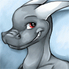
A second set of smaller portraits for minor characters. It's actually sort of ironic that the faces of the minor characters get more details than the major ones.
This is Kate, Thonnen, and Millicent. I am particularly and very strongly proud of how Milli came out. It's a shame she won't be appearing again (not for a long while, certainly), because - and I'm trying not to be self-celebratory here - I think she looks quite stunning.
Kate looks a lot more gentle than her personality really should, as I always imagined her as a rather punkish, firebrand sort of personality.
It is now occuring to me that five of the six minor characters I've drawn are girls, and the one boy is a convincing cross dresser. Probably speaks poorly on my behalf that all the females get weaker roles. It's actually a fear of mine to be accused of sexist writing and it's something I hope to fix in the coming plots.
Category Artwork (Digital) / Portraits
Species Unspecified / Any
Size 1280 x 468px
File Size 91.9 kB


you know, now that I'm looking at Rick, shall we say, undistracted, I notice a couple things about this style.
I think you've got a major flaw in this design, albeit one very readily fixed. (also in your Rick picture, his eyes were gray. I thought there was something off about that.)
It's the eyebrows. I don't think you're getting the full range of expression you can get with a zigzag and a line. It's sort of why Rick, in his previous picture, looks more like a stoner than he does an engaged character. I actually had every intention of mentioning it yesterday, when I noticed it, but it was going to be about that picture specifically. Now looking at the headshots, I think you may need to use less straight lines in your eyebrows.
A compliment in company with the criticism: It is for entirely unselfish reasons that I really like Rick's new hair. You've either de-emphasized his big feather-mullet-bangs or you've gotten rid of them completely, which makes for a far more realistic look. Knowing that this is what you are after, it's a surprisingly effective step, and doesn't make him look any less model-ish.


Comments