 FA+
FA+
1308
Views
Views
85
Favorites
Favorites
Category
Artwork (Digital) / Fanart
Species Unspecified / Any
Size 1382 x 1842
File Size 1.03 MB
Report this content
More from Symbolhero


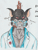
Finally, the last pic for the year.
Having My characters Orion and Alice, AND a special guest on the pic which is Ren (I believe that´s his name) from rabbity featuring a cosplay of Nier Automata.
Obviously we won´t forget Emil´s participation since he´s an icon from Nier saga ; )
A little tune to remember how good the OST is:
https://www.youtube.com/watch?v=6uIo3bYlpwE
Will take the chance as well to wish you guys for a HAPPY NEW YEAR : D
Having My characters Orion and Alice, AND a special guest on the pic which is Ren (I believe that´s his name) from
 rabbity featuring a cosplay of Nier Automata.
Obviously we won´t forget Emil´s participation since he´s an icon from Nier saga ; )
A little tune to remember how good the OST is:
https://www.youtube.com/watch?v=6uIo3bYlpwE
Will take the chance as well to wish you guys for a HAPPY NEW YEAR : D
Category Artwork (Digital) / Fanart
Species Unspecified / Any
Size 1382 x 1842px
File Size 1.03 MB


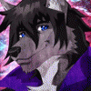
There is one aspect about your recent artworks which I figured out just yet... the outlines/line work of your drawings is different!!
^^
How so?
Well, you know that you have started using hard, black outlines for all characters and details (just like me) and then filled the drawing with colour (just like me).
Unlike myself, you moved on to using coloured outlines now - just like cartoons such as DISNEY do! And that is a fine thing, very nice! The idea is that you get rid of hard, black lines... and the whole artwork becomes more... painted... soft... natural.
I cannot get myself to do this! XD
I prefer the hard, black, 90s COMIC STYLE!!!! Yes, that is me! I like the hard lines but I eventually soften or even colour them if the situation allows (such as hard lighting or fog). ^^"
In any way... I have always preferred the coloured outlines in other artworks. And I have always enjoyed this style in DISNEY movies.
So... what I wanted to say is that the first thing I figured out is that your characters and details are much softer, precise and clean by using the coloured outlines (or filters).
That is pretty darn good!
^^
The characters looks splendid and for a human I think that Alice looks best! Her body and proportions were always tricky and not quite well done... but this time she looks excellent!
And the coloured outlines look best on HER... because her face is so soft this way. COOL!
I might even try the coloured outlines myself in time.
XD
So... the only suggestion I have for the future (yes, I do!!) is... NOT using a line tool for the rocks!!!!!!! :)
Try to draw it by hand. It always looks too artificial and just lazy, sorry.
The huge, round column is OK... but the rock on the right side... even if it fell down from an architectural structure... NOPE! It does not look good.
Try free hand!
So... we all have some hours left... but whatever:
HAPPY NEW YEAR and all the best to you for 2020!
^__^
^^
How so?
Well, you know that you have started using hard, black outlines for all characters and details (just like me) and then filled the drawing with colour (just like me).
Unlike myself, you moved on to using coloured outlines now - just like cartoons such as DISNEY do! And that is a fine thing, very nice! The idea is that you get rid of hard, black lines... and the whole artwork becomes more... painted... soft... natural.
I cannot get myself to do this! XD
I prefer the hard, black, 90s COMIC STYLE!!!! Yes, that is me! I like the hard lines but I eventually soften or even colour them if the situation allows (such as hard lighting or fog). ^^"
In any way... I have always preferred the coloured outlines in other artworks. And I have always enjoyed this style in DISNEY movies.
So... what I wanted to say is that the first thing I figured out is that your characters and details are much softer, precise and clean by using the coloured outlines (or filters).
That is pretty darn good!
^^
The characters looks splendid and for a human I think that Alice looks best! Her body and proportions were always tricky and not quite well done... but this time she looks excellent!
And the coloured outlines look best on HER... because her face is so soft this way. COOL!
I might even try the coloured outlines myself in time.
XD
So... the only suggestion I have for the future (yes, I do!!) is... NOT using a line tool for the rocks!!!!!!! :)
Try to draw it by hand. It always looks too artificial and just lazy, sorry.
The huge, round column is OK... but the rock on the right side... even if it fell down from an architectural structure... NOPE! It does not look good.
Try free hand!
So... we all have some hours left... but whatever:
HAPPY NEW YEAR and all the best to you for 2020!
^__^

Lol thanks! it has been a while since I applied that technique of the colored lineart, it indeed remove the black outline to make the image a bit more clean and more organic as you said.
As for the outline of the debris, well yeah, I kinda keep it like that and trie the same thing. But I suppose I kinda use the same outline color of the column into the blocks when it should be barely the same as the debris. I wanted to keep it with linearts because without them they were kinda flaws that didnt felt like to correct it XD
Maybe you like more keeping the black linearts for the comic aspect as you said, but would be interesting to see you giving a try and see how different would the impression of your pic be XD


Comments