 FA+
FA+
549
Views
Views
21
Favorites
Favorites
Category
Artwork (Traditional) / Animal related (non-anthro)
Species Avian (Other)
Size 800 x 1032
File Size 754.9 kB
Report this content
More from mrminos


Ok, this is a bit bizarre, but given what I do this should come as no surprise. Really this work should be titled: Adventures in Line and Tonalities! ...because that is essentially what it is. I'm quite surprised with how things turned out with this as I free-handed the ink background. I like some things about it, but I'm not really sure if this is good art or not. You be the judge.
The skull raven has been sitting around as a blank line drawing for about a year now. I just decided to dust him off and use him to play around with my Koh-I-Noor pens. I both love and hate the Rapidograph pens, but I'm warming up to them more and more.
The raven says, "CAwwww, those little skulls look tasty. I just wish they had eyes to pluck." ;)
Category Artwork (Traditional) / Animal related (non-anthro)
Species Avian (Other)
Size 800 x 1032px
File Size 754.9 kB

Okay, here's the critique then.. One of the things you did is that you used line direction to "clump together" elements within the picture. For example, all the hills have lines doing diagonally, all the trees have lines going vertically. You echoed the elements of the bird with using diagonal lines in teh trees to indicate curvature and the diagonals match the bird.
You used lines of heavier weigght in teh bird, which made it tonally darker and there for "pop out" of the paper. Whether you meant to or not, you done good. :) Some of this stuff just kinda starts happening by default when you start on peices cuz it "feels right" , that means you are drawing enough to start really getting a feel for that. :) Good job!! I likes!
You used lines of heavier weigght in teh bird, which made it tonally darker and there for "pop out" of the paper. Whether you meant to or not, you done good. :) Some of this stuff just kinda starts happening by default when you start on peices cuz it "feels right" , that means you are drawing enough to start really getting a feel for that. :) Good job!! I likes!

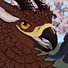

There's my duck! Thank you so much for those great observations, Lord Duckness. I'm really trying to improve my backgrounds (which have always been lacking really) and playing around with India ink seems to be something I'm good at...well at least better than other attempts. :)
Yes, skulls are "loove", tiny skulls especially.
Yes, skulls are "loove", tiny skulls especially.


Hey there! Thanks, stud gator. I was just kinda playing around and things seemed to have worked out right for me for once. Line texture is an amazing thing. It like every time I pick up a pen I learn a little something new. Of course I'm reviewing "Rendering in Pen and Ink" for the fifth time too. That is an amazing book.
I think I'm going to plant some skull vines out back this year. ;D
I think I'm going to plant some skull vines out back this year. ;D

Comments