 FA+
FA+
461
Views
Views
32
Favorites
Favorites
Category
Artwork (Traditional) / General Furry Art
Species Wolf
Size 1200 x 889
File Size 159.6 kB
Report this content
More from sarsis


Listed in Folders


I finally produced an image of Nita that I am happy with. Now I just need to try my paw at drawing Nidaja. For the longest time, I have been unsatisfied with the color green I have been using for their fur, but I like this color. Also, I want Nita to look young, soft, and delicate. This worked for this image. the hair-style I may still play with a little, but long, elegant and swept back is what I will go for with her. Ornaments are also likely to stay.
I used a little different style of shading and highlighting for this color image also, as I want to do MORE color images in the future.
Also, in the future, I intend to draw a LOT more scenery and backgrounds. I am secretly delighted with how the scenery outside the window turned out! :D
I used a little different style of shading and highlighting for this color image also, as I want to do MORE color images in the future.
Also, in the future, I intend to draw a LOT more scenery and backgrounds. I am secretly delighted with how the scenery outside the window turned out! :D
Category Artwork (Traditional) / General Furry Art
Species Wolf
Size 1200 x 889px
File Size 159.6 kB
Listed in Folders
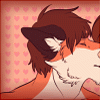


I have to agree on your choice of green; it looks a lot more 'natural' than anything else you've applied thus far. And it's a small thing, but I love that you put her shadow against the door, her angle with the wall light notwithstanding.
The space between her eyes (glabella, I think it's called) looks odd to me. The hard-lined crease stands out quite awkwardly in my eyes. Looking through your art, it seems to be a regular occurrence, so I don't know why I've never noticed 'til now. Probably 'cause there was never any jewelry there to draw much attention. I'm no pro visual artist, but maybe try putting a little separation between the lines? At least on the side near us. You did it in <a href="http://www.furaffinity.net/view/347.....">this pic</a>, and it makes the crease look a lot smoother, rounder. It also might be a thought to shorten the vertical pieces; the fact they go higher than her eyebrows is another odd feature. Might just be a facial structure thing, though, in which case I'll hush. And go play in the snow. *runs past Nita and out the door*
The space between her eyes (glabella, I think it's called) looks odd to me. The hard-lined crease stands out quite awkwardly in my eyes. Looking through your art, it seems to be a regular occurrence, so I don't know why I've never noticed 'til now. Probably 'cause there was never any jewelry there to draw much attention. I'm no pro visual artist, but maybe try putting a little separation between the lines? At least on the side near us. You did it in <a href="http://www.furaffinity.net/view/347.....">this pic</a>, and it makes the crease look a lot smoother, rounder. It also might be a thought to shorten the vertical pieces; the fact they go higher than her eyebrows is another odd feature. Might just be a facial structure thing, though, in which case I'll hush. And go play in the snow. *runs past Nita and out the door*
I agree about that hard crease. I think you are right. When doing black and white work it is somewhat more useful, but in the case of my color stuff, a little darker color to that region may look more natural. I am going to give that a try and see how it turns out. I have been dropping it from some of the black and white work and they don't seem to suffer for the lack of it at the very least. I use the line originally for a spacer. I don't know when I started including it in the end artwork itself. :P

Comments