 FA+
FA+
1372
Views
Views
140
Favorites
Favorites
Category
All / Fantasy
Species Unspecified / Any
Size 900 x 800
File Size 260 kB
Report this content
More from Defago


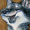
Modo, The Grey Warden sneaking into the dragon lair to lay a surprising attack to the Arch-demon. Will he be able to defeat it by himself?
This is what I've been working on for the past 3 days.
It took me 12 hours to finish this one *sigh*
No doubt it is the hardest one I ever done.
I'll be appreciated if someone give me some critique
so I'll be able to know what should I improve.
Enjoy!
Artwork © Defago (2010)
This is what I've been working on for the past 3 days.
It took me 12 hours to finish this one *sigh*
No doubt it is the hardest one I ever done.
I'll be appreciated if someone give me some critique
so I'll be able to know what should I improve.
Enjoy!
Artwork © Defago (2010)
Category All / Fantasy
Species Unspecified / Any
Size 900 x 800px
File Size 260 kB


I appreciate your openess to critiques. Well, nothing initially jumped out at me, but there are a couple things upon inspection. Be forewarned, I've been told I'm very blunt in my critiqueing, too the point that I've given offence when not meant, but I'm honestly trying to help. I'm the kinda guy who gives it to you straight and speaks my mind.
The dragon's saliva just seems a little too thick, and the mouth for some reason looks kinda small for a beast that large, but that might be perspective.
Okay, actually, the shading on the lion's arms did jump out at me on the second look. They are so dark compared to the rest of the lighting that they look more like grooves or secondary shadows from something else than muscular definition. Other than that I have to say the lighting is done quite well.
The sword, on close inspection (this is going to be blunt), looks like a solid piece of carved stone. The coloring is unilateral, and honestly looks like stone, which doesn't sound like the best material for a sword. If it's supposed to be metal, if there's enough light to put a glint on the earing (a nice touch I might add), then there should be enough for some mild reflection on the blade.
I'm a little confused on what the glowing green stuff is on the cavern floor, but I have never played Dragon Age Origins, and am assuming it is related to that.
Well, I hope you find my thoughts helpful, and this is a nicel piece overall.


Ok critiquing...First the good: The muscle tone we see of the loin's arm is spot on for the most part and his mane wow, good lighting and texture there. The lighting effect on the floor of the cave is very eye catching and very nicely done. The dragon looks awesome as well though I do have to wonder how he fits his whole body in the cave overall.
The stuff that needs work: The slavia as noted above just perhaps too much of it really. I would thin the lines of what slavia you have there already. I would darken the lion's right arm just a bit towards the body, assuming the the only light source in the cave comes from the opening where the dragon is.
Overall there is little to improve upon I think in the picture, the muscle tone, proportions for the lion seem to be in order and the overall composition seems to work in that the eyes always has something to focus on.
Hope this helps


From what I can see the lion's face, eyes, and mane are the best thing going for this. You did a great job with them.
For what stands out the most that could use improvement is the saliva on the dragon. It looks more like transparent icicles than actual watery drool. I'd recomend looking on flickr or another image search like Bing and get some animal or people pictures slobbering/drooling.
Water will stick to an animal's body and drip, not move perpendicular straight down.
Some general things, like the cave mouth would be a bit better if you showed near the entrance a little more brighter light and maybe some highlights on the scales of the dragon to show where light is directly hitting it seperating that from the dragon's head in the cave with green highlights underneath from the fissure.
The dragonage logo on the shoulder was a nice touch. I had to look twice to see it.
Your armor looks segemented instead of connected by composite leather underneath. I had to look twice here as the browns from the skin/fur look similar.
I hope this has helped a little.


I am new to your work so first off -Nice picture; great lighting and composition,
A lot of the lion side is great, esp the detailing, but the dragon side is a little less successful as others have noted above. The thing that throws me is the green lines on the floor- there seems to be no explanation for them- they don't look like acid, lava or vines so they don't work to me.
Defiantly having a rummage in the rest of your gallery!


Comments