 FA+
FA+
2375
Views
Views
250
Favorites
Favorites
Category
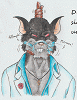
Artwork (Digital) / Muscle
Species Dragon (Other)
Size 1039 x 1417
File Size 1.11 MB
Report this content
More from Symbolhero


First commission for  DubFox featuring his dragon Zephyrys with some update, making him more bigger and badass looking (because why not? òwó)
Note: I LOVE HOW THE WATER LOOKS : D
 DubFox featuring his dragon Zephyrys with some update, making him more bigger and badass looking (because why not? òwó)
 Note: I LOVE HOW THE WATER LOOKS : D
Category Artwork (Digital) / Muscle
Species Dragon (Other)
Size 1039 x 1417px
File Size 1.11 MB


Hey, it looks great, well done! ^^ I like the final piece.
AND yeah, you are right: The water effects are the eye catcher here... not only is the distorted effect of the waves and the legs under water VERY well done... but I also like the "ripple effects" itself... how it all sparkles and how it's waving around... the sun reflections on the surface is supreme and excellent... yeah, the water is definitely the best effect here!
The character (though I don't know that guy) looks also handsome and great, hehehe. The eyes are interesting... it's difficult to make "almost entirely black" eyes to look good. Maybe it's the darker shade or I don't know... the eyes just look very dark and sinister... but not bad or out of place!
^^
Of course, I still have two suggestions:
1) The trees in the background are still too sharp for this kind of shot. Yeah, they are a little bit blurry... but the bushes still have too many details, colour saturation and focus in my opinion. I would really suggest to turn down the saturation a bit here. Add some more brown or blue to it... because it reminds me of some... well... a collection of broccoli! ^^" Sorry!!!
Remember: I can see only three shades of green there and that is not enough... try to add many more and different colours to the bushes next time. Not every leaf is perfectly green in nature!
^^
2) I know... I always repeat myself... but try to use STRONGER SHADING!!! XD
Why?
Well, you can argue that I am a dude who prefers crisp, sharp and stronger shading. But hey... look at my lastest REPTILE SWIMSUIT EDITION artwork:
As you can see, the overall atmosphere and expression are similar... am I right?
Both artworks show a character in a poor/water at bright daylight. Both guys are enjoying the water... and the sun is hitting them from straight above!
If you look at my shading... it still has soft edges, yeah... that is what you also prefer.
BUT the shading is darker because the sun is at its peak!
And that is my main issue here. The contrast should be darker and stronger... the stones... the character's skin... and the armor parts... all needs a bit more contrast.
Maybe your screen is too dark and mine is too bright?????
XD
Possible.
Still, keep it in mind if you don't mind!
I hope this comment didn't smash your head... I know you prefer a long and honest critique.
^^
Like I said... the water effects are unmatched and the overall expression is hot and wonderful.
I would just increase the contrast.
BUT I can see an error/flaw in my comment/suggestion: The steam... the hot, steamy fog caused by the pool... yeah... I can see now that the fog does create some bright, less contrast to the overall appearance... yes. I see it now!
^^"


Comments