 FA+
FA+
695
Views
Views
18
Favorites
Favorites
Category
All / Muscle
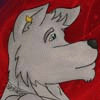
Species Dog (Other)
Size 975 x 760
File Size 561.1 kB
Report this content
More from WulfGym


My favorite scene of a furry story I read a long time ago featuring Ash and Leo.
Category All / Muscle
Species Dog (Other)
Size 975 x 760px
File Size 561.1 kB

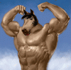

Mmm... I think the biggest hurdle that you have to overcome right now is crossing that line and really thinking in 3D space. You have an idea of foreshortening and occlusion, which is good, but you're still not imagining the 3D forms of things as well as you could be. And if you are, you're not applying perspective as well as you could be. Case in point is how the background meshes with the foreground.
The background in general probably needs to be redrawn. The forced perspective of the floor tiles in general is throwing everything off. Try to make the floor work in perspective with the sink in your mind, for example.
The other major point is anatomical. Your proportions are...not good, to put it bluntly. Biggest problem is your legs are way too short. Upper leg alone can be a head and a half. The lion character's right hand seems to be attached backwards. The hands in general look awkward, which would be alleviated if you made the palms a bit bigger. The doberman's head is awkward-looking - look up some refs instead of trying to approximate with some boxy shapes. The pectorals look like boxes, too. It looks like you have a working knowledge of muscle structure, however, you should apply it more subtly - on abs especially. What I mean by that is, don't tell us where things are with these lines, show us by shading the forms.
I could go into detail on shading here but it was probably more of an afterthought than the main focus. I'd rather this not be the case, but what can you do. I'll just say that it ties in with you needing to think more in 3D space - have an idea of where your light sources are, have things cast shadows, apply highlights accordingly, etc.
Here's to future improvement, cheers.

Comments