 FA+
FA+
5380
Views
Views
393
Favorites
Favorites
Category
Artwork (Digital) / All
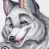
Species Housecat
Size 565 x 800
File Size 193.1 kB
Report this content
More from thefunkyone


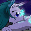
Finally got this sucka finished!
Well, I think so, anyway. The brightness is different depending on if I'm looking at this at work or at home, so I can't be sure if it's too light or too dark or whatnot.
Anyway, this is what the last few posting to my scraps have been working up to. It wouldn have been done sooner but I took a short break from it for a while.
It still has a few issues in terms of perspective and such, but overall I'm kinda pleased with how it came out. Certainly learned a few things from it to take into the next one I do that's detailed like this.
And there will be more. I'm still looking to push my background drawing skills.
Anyways, enjoy and comment :D
Category Artwork (Digital) / All
Species Housecat
Size 565 x 800px
File Size 193.1 kB


Heh, I think the brightness is okay like this, the picture looks awesome.
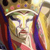
Only thing I can really think of (which is irrelevant now, I shoulda payed more attention to your scraps); I thought they were just jumping around in a stone back yard at first, I didn't realize they were falling down out of a broken window. I wouldn't know what to do about it, except maybe add some more glass shards
Guh, me and my critique. Sorry dude, it's awesome either way ^^;


It's kinda tough to read the title.
I also agree with what ipoke said. It's really difficult without some kind of motion lines to get any intensity...especially the type that would come from busting through a window and falling down 4 stories or so.
Maybe put the ledge or sil of the window in view to give the reader an idea. But definitely a little outside motion blur or some speed lines. Something to intensify the situation. I love the coloring, but that's the only saving grace this cover has because it's boring elsewise.
Fair enough, that's something to learn from.
I was trying not to rely on speed lines though, just to see if I could use the perspective and such to get the sense of height and perceived danger. Like I said though, I know it's not perfect so that's somethnig to work on some more in future pieces.
I was trying not to rely on speed lines though, just to see if I could use the perspective and such to get the sense of height and perceived danger. Like I said though, I know it's not perfect so that's somethnig to work on some more in future pieces.
I'm no expert, believe you me, but I think the best way to translate the drama would be a closer cropped shot of the foreground character. The closer the "camera" is to the image, the more intense it seems to be. The angle becomes steeper and the action more intense, even if you're looking to take speed lines out of the picture.
I think it's a great piece and I would be extremely challenged to come anywhere close to this level of awesome. I've seen production artists just use crudely photoshopped stock to make their backgrounds and work around those. So still working it by hand, you're head and shoulders above them.
I think it's a great piece and I would be extremely challenged to come anywhere close to this level of awesome. I've seen production artists just use crudely photoshopped stock to make their backgrounds and work around those. So still working it by hand, you're head and shoulders above them.


I have to concur with refleximage above; a radial blur for the background layer focused on the characters' point of impact, and possibly a much lighter version of the same for the character layer, would seem to help by both adding a depth of field effect and indicating motion. Not that it doesn't look pretty cool already, just commenting in case you feel like tinkering with filters.

Gamma correction is a bear. It looks good on my PC!
Outlining the characters with the light from the stun baton is a good effect, and helps bring the characters out of the background. They would probably be even better visually differentiated from the background if you chose colors that would give more contrast between the chars and the bg in terms of value and saturation.
The blur overlay effect that you're using is making the characters' fill colors bleed outside of their outlines. This is cool and glowy when applied to the stun baton glow, but it's coming across as an artifact where the color isn't meant to be a hard glow, like the back of Violet's left arm, or Felicia's left leg. You might consider isolating which colors you want to get the extra glow by selecting just the brighter colors, or doing it by layers.
The title's harder to read than it was. The stylized, bold, tightly kerned and leaded, heavily ligatured font you're using needs a clear outline to help legibility. The text on the bottom has this outline (dark bg, dark fill, white outline). In the WIPs, the "White" at the top of the title was while fill, white bg, black outline, which made it a pretty clear read. It has a murkier outline now, and the sword is entirely covering the top of the "h", making it hard to tell what the word is, if you don't already know what you're looking at, without staring and decoding for a second. That wasn't so noticeable in the wip when the title had a better outline, but it's really working together with the weaker outline to make the title harder to read. Making the glass shard over the text a little more transparent might help legibility, and actually now that I look, a lot of the other shards aren't letting much of the bg through, and it might do do make them all a little more transparent.
The "The Shadow and the Blade" text might do better on the left. There's some negative space there, an empty field of wall, that isn't doing much. Moving the text out of the space below Felicia might help with the sense that there's space below her that she's falling in to.
There is a sort of "frozen moment" feeling leant by everything being un-blurred and lacking speed lines. This isn't a bad thing if it's what you were going for. It's really easy to overdo those effects.
The cel shading looks great, and the work you did in the sketch phase really helped the silhouette. This is cool, and would totally catch my eye in a shop.
Thanks very much, those are all very good points :)
The glows were, admittedly, a by-product of the image being too dark and difficult to read in various places. To be honest, I was wary of using them since its easy to overdo, which is probably the case here. Next time I'll have to chose my colours a little more carefully, or at least the saturation.
I was wondering whether keeping the bold white outline was a good idea, and looking at it now I agree that it probably should have stayied in there. The title is hard to read as a few have pointed out, and I agree. It's not helped by the characters obstructing it either, but that's due to me constantly moving them around and trying to work with what I have already. Who knows, maybe I should have lost the title entirely. Still, something learned there :)
Oddly enough, I hadn't thought to move "The Shadow and The Blade" over to the left. Looking at it now it seems like an obvious choice for the reasons you mentioned.
Again, I was hoping to avoid using blurs, but had considered it at one point. Seems like enough people have pointed it out, so maybe I should have gone with that to begin with, lol.
Thanks for the crits! If I don't make edits to this one, I'll keep all of this in mind for the next piece :)

Looks very good, very dynamic aswell, and I don't think the brightness is wrong (you rendered very well the lights on the charachters by the way, very classy) !
Maybe you should just ajust a little bit the contrast and shade a little more the area (like Ipoke my first reaction was thinking they were fighting in a large room with crates ...).
Keep up the good work !
Maybe you should just ajust a little bit the contrast and shade a little more the area (like Ipoke my first reaction was thinking they were fighting in a large room with crates ...).
Keep up the good work !


I guess I've always done it that way. You could say that, due to the variety of species that inhabit their world, that the type of footware they have comes down to personal taste. Most wear the open toe/heel design, but some prefer a full boot. Sometimes it comes down to the type of job they're doing, like a construction worker or soldier would likely need to wear a full boot to protect their feet, whereas most people wouldn't need to worry so much about it in day-to-day life.

Comments